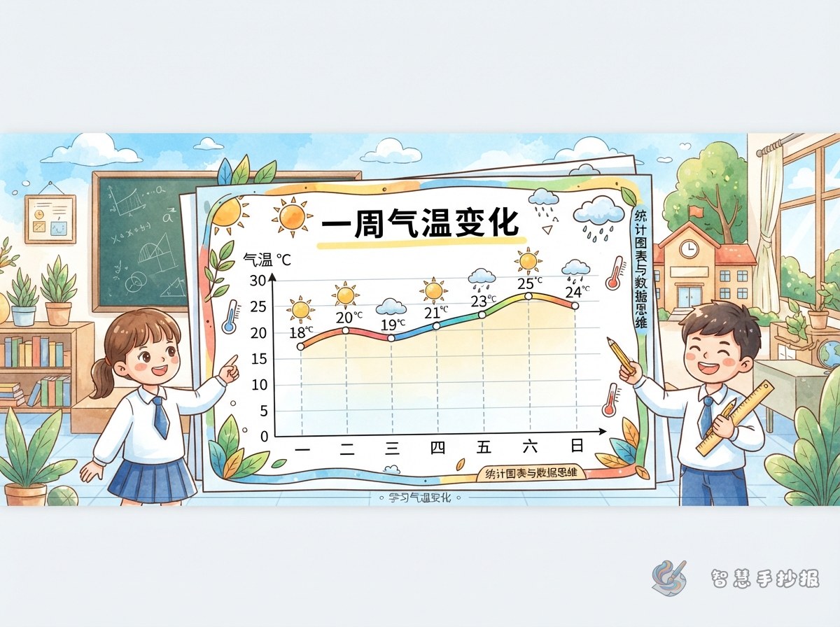
Begin with a Fair Seven-Day Observation
The purpose of this poster is to show how weather observations become useful data. Before drawing the page, prepare a seven-day log and record the temperature at roughly the same time and location each day. Add a simple note such as sunny, cloudy, rainy, or windy.
- Record the date, temperature, weather condition, and observation time.
- Keep the conditions as consistent as possible for a fair comparison.
- Check that every value uses the same temperature unit.
Make the Line Graph the Visual Center
Draw the horizontal and vertical axes lightly in pencil. The horizontal axis shows the seven dates, while the vertical axis shows temperature. Choose equal intervals on the temperature scale, plot one point for each day, and connect the points in chronological order.
Graph tip: Use small colored dots and a neat line so the labels remain easy to read. If both daily high and low temperatures were recorded, draw two differently colored lines and include a simple legend.
Read the Shape, Not Just the Numbers
Add a section called “What the Data Shows.” Short, evidence-based statements are more useful than a long paragraph. Students can examine the graph in this order:
- Locate the highest and lowest temperatures.
- Subtract the lowest value from the highest to find the range.
- Compare neighboring days to find the largest rise or fall.
- Decide whether the week warmed, cooled, or moved up and down overall.
A useful sentence starter is: “The graph shows that the temperature did not change in one steady direction because...” Complete it with dates and values from the actual observation log.
Ready-to-Use Writing Blocks
What Is a Line Graph?
A line graph uses points to represent values and connects them in order. It shows individual measurements while also making changes over time easy to see.
How I Collected the Data
I observed the temperature for seven consecutive days at approximately the same time and place. After organizing the readings, I plotted them on a line graph and compared the highest, lowest, and changing values.
A Note About Accurate Data
Reliable conclusions begin with honest records. If a reading is missing, mark it as missing rather than inventing a number. Any change in the observation method should also be explained beside the chart.
Build the Page Around the Weather Path
Place the title across the top and reserve the largest central area for the graph. A compact observation table can sit on the left, while findings and graph facts fit on the right. Use the bottom strip for a short reflection. Clouds, raindrops, suns, and thermometers make suitable border details, but they should never cover axes or labels.
Blue, orange, and pale yellow create a bright weather palette. Plan every section in pencil before outlining and coloring. To explore more section combinations and poster layouts, students and families can continue creating in the 智慧手抄报 WeChat Mini Program.