Turn a Breakfast Question into a Small Survey
Before drawing, turn the topic into a question that can be recorded, such as Which breakfast foods appear most often over several days? or How varied is my breakfast combination? A focused question makes the final chart much easier to understand.
- Choose the subjects: Record your own breakfasts, your family breakfasts, or a few classmates' breakfasts with their permission.
- Choose the categories: You may track grains, eggs and dairy, vegetables, fruit, or other categories that fit your observation.
- Choose the period: A few consecutive days are enough. The important rule is to record honestly rather than change the numbers to make the poster look better.
- Make a simple tally: Use dots, short marks, or numbers each day, then add them together at the end.
Make the Chart the Visual Center
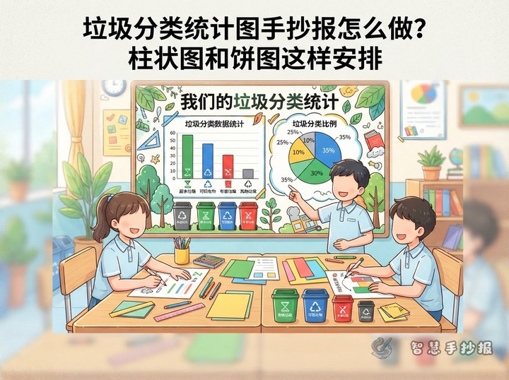
Try a layout with one large chart in the middle and explanations around it. Put the title at the top and use a bar chart in the center to compare how often different breakfast items appeared. A smaller chart on the right can show the proportion of mutually exclusive choices in one survey. A pie chart is not the best choice when one breakfast can contain several food categories at the same time; use a bar chart for that situation.
Give Each Area a Clear Job
- Title area: Write a phrase such as Breakfast Observation Station and add small icons of toast, milk, or fruit.
- Data area: Use the same scale for every bar and label the categories and counts clearly.
- Finding area: Explain which category appeared more or less often and what pattern you noticed.
- Action area: Suggest one small change for the following week, such as preparing fruit in advance or rotating staple foods.
Text You Can Adapt for the Poster
Opening: Breakfast is one of the food choices we make at the start of the day. I recorded my breakfast combinations for several days and turned the results into a data chart.
Data note: The data in this poster comes from my own records. The unit is the number of times an item appeared. It describes this observation only and does not represent everyone's breakfast habits.
Finding: The chart shows that different breakfast items appeared at different frequencies. Recording the data helped me notice my usual choices and think about how to add more variety.
Closing message: A good breakfast can begin with being on time and paying attention to the combination. Start by observing carefully, then make a small adjustment that suits you.
Accurate Charts Make Stronger Posters
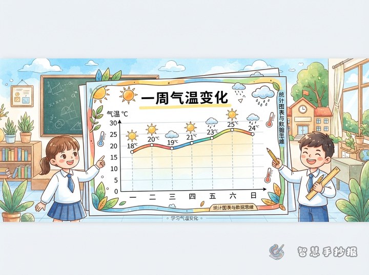
- Label the horizontal axis with breakfast categories and the vertical axis with frequency or number of times.
- Keep bar widths, gaps, and scale intervals consistent. Do not change the proportions just to emphasize one item.
- Use a limited color palette to separate categories. Three or four colors are usually enough for a clean look.
- If you use a pie chart, calculate each part from the same total and include a legend.
- Write the number of observation days, the subjects observed, and the unit in a corner so readers know where the data came from.
From a Tally Card to a Finished Poster
- Choose one breakfast question and draw a short recording checklist.
- Record the information for several days and organize it into category totals.
- Select the chart that explains the data most clearly instead of filling the page with too many shapes.
- Plan the positions of the title, chart, text, and illustrations in pencil before adding color.
- Add the chart title, units, legend, and a short data note.
- Read the finding and action sections again to make sure they come from the actual records.
After planning the topic and data, you can continue in the WeChat mini program 智慧手抄报 to arrange the layout and choose decorative elements, making the breakfast observation poster easier to complete.