Turn “My Day” into a Chart
This handwritten newspaper can explore the question “Where does my time go?” Record time spent on study, reading, exercise, rest, and hobbies, then use charts to show the distribution. The topic connects everyday observation with simple data thinking.
Choose a clear survey range, such as “activities during one weekend day” or “reading time over seven days.” The data may come from personal records or a simple example set, but the page should state the subject, time range, and units clearly.
Useful Sections for the Page
- Data Survey: List the dates, activities, and time spent so readers know where the chart data comes from.
- Time Distribution: Use a pie chart to show the proportions of activities during one day.
- Seven-Day Change: Use a line chart to record reading or exercise time and compare each day.
- What I Found: Write two or three conclusions based on the chart, such as which day had the most reading.
- Action Plan: Set one practical goal, such as reading at a fixed time each day.
Choose the Right Chart
Bar Charts Compare Amounts
A bar chart is easy to understand when comparing reading minutes across several days. Put the dates on the horizontal axis and time on the vertical axis. Keep the scale even and leave equal spaces between bars.
Line Charts Show Change
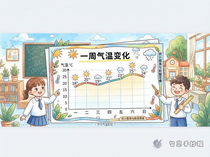
For a topic about weekly activity changes, mark each day’s data and connect the points. An upward line shows an increase, while a downward line shows a decrease. Label the highest and lowest values nearby.
Pie Charts Show Proportions
A pie chart works well for showing how one day is divided among different activities. Use separate colors and add a legend. Four to six categories are usually enough for a clear primary school project.
Text You Can Add Directly
Opening line: “Data is hidden in everyday life. Careful recording helps us discover how we use our time.”
Observation tip: “Record first, organize second; read the chart before making a conclusion. A chart is more than decoration: it helps us understand facts.”
Sample conclusion: “The bar chart shows that I read longer on weekends than on weekdays. The line chart shows that Thursday had the least exercise time, so I need to adjust my plan.”
Fact box: “A chart needs a title, data, units, a legend, and clear axes. Without one of these parts, readers may not understand it correctly.”
Layout and Making Steps
On a horizontal page, place the data table on the left, the main chart in the center, and conclusions and plans on the right. On a vertical page, put the title at the top, followed by the survey notes, main chart, and action plan. Let the main chart take about half of the page so the focus remains visible.
Use blue, green, and orange to separate data categories, while writing scales and notes in black or dark gray. Sketch the layout in pencil first, then draw the axes or pie sections, and finally add labels, legends, and simple lines. Check that the numbers, units, colors, and legends match.
Turn the Results into a Growth Record
The ending does not have to say only “I learned statistics.” Add a practical goal such as “I will read for twenty minutes each day next week and make another line chart at the weekend.” This makes the project both a data display and a record of personal change. For help arranging sections, colors, and layouts, continue creating in the Weizhi Handwritten Newspaper mini program on WeChat.