Start with one clear statistics question
A pocket money handwritten newspaper works best when it answers a real question. Try this: Where did my pocket money go in the past week or month? Then divide spending into snacks, stationery, toys, books, savings, and other. Keep only four to six groups so the charts stay clear.
Ways to collect your records
- Write down what you bought and how much you spent before going to bed each day.
- Combine one week of notes into two columns: item and amount.
- If you cannot remember every purchase, ask a parent to help you estimate, and label it as estimated data.
Choose the right chart for the question
The same data can be shown in different ways. The important thing is to match the chart to the question.
Bar chart: compare amounts
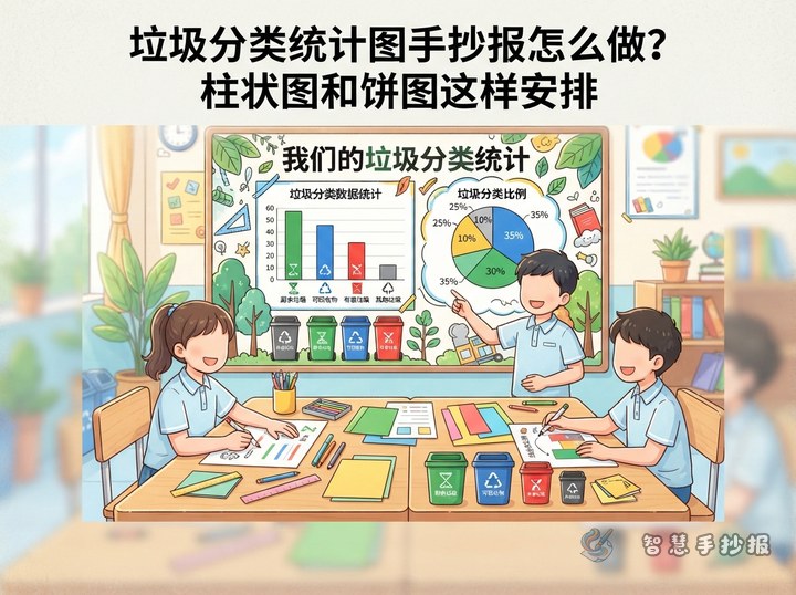
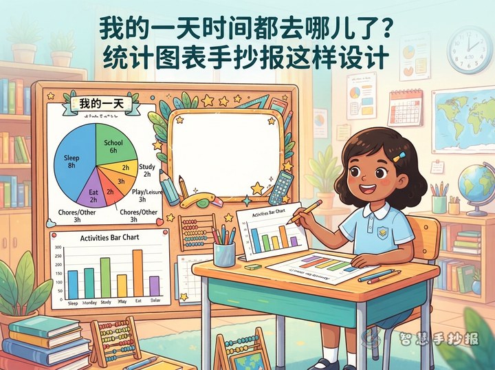
Put spending items on the horizontal axis and amounts on the vertical axis. The taller the bar, the more money that item used. This makes it easy to see which item cost the most.
Pie chart: show proportions
First find the total amount, then work out what share each item takes. A pie chart is great for showing how large the snacks slice is. If percentages are hard, write an approximate fraction such as 'about one third'.
Do you need a line chart?
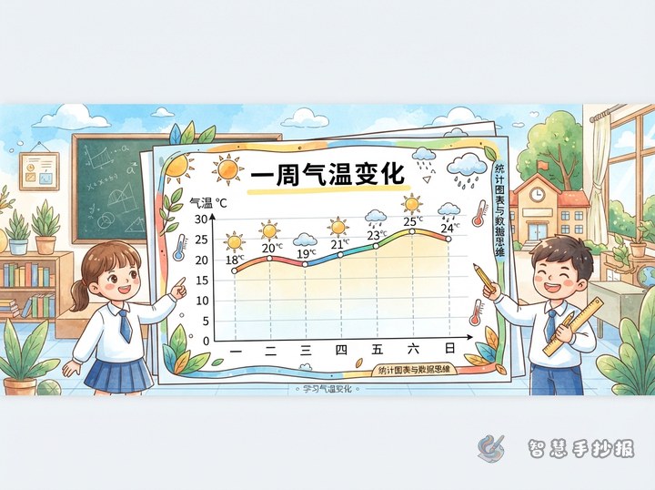
If you record how your pocket money balance changes day by day, a line chart can work well. If you are only comparing items, a bar chart and a pie chart are clearer.
Plan the page in four zones
Divide an A3 or A4 page into four areas: title area, chart area, data note area, and conclusion area. In the title area, write 'Where Does My Pocket Money Go?' and add simple drawings of coins, a piggy bank, or a shopping bag. Place one bar chart and one pie chart in the chart area, leaving enough space between them. Use the data note area for short sentences about when and how the data was collected. In the conclusion area, write one finding of your own.
- The title area takes the top fifth of the page.
- The chart area takes the middle half, with charts side by side or stacked.
- The data note area sits beside the charts and connects with arrows or small labels.
- The conclusion area goes in the bottom right corner inside a colored box.
Text sections that make the newspaper stronger
Besides charts, a handwritten newspaper needs short text sections. You can add 'Statistics Tip', 'My Data Finding', 'Saving Plan', and 'A Word for Classmates'.
- Statistics Tip: Bar charts compare amounts, pie charts show proportions, and line charts show changes.
- My Data Finding: 'I found that stationery cost 12 yuan, the most of any item this week.'
- Saving Plan: 'Next week I will skip one snack and put the money into my piggy bank.'
- A Word for Classmates: 'Track your pocket money for one week, and you will see that small amounts add up.'
Small details that show data thinking
First, give each chart a title and a unit, such as 'Weekly Pocket Money Spending Chart (Unit: Yuan)'. Second, use different colors for each category and draw a small legend beside the chart. Third, write your conclusion with 'because' and 'so' so readers can see your thinking, not just your drawing. When the page is done, you can take a photo and continue in the WeChat mini program Smart Handwritten Newspaper to adjust the title style and section positions.