Pick the weather icons your poster will show
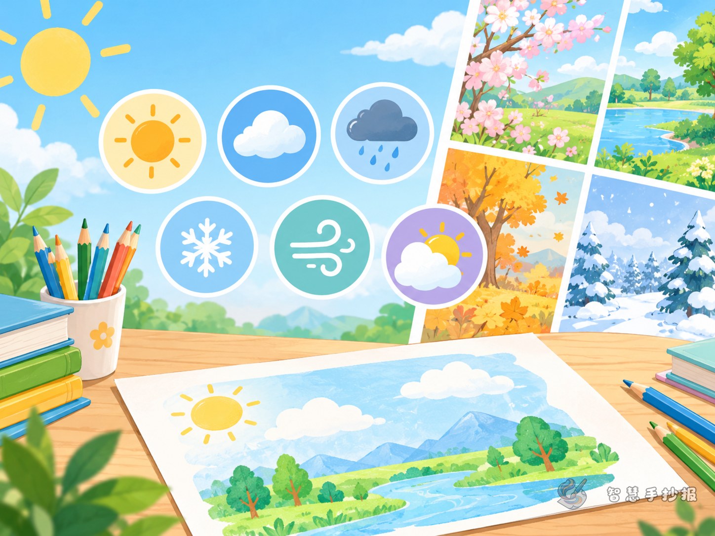
A weather symbols poster works best when a few clear icons do the talking. Choose six to ten symbols; more than that starts to look cluttered.
- Sunny: a circle with eight short rays around it.
- Partly cloudy: half a sun peeking out from behind a cloud made of three rounded arcs.
- Overcast: one thick, round cloud with no sun, shaded light grey.
- Light, moderate and heavy rain: slanted lines under a cloud, using three, five or seven lines.
- Thunderstorm: a sharp zigzag bolt below the cloud.
- Snow: small snowflakes made from six crossing lines, or simple dots.
- Fog: three or four horizontal lines of different lengths.
- Hail: a few small circles beneath the cloud.
Give the title and text boxes short, clear names
Put the main title across the top of the page or in the upper left corner, in the largest letters. Simple titles such as “Weather Symbols I Know” or “Little Weather Station” work well, with a smaller line underneath like “Read the icon, name the weather”.
Keep each column name to two or three words so it reads at a glance:
- Symbol Class: what each icon means.
- Weather Tips: what to wear, when to take an umbrella.
- Proverb Corner: one or two short weather sayings.
- Forecast Desk: a small table where you fill in a week of symbols.
Write one line under every symbol
The icons are the frame; the words are the content. Under each symbol add a short note, for example:
- “Thunderstorms often arrive on summer afternoons. Never stand under a tall tree when it thunders.”
- “On foggy days you cannot see far, so walk slowly and wear something bright.”
- “When it rains for days, the ground gets slippery. Do not run on the way to school.”
Save a small corner for a weather proverb such as “red sky at night, sailor’s delight”, which is easy to remember and pleasant to read.
Split the page so icons and writing stay apart
Divide the paper into four zones: title, icons, writing and a decorative border. Put the icons in the middle or along one side, and the writing on the other, so the two never squeeze each other.
- Draw the zone lines lightly in pencil and check that every area is big enough.
- Keep all icons in a set the same size, in one row or two, with equal gaps.
- Write on blank or pale areas, never on top of an icon.
- Decorate the border with clouds, raindrops or snowflakes in light colours so the icons still stand out.
Order of work and finishing touches
- Write the main title first and fix the centre of the page.
- Draw the icons in pencil, outline them in black, then colour them in.
- Fill the text boxes, drafting the sentences first and counting the words before copying.
- Add the border and small decorations, then check for spelling mistakes and empty patches.
Keep the whole page to five or six colours: yellow and orange for the sun, blue and grey for rain and clouds. Accurate icons plus matching text make a tidy poster.
If you would rather not plan the layout from scratch, open the “Smart Handwritten Newspaper” mini program in WeChat, choose a weather theme and fill your words and symbols into the ready-made frame before drawing it on paper.