Do not stop at color meanings
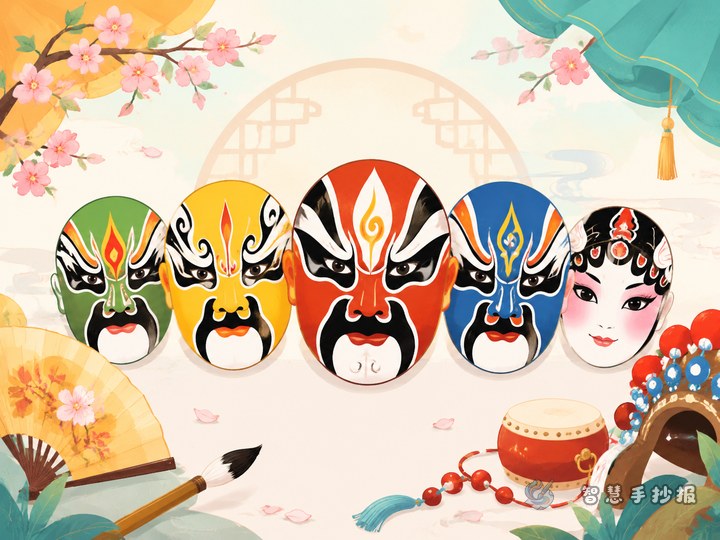
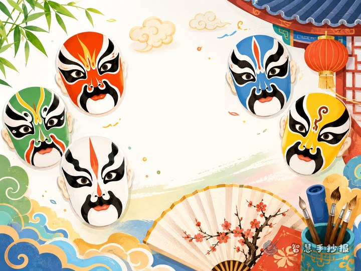
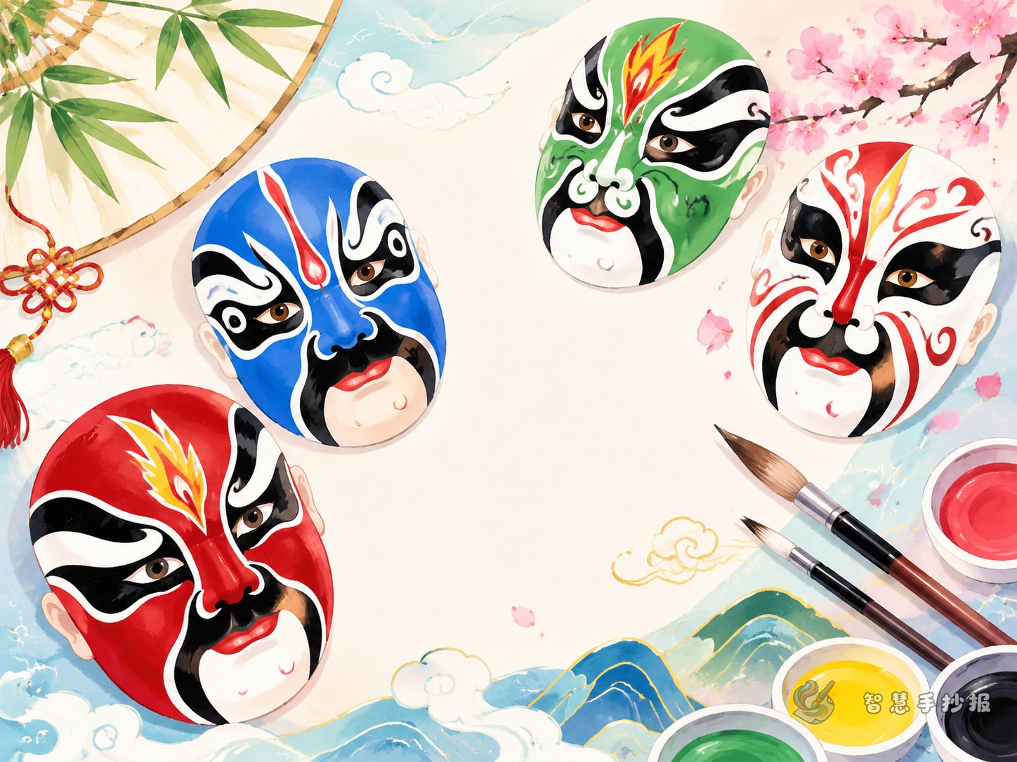
When students make a traditional Chinese opera mask culture poster, they often begin with what red, black, or white means. That is useful, but a poster with only color notes can feel thin. A stronger idea is to present opera masks as a cultural symbol that combines painting, stage performance, and character design.
Write a bold title first, place a large mask illustration in the center, and build several short sections around it. Keep each section to three to five sentences so the page stays readable and suitable for school handwriting.
Section ideas that fit this theme well
How opera masks developed
You can explain that opera masks are part of traditional stage makeup and became more standardized over time. They help the audience quickly recognize different kinds of characters.
What makes the patterns special
You can mention symmetry, strong lines, and bold shapes around the forehead, eyes, nose, and cheeks. These design choices make each face look expressive and memorable.
What masks do on stage
When an actor appears, the mask helps the audience sense the role's personality, status, and energy. It strengthens stage effect and makes the character easier to remember.
Classic parts of a mask
You may list simple elements such as forehead patterns, eye areas, nose lines, and mouth details. Even short explanations can make your poster look organized and informed.
My own appreciation notes
Add one small section with your own observations, such as how the lines feel powerful or how the patterns seem to tell a story. This gives the poster a personal touch.
Short text materials you can copy
- Chinese opera masks are a distinctive symbol in traditional stage art.
- Masks use colors, lines, and patterns to express character traits.
- An opera mask is not only makeup but also a visual art design.
- Symmetry and exaggeration make opera masks striking and vivid.
- Audiences can often sense a role's spirit from the mask at first sight.
- To appreciate a mask well, look at structure, line work, and expression, not only color.
A neat layout plan for your poster
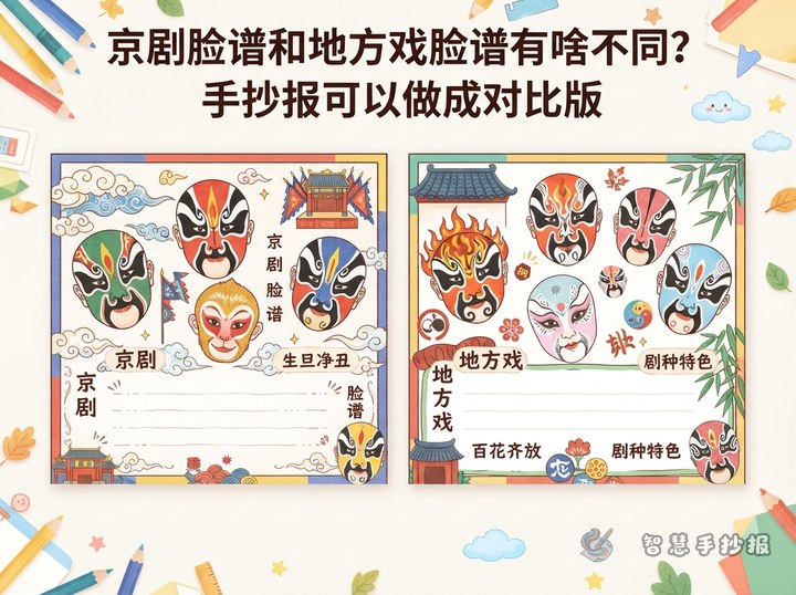
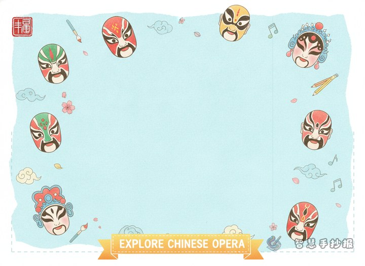
For a standard school poster page, try a central-image layout. Draw one large opera mask in the middle and divide the surrounding space into four smaller sections. This creates a clear visual focus and keeps the information easy to arrange.
- Put the main title at the top in larger lettering.
- Use the center for the most eye-catching mask drawing.
- Place short themed sections around it, such as mask facts, pattern features, stage function, and my thoughts.
- Add simple border decorations inspired by clouds, drum rhythms, or stage motifs.
Do not fill every empty space. A little white space makes the whole poster cleaner.
Color use and writing details
This theme looks good with bright but controlled colors. Choose two or three main colors such as red, black, blue, or golden yellow, and keep some white space for contrast. Write neatly, make section titles stronger, and lightly highlight key words in color.
If you are short on time, do not chase overly complex patterns. First make sure the title is clear, the sections are complete, and the text is concise. Then add small decorations. If you want to keep improving the page, you can continue your poster design in the Zhihui Shouchao Bao WeChat mini program.