Start with a simple theme line
A traffic signals and road signs handwritten newspaper works best when it has one clear idea. Use a theme like 'Red light, stop; green light, go; remember the signs as you go.' Write it large at the top center or top left. Leave a thin line under the title to separate it from the content.
If your paper is landscape, place the title on the left and draw a traffic light on the right. If it is portrait, center the title and split the lower part into two columns. Deciding the title position first makes writing and drawing much easier.
Four content blocks that keep the page organized
1. Traffic light basics
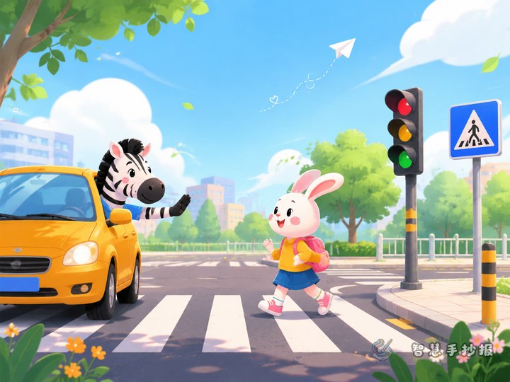
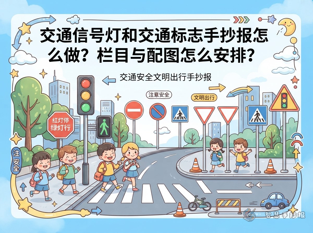
Explain the three lights in short sentences: stop behind the line when the light is red; look both ways and then go when it is green; do not rush when it is yellow. Add a small colored circle or traffic light icon next to each line.
2. Road sign categories
Organize signs by color and shape in three small boxes:
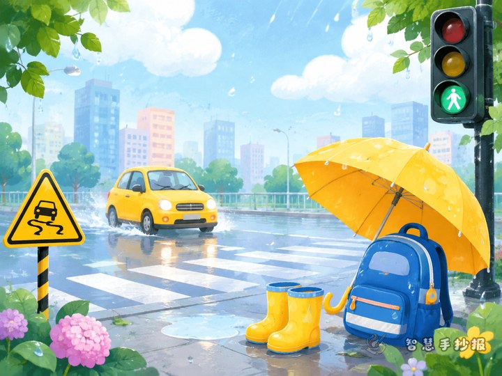
- Warning signs: yellow triangles that tell you to watch out, such as 'watch for pedestrians' or 'traffic signals ahead.'
- Prohibition signs: red circles that forbid an action, such as 'no entry' or 'no honking.'
- Guide signs: blue circles or squares that show what to do, such as 'pedestrian crossing' or 'bicycle lane.'
3. Safety rhyme
Write a short rhyme: 'Look left, look right, then cross the road; red means stop, green means go. No running, no pushing, use the zebra crossing.' Keep each line short so it fits neatly.
4. Civilized travel promise card
Draw a box or card and write: 'I promise to cross at the zebra crossing, wear a seat belt, never throw things from a car, and remind my family not to run red lights.' Place it in the bottom right corner as a strong ending.
Drawing and layout ideas: circles, triangles, and zebra lines
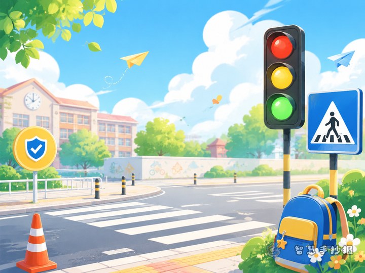
To draw a traffic light, use a bottle cap or compass to make three circles in red, yellow, and green order. Outline the light box in dark gray or black. For road signs, start with a circle or triangle, then color it: red border and white center for prohibition signs, yellow and black for warning signs, blue and white for guide signs.
- Zebra crossing: use a ruler to draw parallel white lines at the bottom of the page, like a small road.
- Direction arrows: good as decorations beside small headings and can show 'stay in your lane.'
- White space: leave a little gap between blocks. Do not fill every space with color, or the title and text will be hard to read.
Step-by-step production order
- Use a pencil to lightly divide the page and mark the title, knowledge, rhyme, and promise card areas.
- Copy your chosen text into each block and keep the line spacing even.
- Outline the title and borders with a black pen, then color the traffic lights, signs, and zebra crossing.
- Check for spelling mistakes and color spills, then erase the pencil lines.
If you want a more finished layout, you can open the Smart Handwritten Newspaper WeChat mini program, choose a traffic safety theme, replace the text and drawings, and continue making your poster there.
Extra details that make it look like a safety map
Turn the page into a route to school: put home at the top left, traffic lights and a zebra crossing in the middle, and school at the bottom right. Arrange signs and text along the route so readers can understand it at a glance. A small sun or leaf near the title adds a fresh feeling, but do not let it distract from the road signs.