Make the theme about comparison, not just collecting facts
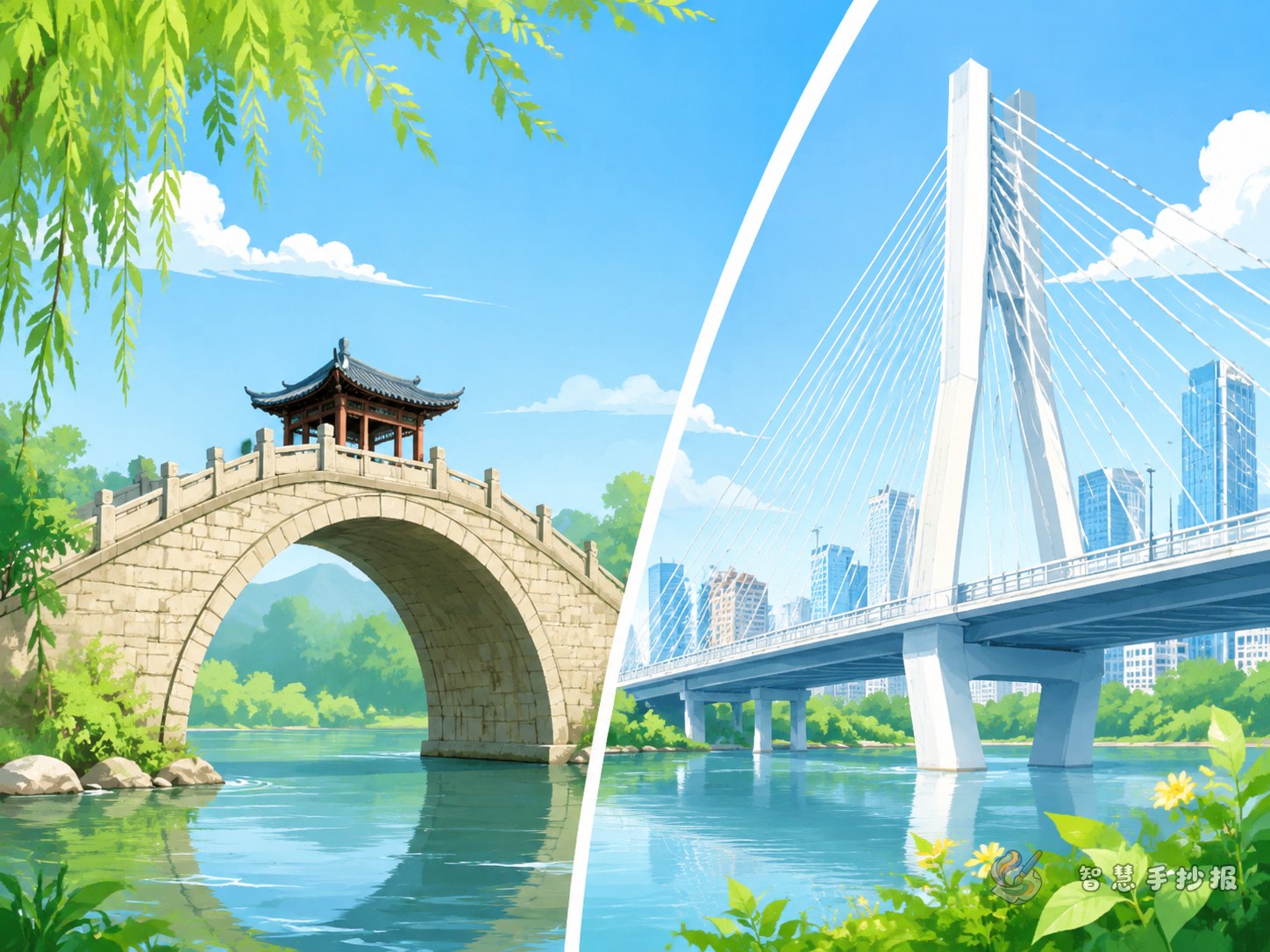
This topic works best when the whole page is built around a clear comparison between ancient bridges and modern mega bridges. You can divide the page into two sides: ancient bridges on the left and modern bridges on the right, with a central title such as “The Development of Bridges.” This makes the page easy to read and visually strong.
The ancient section can focus on stone bridges, wooden bridges, and arch bridges. The modern section can highlight steel structures, long-span bridges, wind resistance, earthquake resistance, and cross-sea or cross-river construction. The result is both historical and technological.
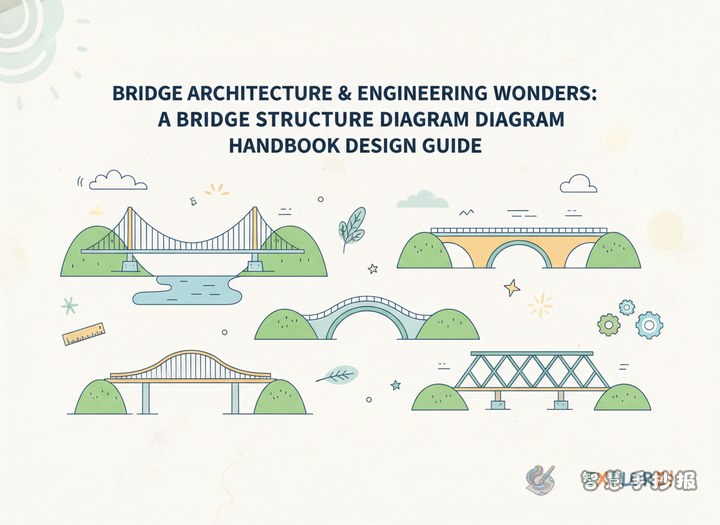
Four useful sections for the page
Section 1: A short bridge timeline
Use a few simple lines to show how bridges developed from basic crossing tools to symbols of engineering progress. For example, early bridges often used wood and stone, later arch bridges became more stable, and today giant bridges can cross wide rivers and seas.
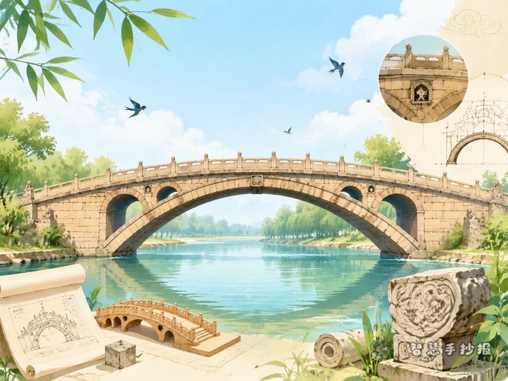
Section 2: Highlights of ancient bridges
- Common materials: stone and wood
- Common structures: arch bridges and beam bridges
- Main features: practical design, local materials, simple appearance
- Good point to mention: builders created durable bridges without modern machines
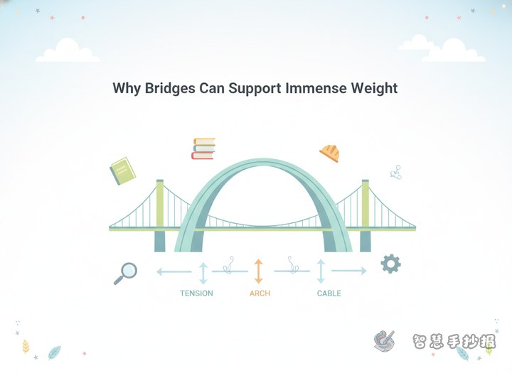
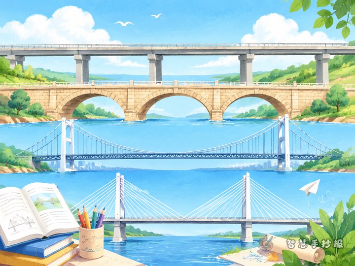
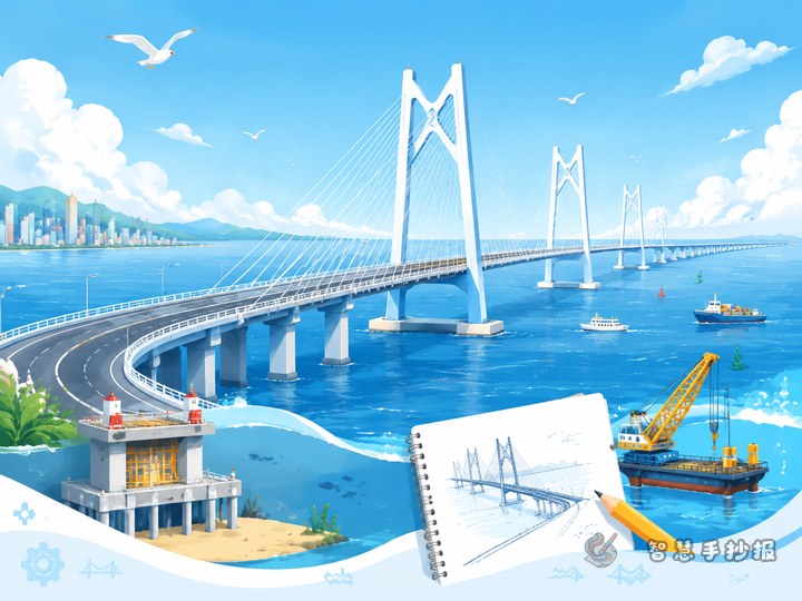
Section 3: Highlights of modern bridges
- Common materials: steel and concrete
- Common structures: cable-stayed bridges, suspension bridges, continuous girder bridges
- Main features: longer spans, stronger load capacity, more precise construction
- Good point to mention: modern bridges can handle wind, traffic, and complex environments
Section 4: What I learned
This section is great for a student voice. You can write ideas like “Bridges connect not only roads but also human wisdom across time” or “As bridge technology improves, travel becomes easier.” A personal conclusion makes the project feel complete.
Ready-to-use text materials
Ancient bridges were usually built with wood and stone. Their design often depended on local conditions. Skilled builders used experience and creativity to make bridges practical, stable, and long-lasting. Many ancient bridges are also beautiful and reflect local culture.
Modern bridges show major progress in materials, calculation, and construction methods. Today’s bridges are designed not only to be strong and durable, but also to improve traffic efficiency and resist wind and earthquakes. They represent the power of modern engineering teamwork.
Comparison summary: ancient bridges show wisdom and craftsmanship, while modern bridges show science and coordination. Different times, same purpose: bridges connect places and make life easier.
Create a sense of crossing in the layout
You do not have to divide the page into equal boxes. Place the main title at the top center and draw a river through the page. Put ancient bridge content on one side and modern bridge content on the other side to create a visual connection. You can also use different colors, such as brown or gray for ancient bridges and blue or dark green for modern bridges.
Add small design elements like arches, cables, waves, and road arrows, but do not overcrowd the page. Short paragraphs and bullet points will keep the work neat and readable.
Small details that can improve the final work
- Use a title that clearly shows this is a comparison between ancient and modern bridges.
- Keep each section short so it is easy for students to copy by hand.
- Include at least one ancient bridge type and one modern bridge type to make the content more specific.
- End with your own reflection so the page feels thoughtful, not just copied.
- After drafting, you can continue arranging sections and colors in the WeChat mini program for a cleaner final version.