Start with a visual anchor
A bookmark strip is a narrow band of color placed along the top, left side, or one corner of a handwritten poster. It gives the page a clear direction without taking up the space of a heavy frame. Lightly mark the strip about a finger’s width from the paper edge, then arrange the title, illustrations, and writing area around it.
Three balanced placements
- Top strip: Place it above the title and hang small pennants beneath it for reading, festival, or growing-up themes.
- Side index: Run it down the left side and place the written sections to the right, which works well for science and knowledge posters.
- Broken-corner style: Decorate only the upper-left and lower-right areas when the page has a lot of text and needs more open space.
Make the pennant trim in five easy steps
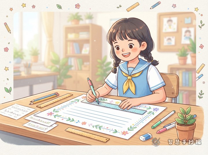
- Use a pencil and ruler to draw the two edges of the bookmark strip without pressing too hard.
- Mark evenly spaced hanging points along its lower edge so the pennants stay similar in size.
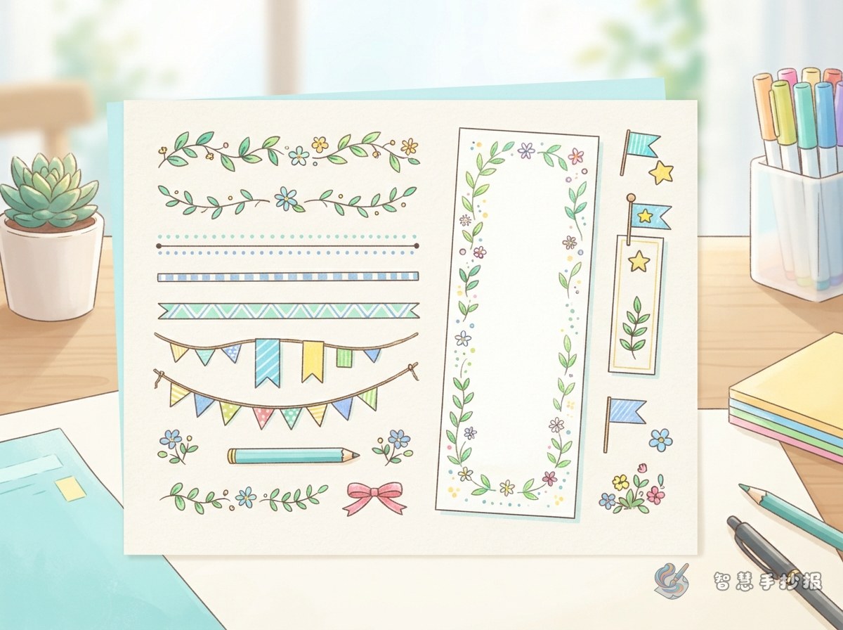
- Connect nearby points with small triangles, trapezoids, or notched flag shapes.
- Alternate two main colors and leave a few flags white to keep the border light.
- Trace only the important edges with a fine black pen, erase the guide marks, and add a few dots or short strokes.
Children who find it hard to repeat the shapes can draw three sample flags on scrap paper first and use them as a guide. Younger students can replace the triangles with simple rectangular paper-strip shapes.
Let the small flags carry the topic
The pennants do not need many details. A short phrase or one simple motif is enough to connect the border with the poster’s subject. Keep each phrase between two and six words so the decoration does not compete with the main text.
- Reading poster: Use phrases such as “Read with joy” or “A book companion” with books, stars, or bookmark shapes.
- Science poster: Try “Ask and observe” or “Test your idea” with a beaker, planet, or magnifying glass.
- Eco poster: Add “Save water” or “Live green” with leaves, water drops, or a recycling symbol.
- Safety poster: Use “Know the rules” or “Look before walking” with a shield, crosswalk, or reminder hand.
Keep the writing area open
A neat poster does not need decoration on every edge. Leave one blank line between the bookmark strip and the title, and separate writing sections with small color blocks or short lines instead of adding another full frame around every column. When the poster has lots of text, use only the top or side version. When it has more open space, add a small pennant detail in the opposite corner for balance.
Choose one darker main color, one lighter color, and one accent color. Repeat the pennant colors, match the title to the bookmark strip, and use softer colors for illustrations. This makes a simple border look coordinated.
A quick check before handing it in
- Are the strip width and pennant spacing mostly consistent?
- Do the title, writing, and illustrations still have room to breathe?
- Are there only two or three main border colors?
- Is the handwriting easy to read against the decoration?
Once the topic is chosen, this bookmark-and-pennant idea can be used as a ready layout for many school posters. To continue arranging the page more quickly, scan to enter the 智慧手抄报 WeChat mini program and keep working on the sections and design.