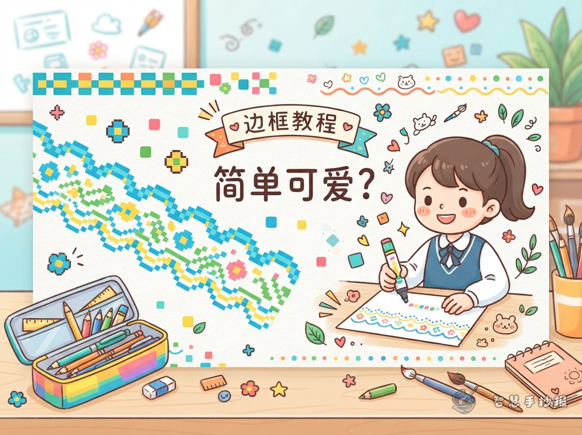
Choose Where the Pixel Border Should Appear
A color-block border is built from basic geometric shapes, so it works well for students who want a neat design without difficult drawing. Before starting, decide how much of the page needs decoration. The border does not have to surround every edge.
- Full frame: Place squares along all four edges for a complete, balanced look. This works best when the poster has a moderate amount of text.
- Corner clusters: Decorate only the four corners to preserve more writing space for reading reports or information-heavy topics.
- Short segments: Add small groups of blocks along the top, bottom, or between sections for a light and flexible design.
Three Block Patterns to Try
Two-Color Checker Trim
Choose one light and one dark color, then alternate them. Draw groups of four to six squares and leave a one-block gap between groups. Blue and white, red and yellow, or green and orange are easy combinations.
Solid and Outline Blocks
Alternate filled squares with empty outlined squares. This adds variety while reducing the amount of coloring. A small dot may be placed inside a few outlined blocks, but leaving some empty will keep the pattern clean.
Mini Pixel Icons
Combine several blocks at the corners to suggest a heart, star, pencil, book, or tree. Focus on a recognizable silhouette instead of tiny details. All four corners can match, or each can show a different icon connected to the topic.
Match the Border to the Poster Topic
A reusable border should still reflect the subject. Changing the palette and corner symbols makes the same basic pattern feel appropriate for many assignments.
- Reading: Use brown, orange, and warm yellow with a small book icon. Suggested sections include “Book Recommendation,” “Favorite Lines,” and “What I Learned.”
- School life: Combine blue, green, and yellow with pencils or flags. Sections might cover good manners, classroom moments, and personal goals.
- Holidays: Select two colors associated with the celebration and add simplified gifts, lanterns, or flowers. The text can introduce customs and short greetings.
- Safety: Pair blue with orange and use a shield or warning-sign shape. Organize the content into safety reminders, correct actions, and memorable rules.
Build the Page from the Outside In
- Lightly draw a safe margin so the blocks remain the same distance from the paper edge.
- Reserve the top center for the main heading and place a larger pixel-style box around it if desired.
- Divide the body into three or four sections. Use thin lines for these boxes so they do not compete with the outer border.
- Write the main text before adding extra icons and color. This prevents decoration from taking over the writing area.
- Erase unnecessary pencil lines and reduce repeated details if any side looks too heavy.
Short lines are easier to arrange, such as “Read a little every day and let knowledge grow,” “Good habits make our school a better place,” or “Follow safety rules and care for yourself and others.” Adapt every line to the chosen topic rather than filling the page with dense text.
Three Details That Keep the Design Neat
Keep blocks consistent: Mark their positions first, and leave a gap at a corner rather than squeezing in a distorted square. Limit the palette: One main color, one supporting color, and a small accent are usually enough. Protect open space: Because pixel blocks are visually strong, leave clear areas around the title and paragraphs.
If the section positions or palette are still undecided, open the Smart Handwritten Poster WeChat Mini Program to continue planning the page. The number and spacing of the color blocks can then be adjusted to suit the paper size.