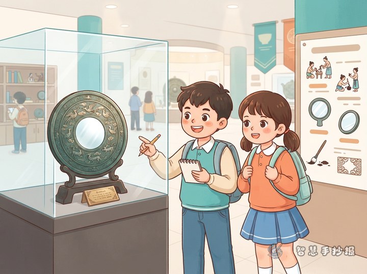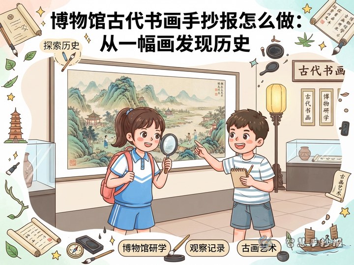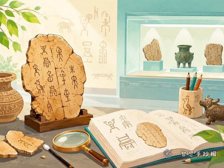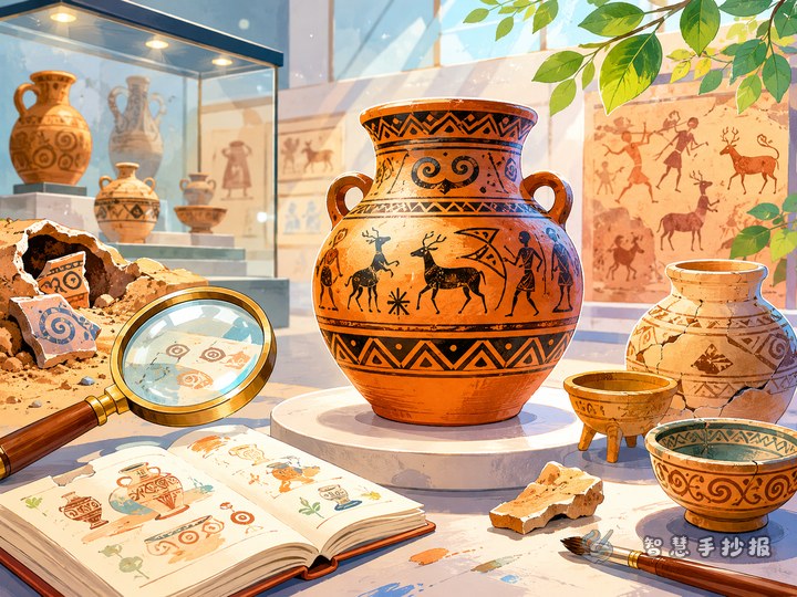
Start by narrowing the topic to bronze ware
A museum study handwritten newspaper can feel scattered if the topic is too broad. Focusing on bronze ware makes both the content and the visual style more unified. The main heading can be something like “Discovering Bronze Ware” or “Bronze Artifacts in the Museum,” so readers immediately know the theme.
If this is a school assignment, add a short line under the title, such as “Reading history through ancient objects” or “Finding clues about the past in cultural relics.” This gives the page a stronger study-tour feel.
Four content blocks that fit the page well
1. What is bronze ware
Use a short introduction: bronze ware refers to objects made by ancient people from copper mixed with other metals. These objects were often used in rituals, dining, ceremonies, and daily life. Three or four simple sentences are enough.
2. Common vessel types
- Ding: often seen as an important ritual vessel with a steady, powerful shape.
- Zun: commonly used for holding wine and often has rich forms.
- Hu: a container with smoother and more rounded lines.
- Pan: used for holding or supporting items.
This “name plus one sentence” format is easier to read than long paragraphs.
3. Pattern observation corner
You can mention common bronze patterns such as geometric designs, cloud-like lines, or animal motifs. The key point is not to go too deep, but to explain that these patterns reflect ancient imagination and artistic taste.
4. What I noticed in the museum
This section adds personal character. You might write that bronze objects are not always shiny, that some look solemn and grand, or that the patterns are much more detailed up close. These simple observations make the page feel real.
A layout that feels stable and historical
A strong layout idea is main title in the center, fact boxes on both sides, and a reflection section at the bottom. This creates a calm, exhibition-board style. Avoid dividing every block into the exact same size, because that can make the page look stiff.
- Place a large title in the middle with a clean border.
- Put vessel types on the left and pattern meanings on the right.
- Leave the bottom area for a museum reflection or favorite artifact note.
If you want the page to look more museum-like, use small labeled boxes, numbered facts, and brief explanations.
Short writing materials you can copy and adapt
Sample 1: Bronze ware is an important witness to ancient civilization. These objects were useful in daily and ritual life, but they also carry art, history, and cultural meaning. Walking through a museum gallery of bronze ware feels like reading a three-dimensional history book.
Sample 2: During my visit, I noticed that the patterns on bronze objects were very detailed. Some looked serious and powerful, while others had smooth and elegant lines. Even though they were made long ago, they still feel impressive today.
Sample 3: This study trip helped me understand that cultural relics are not just old objects. They are important clues to ancient life and ideas. Protecting relics means protecting our memory of history.
Color and decoration choices
This theme does not suit bright fluorescent colors. It looks better with bronze, dark green, brown, and cream. The main heading can be bold, while the border can use simple repeated lines, cloud patterns, or geometric corners for an ancient style.
- Main title: bronze or dark brown for a strong but calm focus.
- Subheadings: dark green or reddish brown for clear hierarchy.
- Decorations: use small line details rather than filling the whole page.
If time is limited, finish the title, section boxes, and key words first, then add the text.
How to make the final page feel complete
Before finishing, check three things: is the theme clear, does it feel like a museum study project, and does it include your own observations? A bronze ware page should not be only definitions, and it should not be only decorations without facts. Combining knowledge with personal reflections makes the work much stronger.
If you want to keep improving the title style, section arrangement, or color matching, you can continue designing your page in the Zhihui Shouchao Bao WeChat mini program.