Turn the Theme into “Patterns with Moving Colors”
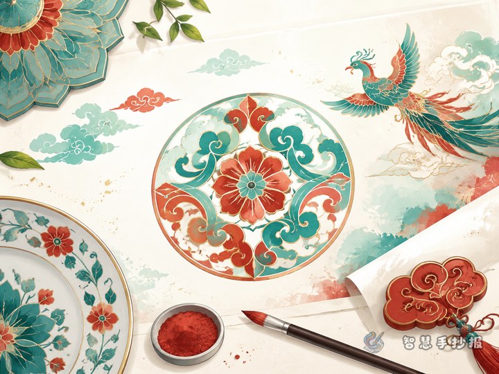
Cloud patterns, key-fret patterns, and ruyi patterns are great choices for a handwritten newspaper about traditional Chinese patterns and color aesthetics. Their lines are clear, their meanings are positive, and they are friendly for primary school students to draw. A suitable theme could be Patterns Speak, Colors Tell Stories, making the page more than a simple list of pattern names.
You may begin with this short paragraph: In traditional Chinese decoration, patterns and colors often appear together. Cloud patterns show the beauty of flowing skies, key-fret patterns suggest order and continuity, and ruyi patterns express good wishes. When these patterns are placed in a handwritten newspaper with calm yet bright traditional colors, the page can show both classical beauty and warmth.
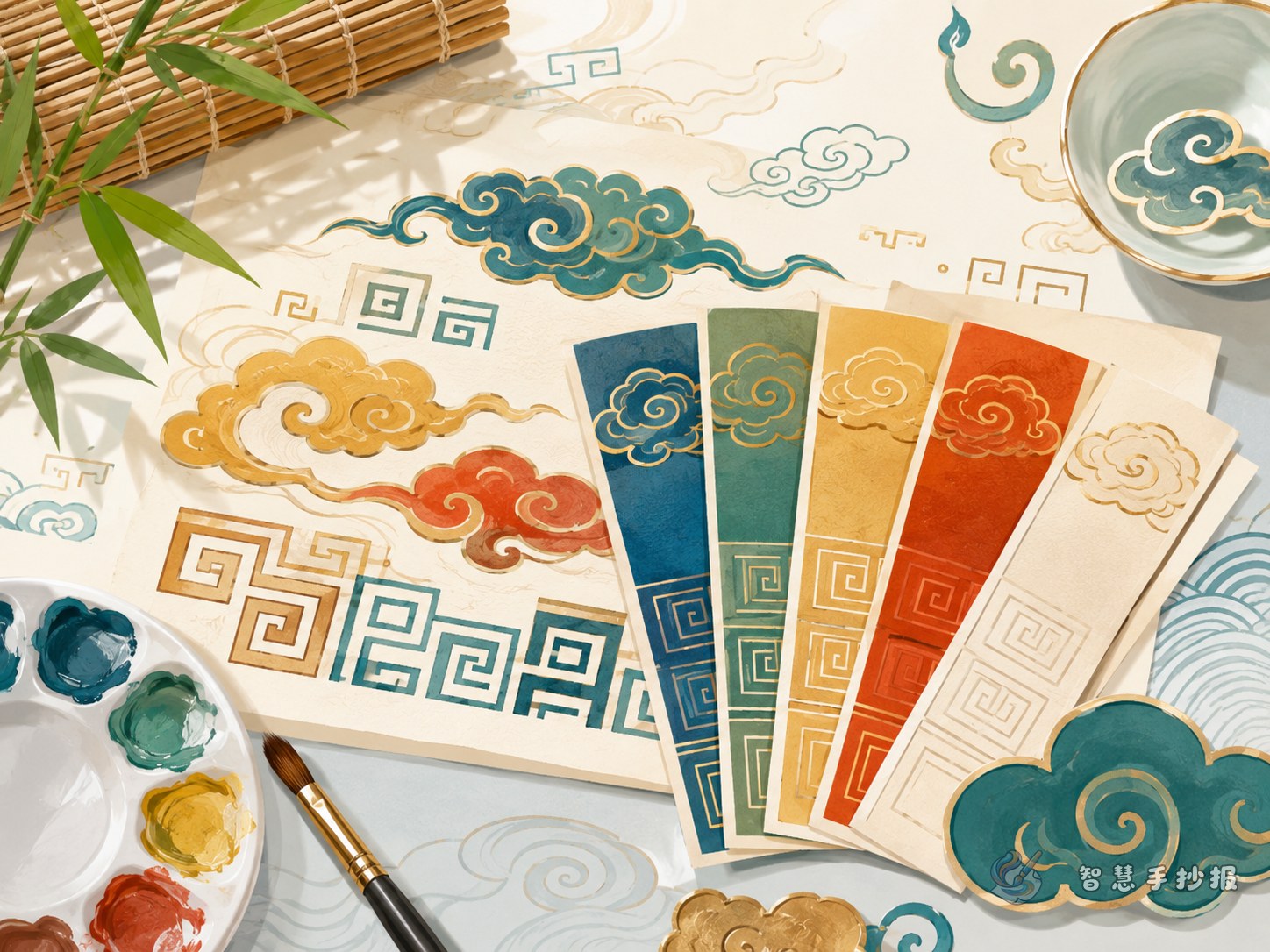
Three Traditional Color Palettes That Are Easy to Use
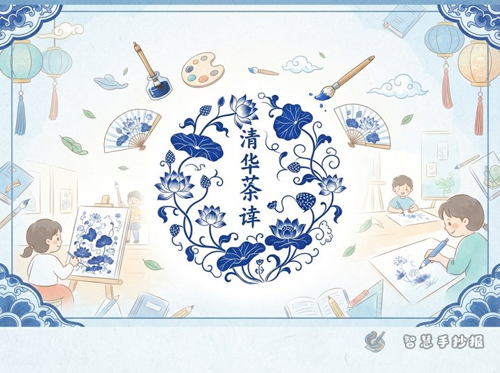
- Indigo and warm white: Suitable for borders and title boxes. It feels clean, quiet, and slightly like blue-and-white porcelain.
- Rouge red and golden yellow: Good for corner decorations and important words. Use it in small amounts to keep the page from looking too crowded.
- Turquoise and light ochre: Works well for cloud and ruyi patterns, giving the design a natural and elegant look.
Choose one main palette first, add one supporting color, and then outline the patterns in black or dark brown. This keeps the page neat and makes the patterns easier to see.
What to Write in the Handwritten Newspaper
Pattern Cards
Cloud pattern: often used to show auspicious meaning, movement, and the beauty of the sky. Key-fret pattern: continuous lines that suggest order and lasting blessings. Ruyi pattern: rounded shapes that represent good wishes.
Color Observation Column
Traditional colors are not simply about being bright. A deep color can make the page steady, a light color can create breathing space, and bright colors such as gold or red are best used as accents.
My Color Discovery
Students can add one or two personal observations: I found that the same cloud pattern looks calm in blue but lively in red. If the patterns are placed along the border, the writing area becomes clearer.
Design the Page Like a Small Folding Screen
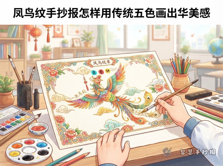
This topic works well with a folding-screen layout. Place the title in the center, use two vertical columns for patterns and colors, and draw a continuous key-fret border at the bottom. Add small ruyi or vine patterns in the four corners to make the page feel complete.
- Divide the page into a title area, writing areas, and decoration areas with pencil first.
- Draw repeated patterns along the edges instead of filling the writing space.
- Use dark blue, brownish red, or deep green for the title outline, and keep the inside light.
- Keep each paragraph to three to five lines, with small icons beside it for easier reading.
Three Things to Avoid
- Do not use every traditional color at once, or the page may look messy.
- Do not draw patterns too densely. Empty space helps traditional patterns look more elegant.
- Do not only copy definitions. Add your own thoughts about color beauty and matching ideas.
If you want to organize the title, columns, text, and layout more quickly, you can continue making the page in the Zhihui Shouchaobao WeChat mini program and turn your selected patterns and colors into a clearer handwritten newspaper plan.