Decide First: Can the Title Be Turned into a Design Feature?
A title that is slanted, too small, or off-center does not always mean the whole hand-copied newspaper must be redone. Lay the paper flat and look at it from a short distance. Check whether the words are easy to read, whether they cover the body text, and whether there is room to add decoration. If the title is readable, it can usually be rescued with a title panel, small graphics, and a better balance of space.
The key rule: do not keep tracing over the letters with a dark pen. Build a complete title area first, then make the colors across the page work together.
Quick Fixes for Different Title Problems
If the title is slanted
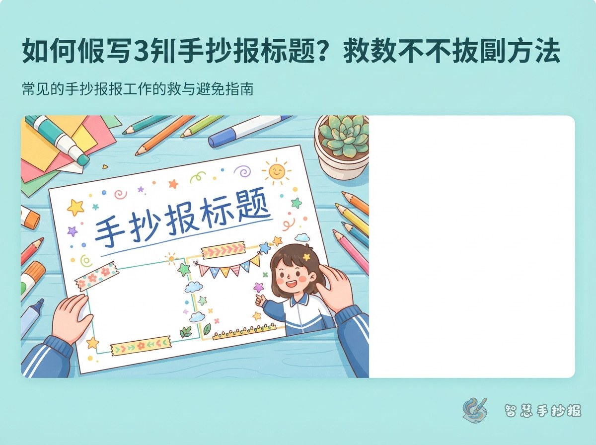
Draw a ribbon, cloud banner, or bookmark-shaped panel along the same angle as the title. Add small stars, leaves, or dots at the ends. The slant will look intentional and lively instead of mistaken.
If the title is too small
Add a short subtitle above or below it. For example, a main title such as “Safety Walks with Me” can be paired with “Campus Safety Tips” and “Follow Rules, Grow Safely.” A thin outline around the title area also makes it feel larger.
If the title sits too far to one side
Use the empty side for a mini section such as “Today’s Tip,” “Safety Slogan,” or “My Promise.” Connect it to the title with lines in the same color family. If the title is too high, add a curved divider or a few small icons underneath to create breathing room.
- Useful title-panel shapes: ribbons, clouds, pencils, leaves, open books, and speech bubbles.
- A method to avoid: repeatedly thickening every letter with a dark marker.
- Color tip: use no more than two colors for the title, and keep the panel lighter than the lettering.
Use Content Blocks to Balance the Page
Once the title is repaired, place the text in separate blocks instead of crowding everything underneath it. Three easy blocks are a “Fact Card,” “My Suggestions,” and a “Quick Reminder.” They are simple to write and help even out the layout.
- Fact Card: write three short facts, each in no more than two lines.
- My Suggestions: write two or three actions beginning with “I will...”
- Quick Reminder: place one short sentence beside the title or in an empty corner.
For a campus safety theme, students can use lines such as “Walk, do not run, during breaks.” “Stay away from danger and tell a teacher when help is needed.” and “Keep safety in mind every day.” For other themes, replace these with messages about recycling, reading, festivals, or good manners.
A Ten-Minute Final Check
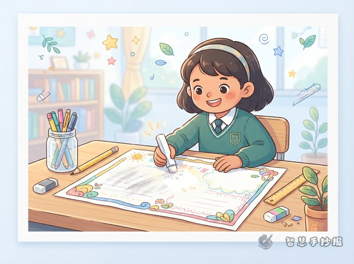
Erase light pencil marks first, then add outlines and color. Keep borders thin and leave even margins around the page. Two to four small illustrations are enough; place them near the title, at the corners of content blocks, or in blank spaces. Step back and check: Is the title the first thing people notice? Are the sections clear? Are the colors limited to two or three main shades?
If you are still unsure about the title, panel, or section placement, open the Smart Handwritten Newspaper WeChat Mini Program to explore layout ideas for your theme before finishing your own page.
A Simple Order That Prevents Mistakes
Plan the title area first, divide the content second, and add color last. Lightly mark a center line or title box before writing. Reserve similar-sized spaces for each section. Start coloring with light shades, then add darker outlines only after you are satisfied with the layout.