Identify the Problem Before You Erase Again
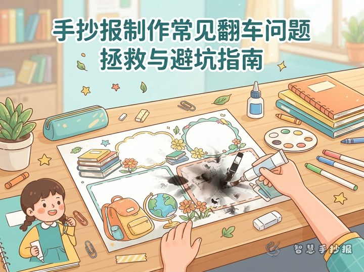
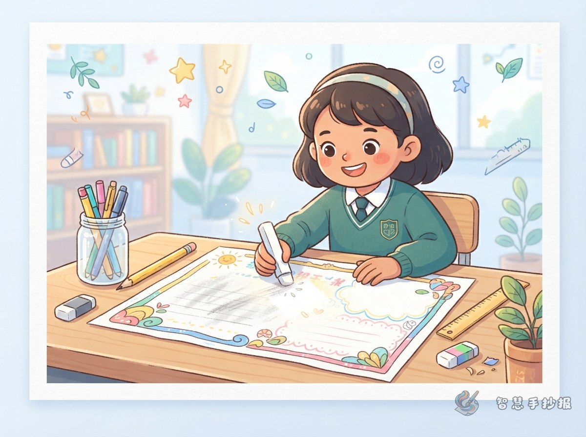
When a handwritten poster begins to look gray, pause before rubbing the page again. Gently brush away eraser crumbs and inspect the area. The problem may be a few remaining guidelines, loose graphite spread across the surface, or paper fibers already damaged by friction.
- Light guideline marks: Use a clean eraser and move it gently in one direction.
- Gray graphite patches: Remove loose graphite first, then soften the area with a pale background or decoration.
- Rough or thinning paper: Stop erasing and use a planned cover or layout adjustment.
Match the Repair to the Smudge Location
Marks around the main heading
Add a light shadow, a second outline, a cloud-shaped label, or a ribbon behind the heading. This can turn a faint pencil line into part of the design. Keep the new outline even so the title does not become heavy or difficult to read.
Marks inside a writing section
If a smudge sits beside a paragraph, shorten one or two lines and add a small leaf, star, or dot divider. A wider mark can be covered with a pale text panel. Choose a light color so the writing remains clear.
Marks in an open area
Do not fill every empty space. A tiny spot can become a theme-related icon repeated in two or three other places, making it look intentional. For a larger gray area, add a very soft color block that visually connects with another section.
Keep the Information Clear While Adding Repairs
A good cover should support the subject instead of adding random pictures. Useful sections may include a topic introduction, practical actions, quick facts, and a personal reflection. Keep each section concise so the repair does not create a crowded page.
Adapt short lines such as these to the chosen topic: careful steps make a project cleaner; planning before writing reduces corrections; a small mistake can become a new design idea. Rewrite them so they match the main heading and illustrations rather than using unrelated filler.
Make the Corrected Layout Feel Intentional
- Use one main color and no more than two supporting colors for all new elements.
- Keep borders and line thickness consistent across similar sections.
- Repeat one small decorative symbol elsewhere to balance the repaired area.
- Preserve spacing between paragraphs, even if that means removing a sentence.
- View the poster from a distance before adding any final color.
Use Lighter Guidelines Next Time
Plan the title, sections, and illustrations on scrap paper first. On the final sheet, use a sharp, harder pencil to draw only faint placement lines. After inking, wait until every line is fully dry, then erase one section at a time. Placing a clean sheet under the drawing hand also prevents graphite and moisture from transferring to the poster.
If the section sizes or cover-up illustrations are still difficult to arrange, use the Zhihui Shouchaobao WeChat mini program to explore a suitable theme and layout before finishing the poster on paper.