Decide Whether the Empty Space Is Really a Problem
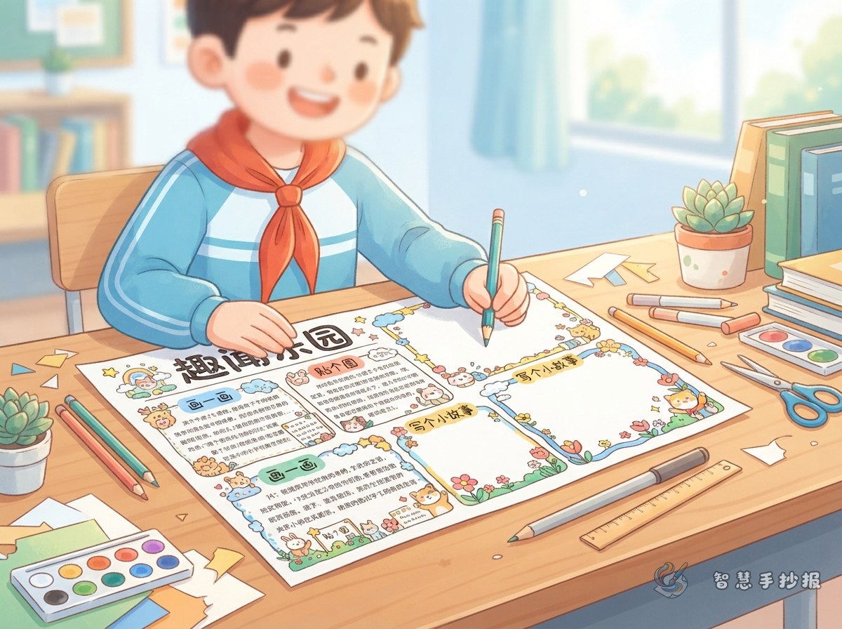
Extra space does not always mean a poster is unfinished. Place the poster at a distance and look at the overall balance. A large blank corner may make the layout feel uneven, while open space around the title can help the main idea stand out. If every section looks thin, the poster may need more content rather than more decoration.
Match the Fix to the Size of the Gap
Small scattered gaps
Add a few dots, stars, leaves, short lines, or simple border patterns. Reuse colors already present in the poster so the new details do not look unrelated.
Space below a text section
Add a compact feature such as Quick Fact, What I Can Do, My Reflection, or Friendly Reminder. Two or three short sentences are usually enough to complete the area naturally.
One large empty corner
Turn it into a themed illustration area with a simple round, square, or free-form frame. Choose easy visual elements connected to the topic, such as a book, a child, plants, the Earth, or a flag.
Short Lines You Can Adapt
When space is limited, use brief statements that can stand on their own and fit into different shapes.
- Action line:Start with one small step and keep the good habit going.
- Reminder:Observe carefully, learn actively, and discover something new each day.
- Reflection:One thoughtful action can make a meaningful difference.
- Call to action:Let us take part, help one another, and improve together.
Adapt each line to the actual topic. An environment poster can mention saving water, a reading poster can encourage daily reading, and a safety poster can focus on following rules.
Rebalance the Layout Instead of Filling Everything
- Add a bottom border or a light background to extend an existing section visually.
- Use thin dividers, small headings, or numbers to create a clearer reading order.
- Make a large open area into a themed illustration zone for contrast with the text.
- Keep some breathing room around the title and main picture so they remain prominent.
Avoid filling every gap with words or adding decorations that overpower the subject. Check the poster from a distance and confirm that the title is clear, the sections are easy to identify, and both sides feel balanced.
A Final Three-Step Check
Make sure the added material stays on topic, no decoration covers the writing, and the new lines and colors match the original style. For more help arranging sections and illustrations, continue planning your poster in the Smart Handwritten Poster WeChat Mini Program.