When the picture hogs the page, find the real cause
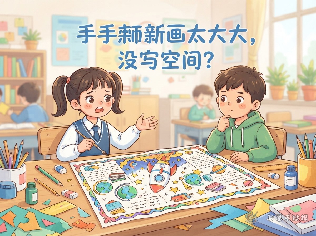
The writing may be running out of room for different reasons, and each one needs a different fix. Look at the page and decide which of these fits best.
- The illustration is too large: one main picture covers half the sheet or more, leaving only narrow fragments of white space.
- The frames are too wide: thick title boxes, decorative borders and heavy lines eat into the area where text should go.
- The handwriting is too big: large letters and loose spacing mean only two or three sentences fit in each section.
Most posters combine the first two problems, so it helps to tackle the picture and the frames together.
Four ways to free up writing space without erasing the art
- Borrow the edge: use a ruler to draw a thin line just outside the illustration and turn the margin into a narrow text strip. Three to five short sentences fit there and look like a deliberate design choice.
- Write inside light areas: clouds, speech bubbles, tree trunks, windows and sky can hold a short fact or hint. Keep the letters small and dark, and use only brief phrases.
- Add a tip box: cut a small piece of paper close to the background colour, stick it in a corner, trim the edges neatly and draw a thin border. A heading such as "Did you know?" plus two facts creates a whole new section.
- Thin the heavy borders: cover an over-wide title frame or decorative band with light paper or a correction sticker, then redraw a fine line. You often gain one or two extra lines of writing space.
Keep the patches to two at most
The aim is for the rescue to look like part of the design. Keep patches, re-drawn frames and added boxes to no more than two places, and stay within one main colour plus one or two accents.
Set a simple space budget for art and text
A rough ratio prevents one drawing from taking over: about two thirds for text, a quarter to a third for illustration, and no more than the top fifth for the title. It does not need to be exact, but it keeps the page balanced.
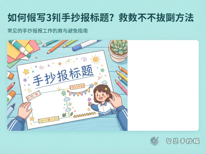
- Reserve a horizontal band at the top for the main title, only one or two lines high.
- Place the main picture in a corner or along one edge instead of across the whole page.
- Divide the rest into two or three text columns, each able to hold three to five sentences.
- Younger children can have bigger pictures; older students with more content should reduce the art.
Sketch the divisions in pencil first, estimate how many words each box can hold, then decide how big the drawing should be. This is far easier than repairing the layout afterwards.
Make the writing look full without looking cramped
- Keep one letter size: section headings can be one size larger than body text, but avoid mixing sizes randomly.
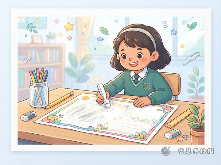
- Use faint pencil guide lines: erase them later so the rows stay even and the page looks tidy.
- Write short sentences and use bullet points: one idea per line reads well and fills space clearly.
- Plan three to five sentences per section: finish with a short summary or reminder so no section looks half empty.
If there still is not enough content, add ready-made material: a short background fact, two or three figures, a relevant quotation, or a simple step list. These are brief, informative and fit neatly into the extra sections you created.
Next time, build the text skeleton first
Most "no room to write" problems come from drawing before writing. Change the order: choose the theme, list three sections, estimate the words for each, divide the page in pencil, write the text, and only then add illustrations and decorative borders. Once the writing structure exists, the artwork simply fills the gaps.
If you are unsure about proportions, open the Smart Handwritten Poster mini program in WeChat, browse a layout style and see how much space is given to pictures and text before you start drawing. Children who get used to this order spend far less time redoing their work the night before it is due.