Decide What the Poster Is Really Answering
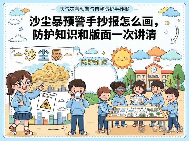
Most flood posters drift into explaining water. Readers only need three things: what the warning means, where to go when water rises, and what to prepare in advance. Before you start, write one theme sentence on scrap paper, such as "when the warning comes, think about higher ground and your route", and place it under the main title as a subtitle.
Keep the number of columns to four or fewer. Younger students write large characters and need white space, so too many boxes make the page look crowded and hard to read.
Turn the Escape Route Into the Backbone of the Page
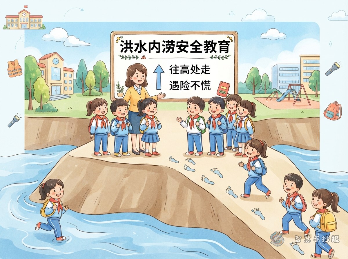
Unlike other weather topics, flooding is about movement. Draw one long curved arrow from the bottom left corner to the top right and thread the columns along it: it starts with the warning signal, passes "stay out of underground car parks, never walk through floodwater, keep away from the river", and ends with "wait on high ground for instructions". The page then has a direction of its own, which is far more memorable than a row of boxes.
Three blocks that fit these columns
- What the warning shows: the deeper the colour, the earlier you should prepare.
- Where the danger is: basements, underpasses, low-lying roads, riverbanks and gullies.
- How to move: head uphill, use roads you know, stay with an adult.
Short Sentences You Can Copy Straight Onto the Poster
These are short enough to fit inside a column as small reminders:
- When you hear the warning, pack your rain gear and torch, then charge your phone.
- If you cannot see the bottom, taking the longer way round beats taking a risk.
- Never shelter under a big tree, a billboard or a power pole.
- If you are trapped, move to higher ground and wave something bright.
- Family emergency bag: water, biscuits, torch, daily medicine, power bank.
If your teacher asks for a personal note, add one line: "I learned to check the warning first, then decide whether to go out."
Colours, Icons and Title Frames
Blues and blue-greys suit a flood theme, with yellow and orange for the warning blocks. Show the warning colours as four small dots or four little flags, each with one short line beside it. That stands out far better than copied paragraphs.
- Write the main title in large blue letters with a white outline, and draw a thin water level line underneath.
- Use pale blue frames for knowledge boxes and yellow sticky-note shapes for safety reminders.
- Draw only two or three pictures: an umbrella, a warning sign, steps or a tall building, and keep them near the edges.
A Simple Order for Making It
- Lightly sketch the page and mark out four columns.
- Write the main title and subtitle to fix the centre of the page.
- Fill in the text columns with straight characters and a little line spacing.
- Add the route arrow and the small icons last, so they do not cover the writing.
- Erase the pencil lines and check for missing or wrong characters.
If you would rather skip the layout and material hunting, open the Smart Handwritten Newspaper mini program in WeChat, pick a weather disaster warning template, drop these sentences in, print the outline and change the colours to make it your own.