Why a Jian tea bowl makes a strong handout topic
Jian kilns in Fujian were known in the Song dynasty for black-glazed tea bowls. Unlike celadon or white porcelain, their beauty comes from fine patterns formed inside a dark glaze, which makes them easy to show on a handout: the bowl itself becomes the eye-catching part of the page. You do not need to cover all of Song history. Keep one main question in mind: why did people keep turning a black bowl in their hands?
Jot down three words before you start: black glaze, tea bowl, kiln patterns. They stand for colour, use and visual focus, and every section can grow from them.
Four glaze patterns in one line each
Do not pile up definitions. One sentence per pattern is enough:
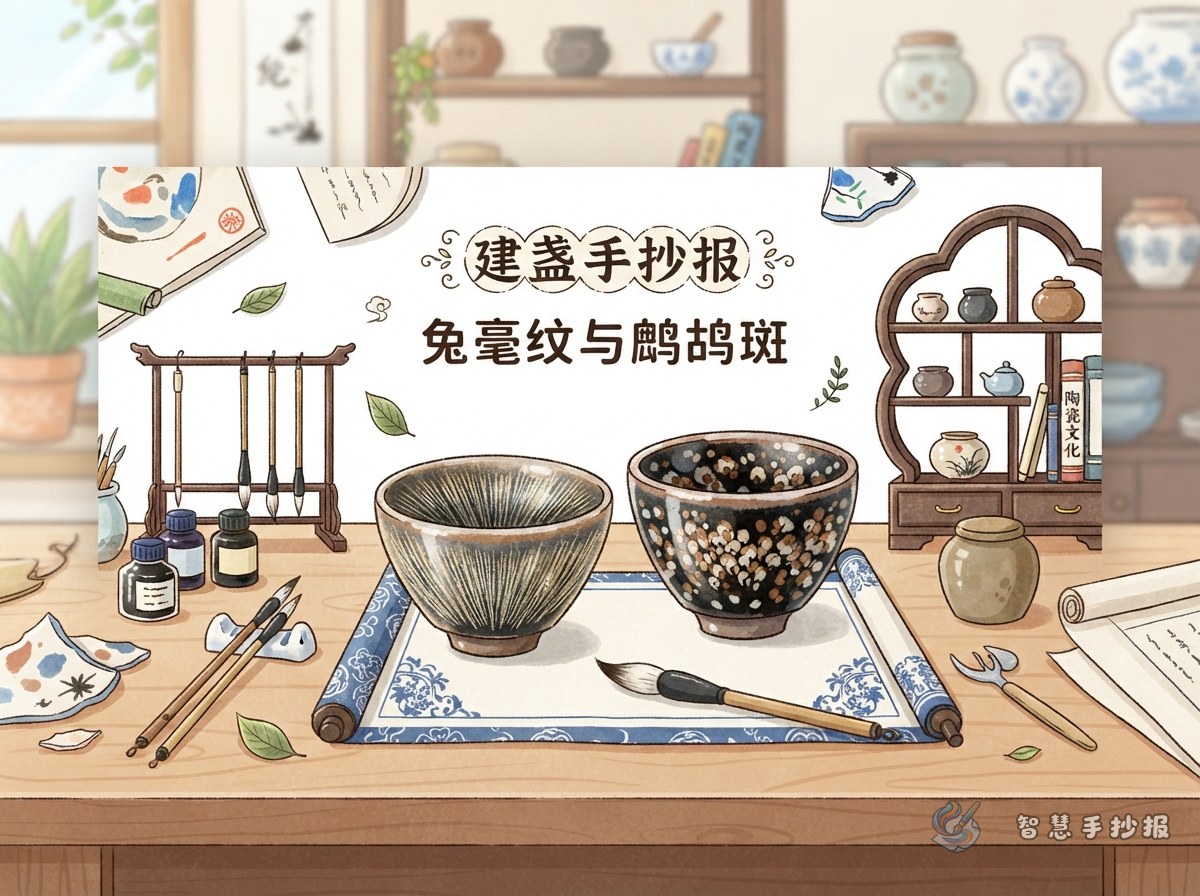
- Rabbit fur: long thin streaks running down the inside wall, usually ochre or silver grey.
- Oil spot: small round dots scattered across the glaze, like oil floating on water.
- Partridge feather: larger, brighter dots with layers of colour, named after a bird's chest markings.
- Yohen: very rare, with a blue-violet halo around the spots, like a cluster of stars.
Instead of writing formal definitions, try phrases such as “I gave this pattern a nickname”. It sounds more like a student's own page.
Drawing the bowl in three steps
Place a slightly tilted tea bowl as the main picture and let it take about one third of the page.
- Draw a flat oval for the rim, then two curved lines that close into a small foot ring. Keep the edges a little uneven so the drawing feels handmade.
- Fill the inside with dark grey or black, leaving a small blank area as a highlight. Leave the glaze lighter near the rim to suggest where it thins out.
- Once the base is dry, add patterns with pale yellow, ochre or silver grey: thin radiating lines for rabbit fur, small dots for oil spot, larger dots with a lighter layer for partridge feather.
If you are worried about mistakes, test three lines on scrap paper first. Pale lines on dark glaze usually look better than dark lines on white paper.
Planning the layout around the bowl
Try a “bowl-shaped” arrangement: put the main bowl in the upper left, save the upper right for the title, then split the lower half into two columns. The left column can hold the four-pattern comparison, the right column a short note on tea culture, and a single line at the bottom can carry a potter's story or your own thought.
Borders do not have to be rectangles. You could:
- use the bowl outline as a frame and fit text inside it;
- run a row of small dots (oil spot) as a divider;
- place fine diagonal lines (rabbit fur) behind the title.
Limit colours to black, ochre, cream and slate blue so the page feels like one object rather than a patchwork.
Short lines you can copy onto the page
Use these as they are, or rewrite them in your own words:
- A black bowl can hold tea, and it can also hold the light left behind by the kiln fire.
- Rabbit fur is where the fire travelled; oil spot is where the fire paused.
- In Song tea gatherings, people compared not only tea but also bowls.
- The black of a Jian bowl is not a flat black; it is a black you can look at for a long time.
A closing line such as “Famous kilns are not only green and white — some beauty hides inside a dark glaze” works well at the end or under the title.
Common mistakes and quick fixes
Three problems come up often. First, patterns drawn too evenly look printed and lose the handmade feel, so vary the line lengths on purpose. Second, filling too much of the page with black makes the writing hard to read, so keep dark glaze for the main drawing only. Third, mixing up the four pattern names confuses readers, so use a small bowl sketch with a one-line caption for each.
If time runs short, finish the main drawing and two sections, then fill the remaining space with borders and small motifs. The page will still look complete. For more layout templates, title lettering and pattern references, open Smart Handwritten Newspaper in the WeChat mini program and keep combining themes.