A shorter introduction often works better
When students make a handwritten newspaper for a school art festival calligraphy and painting exhibition, the opening paragraph is often the hardest part to begin. In fact, the introduction does not need to be long. Its job is to present the theme, set the mood, and lead into the rest of the page.
For younger students, simple and clear sentences are the best choice. The introduction can focus on the lively feeling of the art festival, the beauty of calligraphy and painting, or what you learned after viewing the exhibition.
Ready-to-use introduction ideas
Version 1: Focus on the art atmosphere on campus
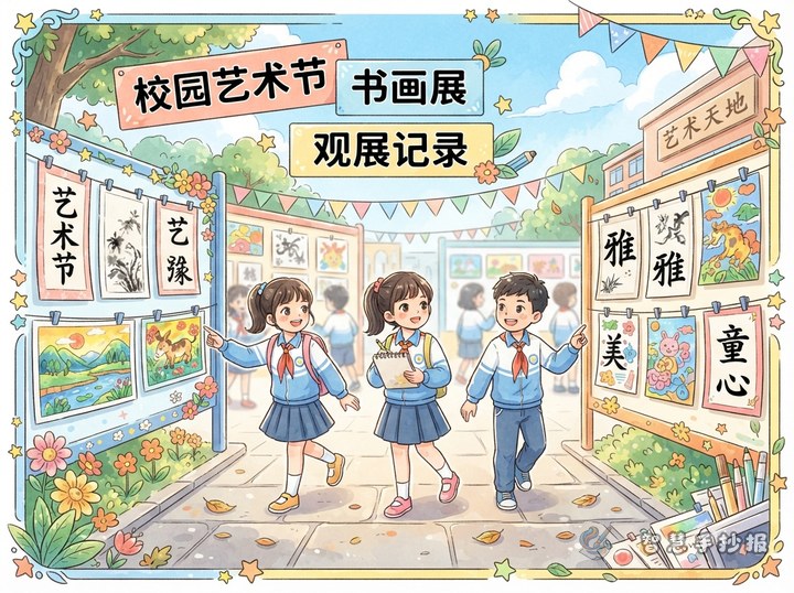
The school art festival has arrived, and the calligraphy and painting exhibition makes our campus even more colorful. Every painting is full of bright ideas, and every calligraphy work shows care and strength. These works let us feel the beauty of art.
Version 2: Focus on student talent
At the school art festival exhibition, we can see many excellent student works. Whether it is neat calligraphy or imaginative painting, each piece shows effort, creativity, and a love for art.
Version 3: Focus on personal reflection
After visiting the school art festival calligraphy and painting exhibition, I felt that art is close to our daily life. Calligraphy teaches patience and focus, while painting shows the power of color and imagination. The activity makes school life richer and more meaningful.
What to place around the introduction
A single paragraph is not enough for a full handwritten newspaper page. After writing the introduction, you can build around it with a few small sections.
- Exhibition note: Briefly explain what the school exhibition is about.
- Artwork highlights: Describe the style, color, or mood of the displayed works.
- My thoughts: Write two or three simple lines about your feelings.
- Art quotes: Add short and inspiring lines.
- Viewing manners: Mention quiet viewing and respect for artworks.
Useful content directions for this theme
- Praise the value of art in school life.
- Highlight student creativity and effort.
- Connect calligraphy with traditional Chinese culture.
- Show how art helps students grow in observation and expression.
Keep the sentences short. Short lines are easier to arrange on the page and look cleaner in a handwritten format.
Layout ideas that match the theme
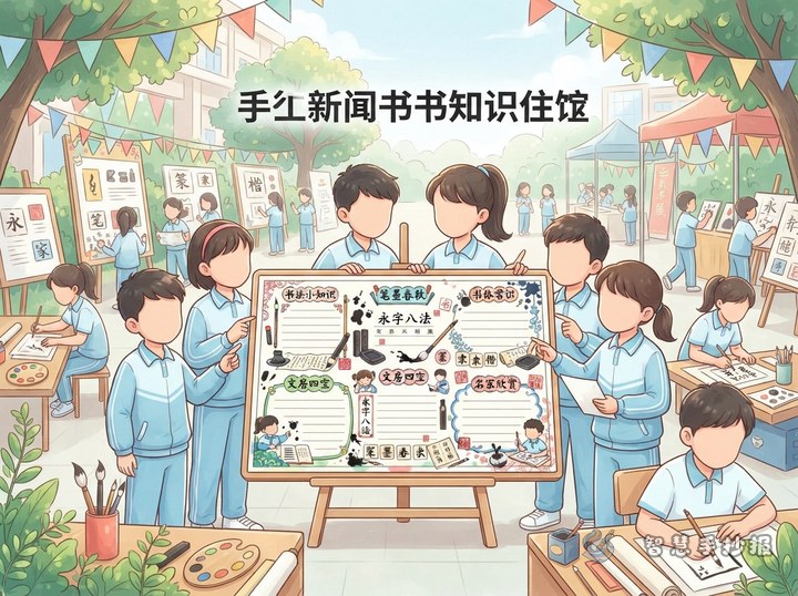
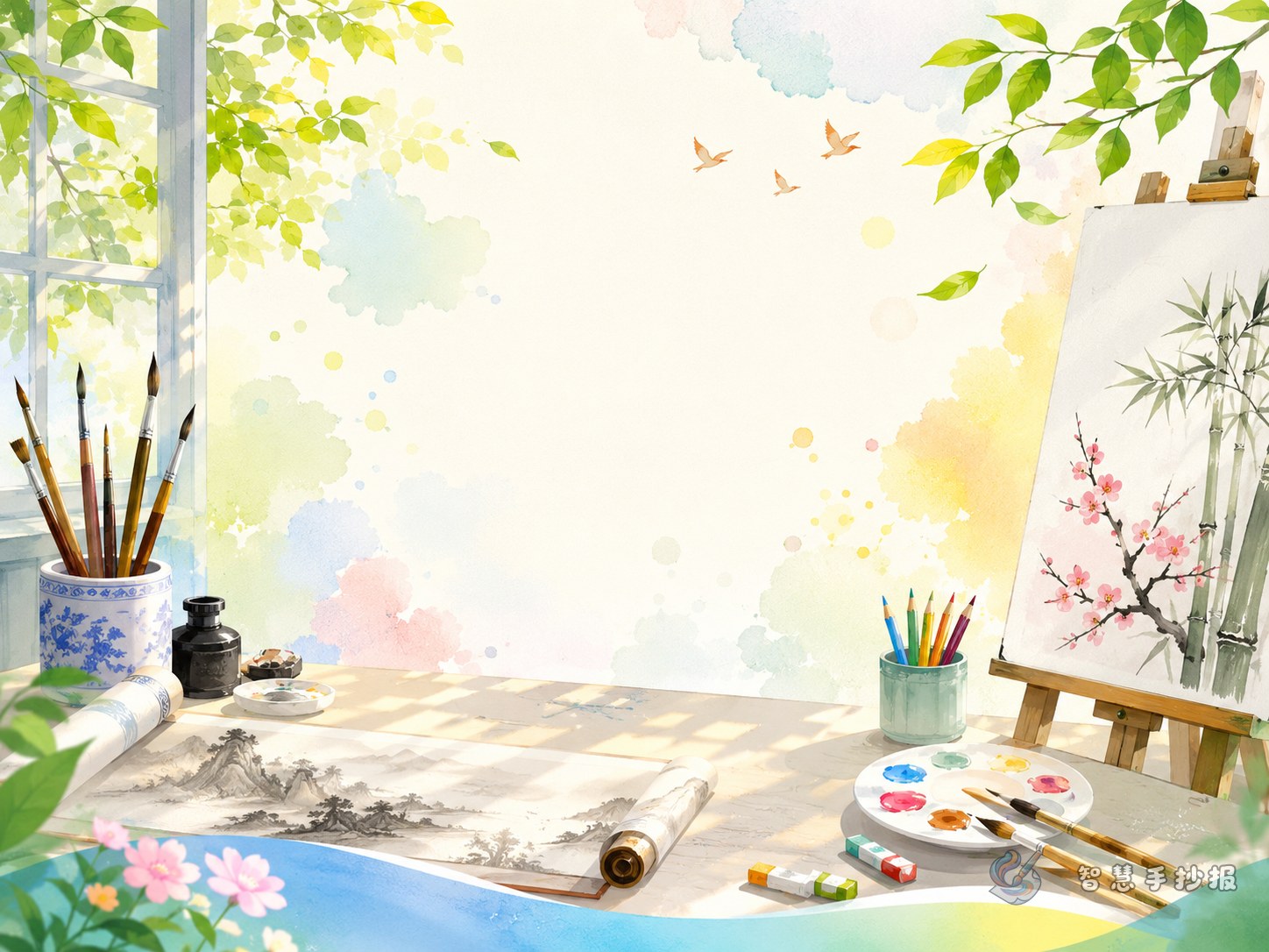
You can place the main title at the top center, the introduction in the upper left or middle, artwork highlights on one side, and personal reflections or quotes at the bottom. This creates a smooth reading order.
Soft colors such as light blue, pale green, cream, or light orange work well. Decorations can include brushes, ink marks, palettes, scrolls, or simple floral corners without making the page feel crowded.
Practical finishing tips
- Draft the introduction first, then copy the best version neatly.
- Do not make the page too text-heavy.
- Use larger writing for headings and clear handwriting for body text.
- Leave some blank space to keep the page elegant.
- If you want to improve the wording, sections, or layout further, you can continue in the Zhihui Shouchao Bao WeChat mini program.