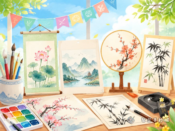
Build the page around a visitor’s route
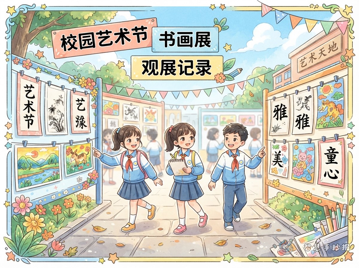
A campus art festival calligraphy and painting exhibition handwritten newspaper does not need to list every artwork. It can become a small observation journal about what you noticed while walking through the exhibition. Ask yourself: Where did I begin? Did I first notice the brushstrokes or the colors? Which work made me stop for a longer look? Connecting these real details will make the page feel personal.
Main thread: Arrange the content in the order of entering the gallery, observing the artworks, recording an impression, and sharing a takeaway. This keeps the art festival theme clear without turning the page into a plain list of works.
Turn observations into four small exhibition stops
First impression
Use two or three sentences to describe what you noticed upon entering. You might mention the neat display, the bright atmosphere created by different colors, or classmates quietly looking at the artworks.
Brushwork notes
Look at the lines, lettering styles, and shades of ink in the calligraphy pieces. You can write that some characters look steady and spacious while others feel lively and energetic.
Color discoveries
Observe the colors, people, scenery, or imaginative scenes in the paintings. The wording does not need to be complicated. Simply explain what you saw and how it made you feel.
What I learned from the visit
End with a personal takeaway, such as wanting to practice calligraphy, realizing that painting requires patience, or understanding that every artwork contains the creator’s ideas.
Short lines for note boxes
- Calligraphy note: “Every horizontal and vertical stroke feels strong, making the whole piece calm and confident.”
- Painting impression: “The bright colors seem to keep happiness on the paper, so I wanted to look a little longer.”
- Visitor’s feeling: “I saw not only the artworks, but also the patience behind each careful creation.”
- Courtesy reminder: “Walk softly, look carefully, and never touch the displays as a quiet sign of respect.”
Adjust these lines to match your own experience. A specific detail about a color, line, or feeling will make the page more vivid than simply saying that the artwork was beautiful.
Design the layout like a gallery map
Make the visitor’s route the main visual line. Place the first impression in the upper left, calligraphy and painting observations in the center, personal learning on the right, and a courtesy reminder along the bottom. Arrows, footprints, or tiny display signs can connect the sections and guide the reader.
- Keep the main theme visible at the top, but leave enough open space for the writing below.
- Use tidy horizontal boxes for calligraphy notes and rounded or irregular note shapes for painting impressions.
- Limit each paragraph to a few lines and highlight important words with a heavier stroke or a clear color.
- Choose two or three main colors to create an art festival mood without making the text difficult to read.
Check the observation record before copying it neatly
- Make sure the page shows your own observations and feelings instead of empty descriptions.
- Check that calligraphy, painting, personal learning, and courteous visiting are all represented.
- Sketch the route and section positions in pencil before writing neatly, so no area becomes crowded.
- Read the page from top to bottom and check whether the sections connect naturally and the handwriting is clear.
If you still need a layout reference, you can first choose a suitable page arrangement in the 智慧手抄报 WeChat mini program, then add your own exhibition notes and color ideas to make the project easier to complete.