Start with a clear theme instead of scattered ideas
A strong hand-copied newspaper for a school art festival calligraphy and painting exhibition should not be just a simple introduction. It works better when built around ideas like The Beauty of Calligraphy and Painting, Into Our School Art Festival, or Ink and Colors on Campus. This makes the page feel artistic while also connecting the exhibition with school life and personal thoughts.
The main title should be bold and easy to notice. A smaller subtitle can include words such as calligraphy, painting, creative works, or student exhibition to make the page look complete.
Four useful sections that are easy to fill
- About the art festival: Briefly explain why the exhibition matters, such as enriching campus life, showing student talents, and improving appreciation of beauty.
- My favorite types of artwork: Write a few lines about calligraphy, Chinese painting, children's drawing, sketching, or watercolor.
- Quick art facts: Add short and simple knowledge points, such as common calligraphy styles, color matching ideas, or basic composition tips.
- My thoughts after visiting: Describe what you saw, what you learned, and what you hope to try in the future.
Ready-to-use writing material
Short lines about the meaning of the exhibition
The calligraphy and painting exhibition brings the fragrance of ink into our campus. It helps students discover beauty, enjoy beauty, and create beauty through appreciation and practice.
Short lines about viewing the works
Each piece feels like a small window showing imagination and effort. Calligraphy shows the elegance of Chinese characters, while paintings use bright colors to express creativity and joy.
A simple ending sentence
The school art festival reminds us that beauty is all around us. With careful observation and sincere expression, everyone can become part of campus art.
Let the layout shine through balance, not complexity
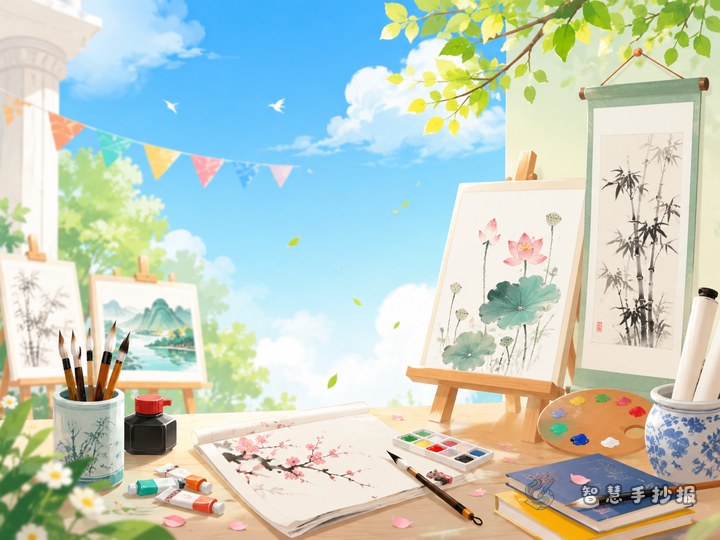
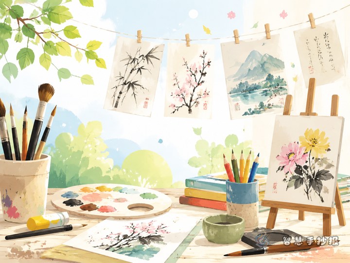
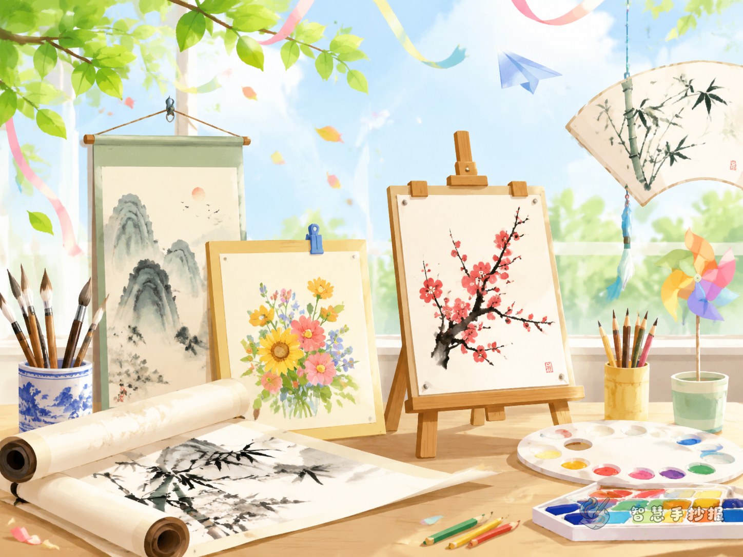
This topic looks good in a top-title with surrounding sections layout or a horizontal spread design. Place the main title at the top center and decorate it with brushes, palettes, scrolls, or ink drops. Do not overcrowd the page. Some blank space will make the newspaper cleaner and more attractive.
- Main colors: light blue, cream, ink green, with a little orange.
- Border ideas: scroll-style borders, picture-frame lines, or paint splash corners.
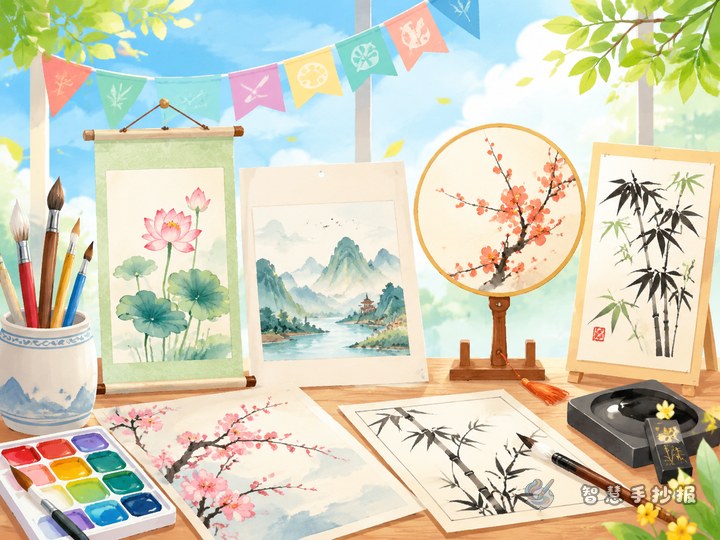
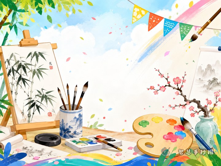
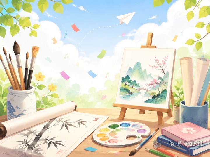
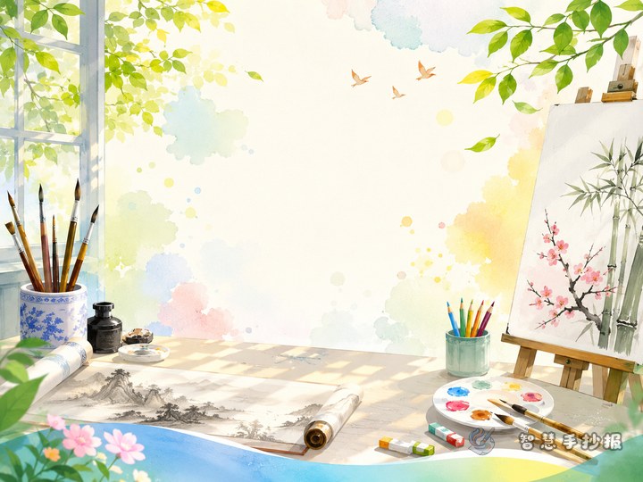
- Decorations: brushes, inkstone, easel, flowers, landscapes, small exhibition signs.
- Font tip: artistic title, but neat and readable body text.
Simple ways to make the work feel competition-ready
- Do not use only long paragraphs. Divide the page into clear sections.
- Include both calligraphy and painting elements so the theme feels complete.
- Add a personal reflection area to make the work more unique.
- Use one or two short theme sentences in a corner to strengthen the overall feeling.
If you already have a topic but still need layout inspiration, you can continue in the Zhihui Shouchaobao WeChat mini program to explore more title styles, section ideas, and school art festival page designs.