Choose the overall mood first
A handwritten newspaper for a school art festival does not need to look the same every time. If you decide the mood first, the border and illustration choices become much easier.
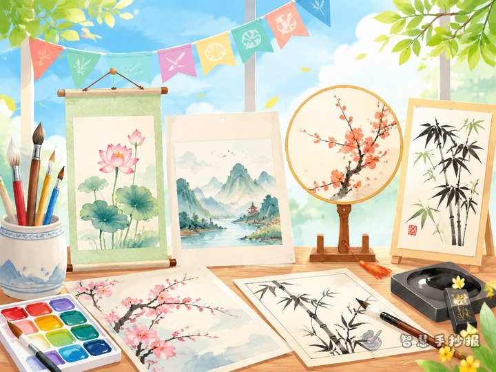
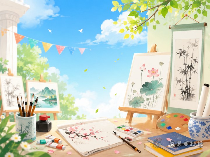
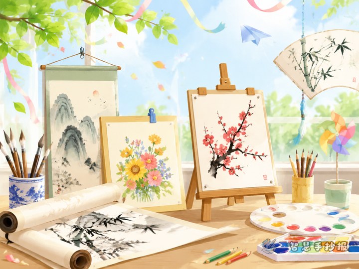
- Calligraphy style: Use scrolls, ink marks, seals, and brush lines for a calm and classic look.
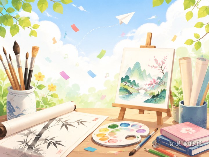
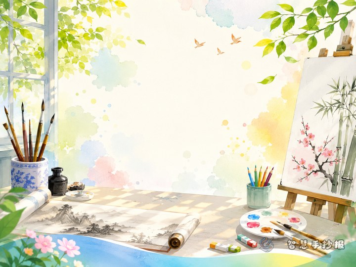
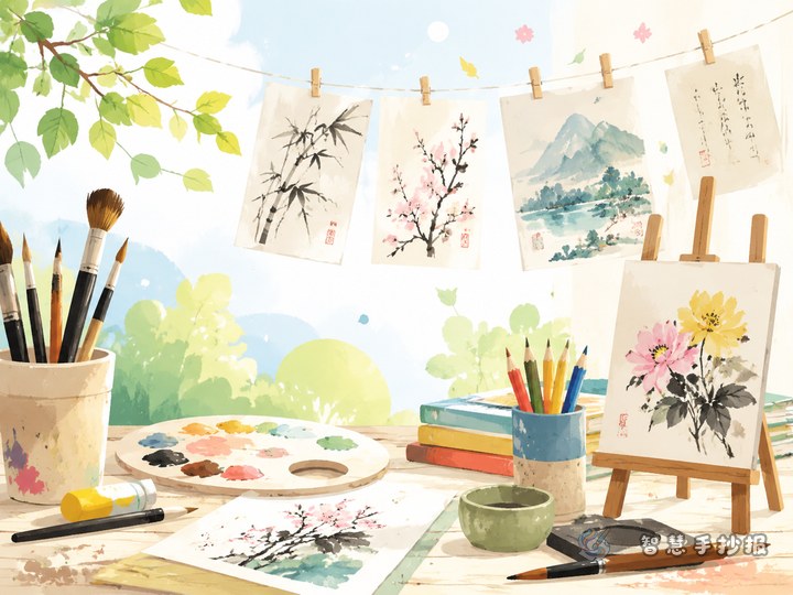
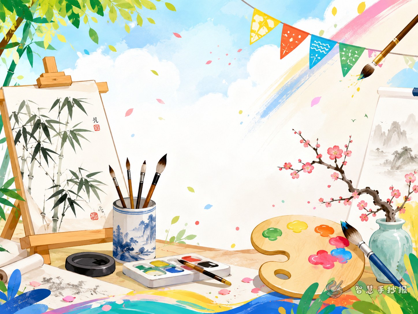
- Painting style: Add palettes, paintbrushes, easels, and art boards for a lively page.
- Exhibition style: Arrange the layout like a gallery wall, as if student works are being displayed.
- Fresh campus style: Use leaves, flags, stars, and neat lines for a light and friendly feeling.
If you cannot decide, combine a few calligraphy details with a few painting details for a balanced result.
Simple borders often work best
The border affects the whole page. If it is too heavy, the writing feels crowded. If it is too light, the theme may look weak. A good idea is to choose one main style and keep the rest of the decoration small.
- Frame border: Looks like a painting frame and gives a clean, formal effect.
- Scroll border: Great for a calligraphy-centered page, especially around the title.
- Paint splash border: Uses soft curves and color spots for a creative art feeling.
- Corner decoration border: Keeps most of the page open and decorates only the four corners.
For younger students, a thin border line with small corner illustrations is usually the easiest and safest choice.
Illustration ideas that match the theme
You do not need too many drawings. Repeating a few matching elements makes the whole page feel more unified.
Best illustrations near the title
- Brushes, inkstones, and rolled paper
- Palettes, paint tubes, and colored brushes
- Mini easels and art labels
- Ribbons, stars, and medals
Best illustrations in empty spaces
- Small corner patterns
- Ink dots or watercolor marks
- Tiny frame shapes
- Leaves, paper pieces, and pencil tips
Make larger illustrations around the title and smaller ones near the text so the writing stays easy to read.
Match the border with your content sections
Decoration should support the writing instead of covering it. It helps to divide the page into content sections before finishing all the details.
- Title area: Place it at the top center and decorate it with a scroll, frame, or brush effect.
- Section one: Introduce the school art festival exhibition.
- Section two: Write about favorite calligraphy or painting elements.
- Section three: Share viewing feelings or the meaning of art activities.
- Section four: Add polite visiting tips or creative suggestions in a small card-shaped box.
If you still have space, turn one text box into a mini “art display window” with a frame-like outline and a short appreciation sentence inside.
Use color in a controlled way
Many pages look unfinished not because they lack decoration, but because they use too many colors. This theme looks better with a limited palette.
- Calligraphy mood: Black, red, and beige.
- Painting mood: Blue, yellow, and white.
- Soft campus mood: Green, light orange, and white.
Let the title use the strongest color, keep text boxes lighter, and make the small illustrations repeat the same tones. This creates a neat artistic effect.
A quick way to finish the page
If you are short on time, start with the title, then lightly sketch three or four text areas in pencil. After that, choose one border style, add a few illustrations around the title and corners, and finish with color and writing. Keep the sentences short and use bullet points where possible.
When the draft is done, check whether some parts feel too empty or too crowded and make small changes. If you want more ready-to-use layout inspiration, section ideas, and decoration styles, you can continue exploring in the Zhihui Shouchaobao WeChat mini program.