Why the title matters first
When students make a newspaper for a school art festival calligraphy and painting exhibition, the first difficulty is often not drawing the border but choosing the title. A good title gives the whole page a clear direction. It helps you decide the sections, decorations, and even the color style.
The best title should show that the topic is about campus art, calligraphy, and painting display. It should also sound natural and look nice when written in large letters.
Useful title directions to choose from
Titles with a campus feeling
- Art in Our Campus
- The Beauty of School Art
- Colors Across the Campus
- Ink and Inspiration at School
Titles with a calligraphy and painting style
- Brushes in Bloom
- Ink of Childhood
- Colorful Canvas Dreams
- Art on the Tip of the Brush
Titles with an exhibition mood
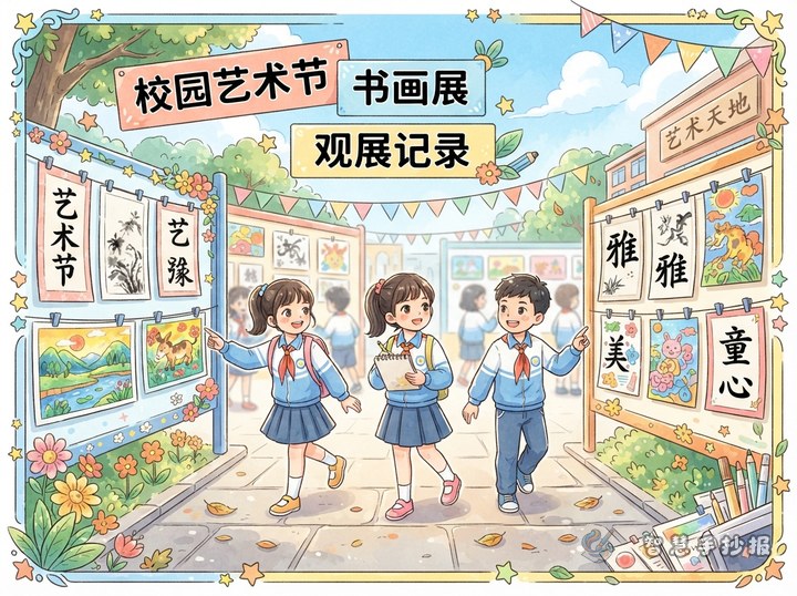
- Welcome to Our School Art Show
- Highlights from the Calligraphy and Painting Exhibition
- What I Saw at the Art Festival
- A Small Gallery of Big Creativity
You can choose the title according to your page design. If you want to draw brushes, seals, or scrolls, a title with an ink or calligraphy feeling works well. If your border uses palettes, crayons, flowers, or painted scenery, a brighter and more playful title may fit better.
What to write after the title is decided
To make the newspaper full but not crowded, you can prepare 3 to 4 short content blocks. Each part should be simple and clear.
- Event introduction: Briefly explain that the exhibition shows students’ calligraphy and painting works and reflects the artistic atmosphere of the school.
- Favorite kinds of artwork: Write about watercolor, traditional painting, children’s drawing, hard-pen calligraphy, or brush calligraphy.
- Small art facts: For example, calligraphy pays attention to strokes and structure, while painting values color and composition.
- My exhibition reflection: Share what you learned, such as patience, observation, and the joy of art.
Short lines you can place on the page
- Every stroke shows careful growth.
- Every picture brings color to campus life.
- Art makes school brighter and childhood richer.
- Calligraphy has strength, and painting has warmth.
- In the exhibition, I can see imagination and effort.
- Art education helps children grow with beauty.
These lines work well near the title, at the beginning of sections, or in small decorative spaces around the page.
Let the title stand out in the layout
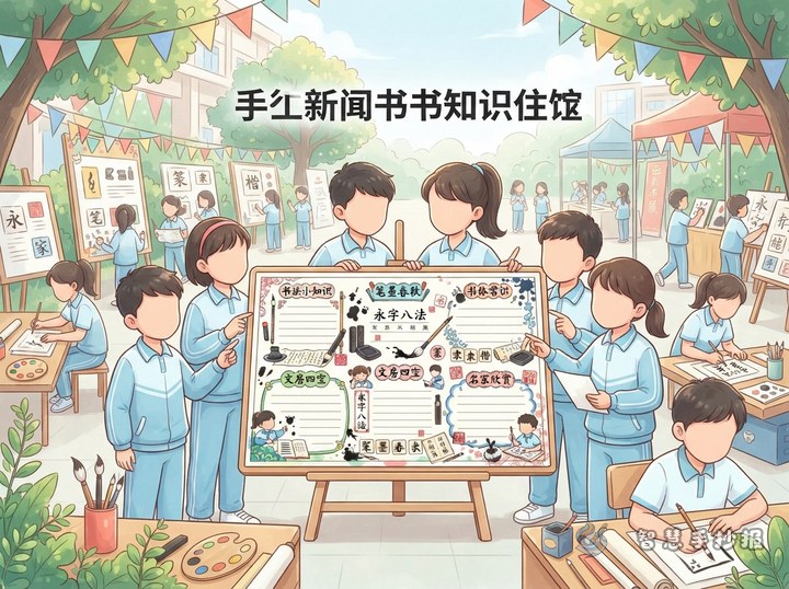
The title should be the visual center of the newspaper. Put it at the top or near the top center with larger letters. You can outline it with color or draw it in a scroll style, but do not use too many colors at once.
- Black with red creates a calligraphy-style page
- Light blue with orange feels fresh and lively
- Green with sky blue suits a cheerful children’s art theme
Add simple elements like brushes, ink stones, palettes, easels, frames, or mini display cards. These details make the theme clear without making the page too crowded.
A simple trick before finishing
If you are not sure which title is best, write down three options first and compare them with your layout. Usually, the best one is the title that is easy to write, easy to expand into content, and well matched with your decorations. After that, check whether the title is noticeable, the sections are balanced, and the colors look harmonious.
If you want to finish the page more efficiently, you can also continue in the Smart Handwritten Newspaper WeChat mini program to explore more layout ideas and ready-to-use inspiration for this topic.