Choose one bright accent instead of making everything glow
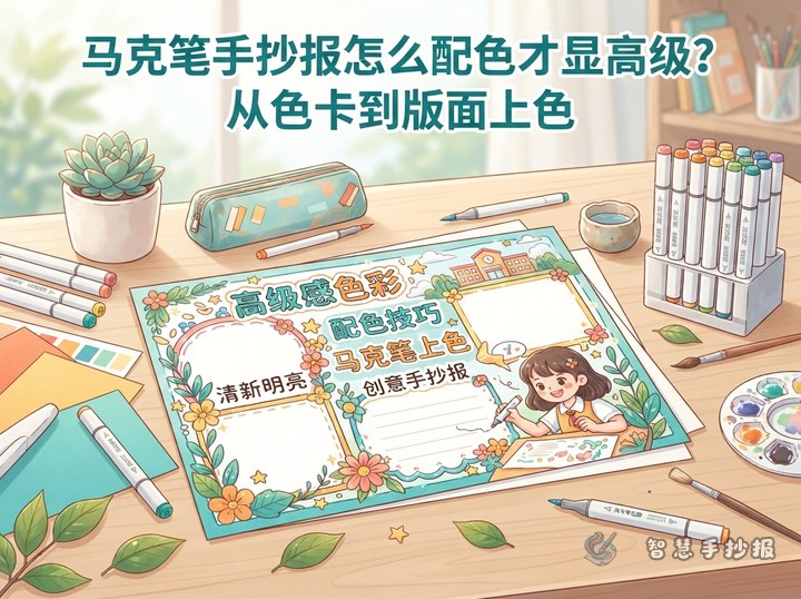
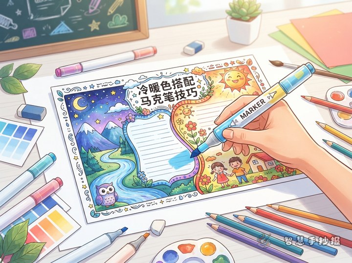
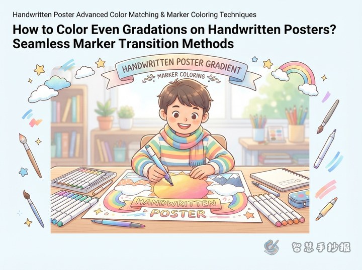
Bright markers work well for school spirit, holiday greetings, reading, and science themes. However, a polished poster does not come from using more colors. Start with one accent color, such as lemon yellow, coral orange, aqua blue, or fresh green. Support it with calm shades like warm white, light gray, misty blue, or pale pink. The accent color should guide attention, while the rest of the page should feel quiet and balanced.
For a lively school theme, try pale blue or creamy yellow as the base, then use coral orange for a title underline, clothing details, and small icons. For a reading theme, warm white and light brown create a gentle mood, while bright yellow can highlight bookmarks, stars, and key words. The result feels cheerful without becoming harsh.
A practical color formula for bright markers
Use a soft base to unify the page
Choose low-intensity colors for large background areas and major illustrations. Test the markers on scrap paper first and check how dark they become after drying. The background does not need to be completely filled. Color blocks, short strokes, dots, or light corner decorations can create atmosphere without covering the whole page.
Use the accent color to guide reading
Bright color works best on one word in the main title, section numbers, corner stickers, motion lines, or beside important phrases. Leave some distance between bright areas. Avoid making the title, border, illustrations, and text boxes all highly saturated.
Use a dark shade to anchor the design
Deep blue, dark brown, or forest green can define the title shadow, important outlines, and a few decorative lines. These colors usually feel softer than large areas of pure black. Finish the outlines before coloring, and add a second marker layer only in small areas so the paper does not become muddy.
Turn the palette into a clear poster layout
- Title area: Use dark lettering or a dark outline, then add bright color to only one part of the title or draw a short bright underline.
- Central illustration: Use one or two bright colors for the main subject, such as a book, balloon, plant, or star. Keep the remaining details light.
- Text sections: Divide the writing into “Theme,” “Did You Know?”, “Try This,” or “My Thought.” Use pale boxes with different shapes instead of changing the main color for every section.
- Borders and corners: Repeat the accent color through a few dots, short lines, or tiny icons. This connects the edges with the center while keeping enough space around the text.
Short text materials for the poster
“Let color be a cheerful reminder, and let every act of reading, observing, and trying leave a bright mark.”
“A poster does not need noisy colors. The right touch of brightness can gently lift up the most important ideas.”
- Theme introduction: We use bright colors to record discoveries at school and place knowledge, imagination, and happiness on one poster.
- Section ideas: Today’s Highlight, My Discovery, Try It Yourself, and One Sentence for My Classmates.
- Closing line: Keep your curiosity, find your own bright color, and make an ordinary day worth remembering.
Four quick checks while coloring
- Make a small color chart first and check whether the accent color works with the base.
- Work from light to dark and from large areas to small details. Add the brightest accents last.
- Do not place highly saturated colors directly against every line of text, or reading may become difficult.
- Step back when the poster is finished. If your eyes stop at only one corner, remove one bright detail there or add more white space.
After choosing the theme and palette, you can continue organizing the title, sections, and layout in the “Zhihui Handwritten Newspaper” WeChat mini program, so every bright detail supports the message of the poster.