Choose One Light Direction First
A polished school poster does not require complicated coloring. Imagine that the light comes from the upper left or upper right, then apply that direction consistently to the title, borders, and illustrations.
- Lit areas: Leave some white paper visible or use a lighter shade of the base color.
- Shaded areas: Add a darker shade from the same color family on the side facing away from the light.
- Cast shadows: Place a small gray or dark shape behind and below letters or objects, keeping every shadow in the same direction.
Build Dimension Without Making the Page Heavy
Titles and large lettering
Fill the title with a light marker color, then add a darker shade along the unlit edge. After the ink dries, use a white gel pen to draw a few short strokes, dots, or narrow curves on the lit side. Highlights should cover much less space than the shaded areas.
Borders and illustrations
A border only needs shading along its bottom edge and one side. For books, globes, flowers, or holiday decorations, keep the main area light, deepen the lower edge, and preserve a few white details. Avoid repeated layers on faces and pale areas because saturated paper can look fuzzy or dull.
Three Color Sets That Work Well
- Teal, blue, and warm yellow: A clear choice for science, environmental, and school themes.
- Coral, soft cream, and gray-blue: A warm but controlled palette for reading, growth, and celebration topics.
- Berry, pale pink, and charcoal: Useful for art, dreams, and traditional culture, with charcoal reserved for thin shadows.
Use one main color, one supporting color, and one small accent color. Treat the white pen as a finishing tool rather than another dominant color.
Connect the Writing Sections to the Palette
Useful sections include “Why This Topic Matters,” “Quick Facts,” “What I Can Do,” and “Mini Quiz.” Write body text in black or dark gray, then use the main color for keywords, small headings, or pale text boxes. Short lines such as “A small habit can become the brightest part of our actions” or “Observing light and shadow gives simple drawings more depth” can connect the visual style with the topic.
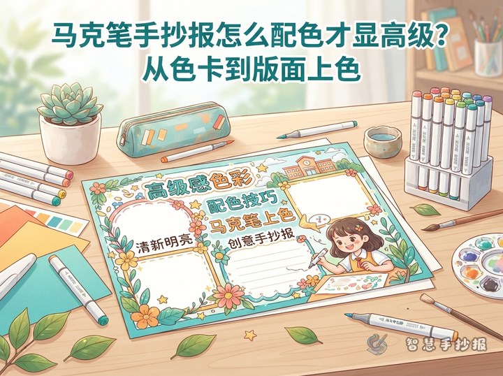
Place the title across the top or near the visual center, arrange two main sections on the left and right, and reserve the bottom for a short checklist or conclusion. Keep text backgrounds pale and leave breathing room around paragraphs.
A Clean Marker Coloring Sequence
- Sketch the layout lightly in pencil and mark the light direction.
- Apply large areas of pale color before supporting and accent colors.
- Let the base layer dry, then deepen the shaded sides.
- Finish the writing before adding cast shadows and white highlights.
- Check that every shadow points the same way and erase extra pencil lines.
To organize sections, text ideas, and decoration before coloring, continue the project in the Smart Hand-Copied Poster WeChat Mini Program and then apply the marker steps in order.