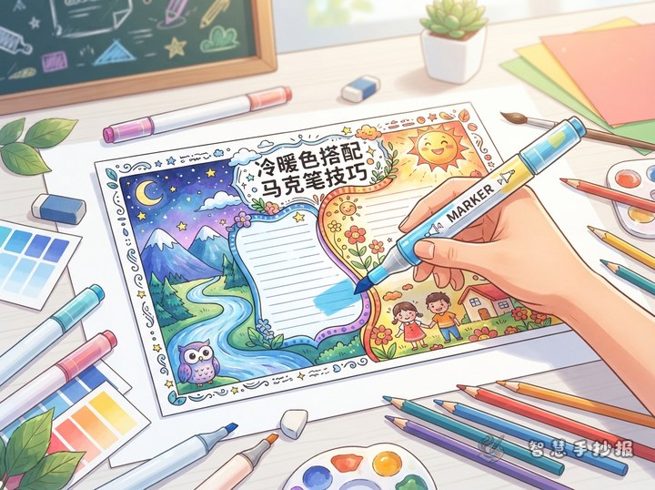
Why Marker Color Slips Past Your Pencil Lines
You draw a clean outline, then one pass of color turns it into a blur: the ink crosses the pencil line, two blocks merge, and the title becomes a single dark blob. Three things are usually behind it.
- Paper that is too thin: color spreads sideways along the fibers. Test a stroke on plain copy paper first to see how far it travels.
- A nib that is too wide: broad nibs are for large background areas. Switch to a fine tip for small shapes and thin edges, or use the side of the nib.
- Scrubbing back and forth: repeating strokes pushes color further out. Steady one-direction strokes hold the edge much better.
Build an Invisible Fence Around Every Color Block
The most effective trick is not speed, it is tracing the shape before you fill it.
- Go over the outline lightly in pencil so the shape is easy to read.
- Using the lightest marker in the color family, trace a thin line just inside the outline.
- Wait about ten seconds so that line settles, then fill the middle with a mid or darker tone.
- Keep the nib moving in one direction and do not cross the freshly traced edge.
The outlining shade must be lighter than the final color. Outline with a dark marker and you get a hard dark ring around every shape, which reads as messiness rather than depth.
A Coloring Order That Keeps Edges Clean
A poster usually has a title area, illustrations, text boxes, borders, and background. Sorting them into an order solves half of your edge problems.
- Light before dark: a light nib that picks up dark pigment turns grey in the pen; a dark marker over light color is safer.
- Large areas before small ones: finish backgrounds and main illustrations first, then go in with a fine tip for tiny icons, petals, and stars.
- Distant before near: sky, grass, and backdrop go down early; characters and main shapes go on top.
- Borders and text boxes last: these thin lines smudge easily under a resting hand, so leave them until the end.
For a dimensional title, color the letters first, then press a narrow strip of a darker shade along the bottom edge of each letter. Do not outline the whole letter in black, or it will look heavy.
How to Rescue a Block That Already Went Too Far
A spill does not mean starting over. A few small moves will tidy it up.
- Cut it back with white: run a white gel pen along the spilled edge to slice off the excess color.
- Re-draw the outline: go over the shape with a dark liner so the ragged edge becomes a deliberate decorative line.
- Turn it into shadow: if the spill is slight, deepen it as the shadow under the shape and it will read as depth.
- Hide it with white space: convert the messy spot into a small dot, leaf, or cloud.
Small Edge Details That Make a Poster Look Polished
- Give each block only one kind of edge treatment, either a liner outline or clean white space, never both.
- Use the same color for the outer border and the text boxes and the whole page instantly looks organized.
- Do not push a large background all the way to the paper edge. A narrow white margin feels more breathable than a full bleed.
- Rank your values: darkest in the title area, medium in illustrations, lightest in text boxes, so the reader sees the hierarchy at a glance.
Once the layout works, you can still try another color scheme: open the 智慧手抄报 WeChat mini program, pick a theme layout, adjust colors and structure online, and print the clean line art. Coloring it by hand then becomes much easier.