Stop Adding Colors and Give Each One a Job
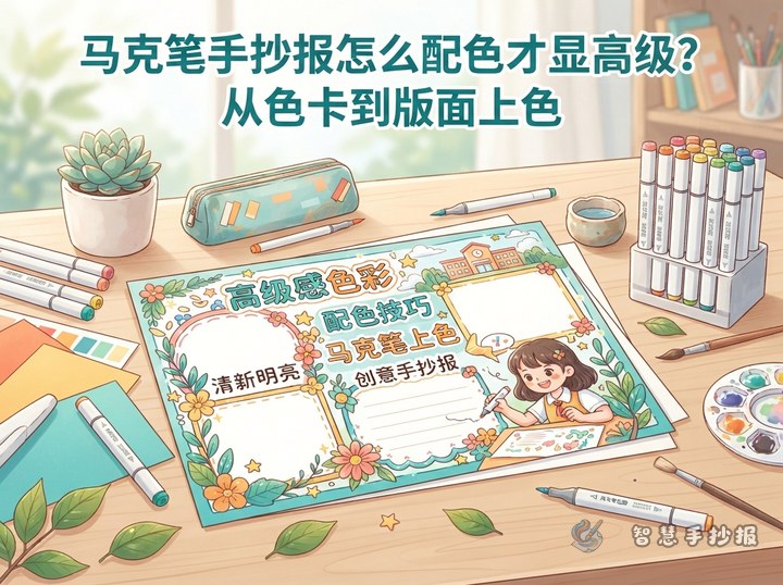
A poster often looks messy not because the colors clash, but because every color occupies too much space. Choose three roles: a calm dominant color, a coordinated supporting color, and a brighter or darker accent color. Aim for an approximate 60-30-10 balance rather than measuring every area.
- 60% dominant color: Use it for the outer border, large title panel, broad decorative bands, or the overall paper background.
- 30% supporting color: Apply it to section boxes, subheadings, and main illustrations.
- 10% accent color: Save it for important title letters, numbers, arrows, icons, and tiny highlights.
For example, blue can lead the design, soft green can support it, and orange can highlight important details. A small amount of orange will attract attention without overwhelming the page.
Connect the Palette to the Topic and Sections
This method works for reading, environmental, safety, festival, and classroom themes. Before drawing borders, choose three or four content sections and decide where each color will appear.
A Flexible Section Plan
- Topic introduction: Explain the theme and its value in two or three sentences.
- Knowledge corner: Present three to five short facts.
- Action list: Suggest simple steps readers can try immediately.
- My message: End with one clear and encouraging sentence.
Reusable Writing Ideas
An opening can say, “Start with one small habit and turn what you know into something you can practice every day.” For an action section, use short phrases such as “observe carefully,” “learn actively,” “keep useful notes,” and “practice regularly.” A closing line could be, “Let us begin today and create positive change through small actions.” Replace the key terms to match the chosen school topic.
Use Color to Guide the Reading Path
Try a large title across the top with three content areas below. Give the title panel the dominant color and highlight only one or two title words with the accent. Keep section borders consistent with thin dominant-color lines, then add the supporting color to each subheading.
Repeat the accent color at three points, such as the upper-left title, a central section number, and the lower-right closing message. This creates a natural path across the page. Leave open space around paragraphs instead of filling every gap with another decoration.
Color in the Order of Light, Main, Dark, and Bright
- Make a small swatch card on scrap paper and check each marker after it dries.
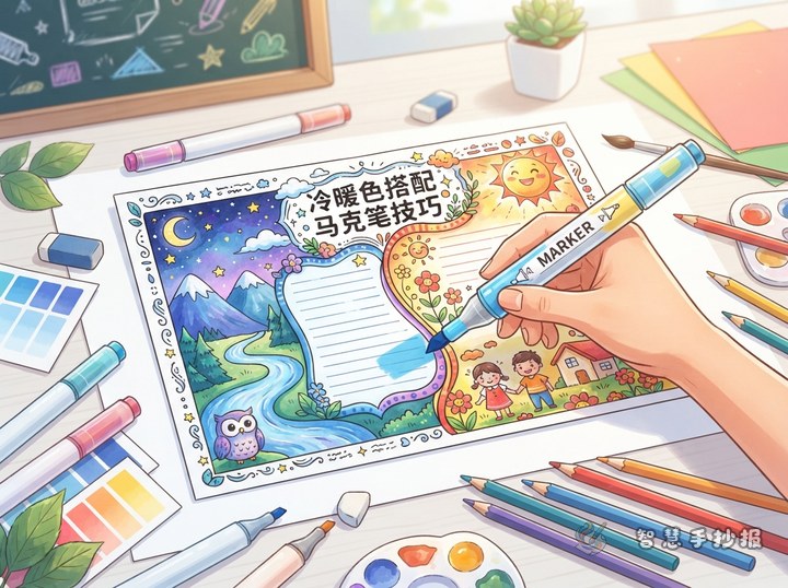
- Fill the lightest backgrounds and supporting areas first, moving the broad tip in one direction.
- Add the dominant color with slightly overlapping strokes to reduce visible seams.
- After the large areas dry, use a deeper shade from the same color family for edges, shadows, or dimensional title details.
- Add the accent color last and keep it limited so the paper does not become overworked.
For small writing, use a clean outline pen rather than repeatedly tracing letters with a marker. If a color crosses a border, tidy the edge with a slightly thicker outline instead of enlarging the colored area again and again.
Finish with a Squint Test
Place the poster at a distance and narrow your eyes slightly. The main title should appear first, followed by the section headings and then the body text. If several areas compete for attention, remove or cover some accent details. If the page feels too flat, add a small accent to key words or section numbers. Students and parents can also continue organizing sections and layout ideas in the Smart Handwritten Poster WeChat Mini Program before applying the 60-30-10 palette.