Build a Cool-Color Base and Reserve Warm Colors for Focus
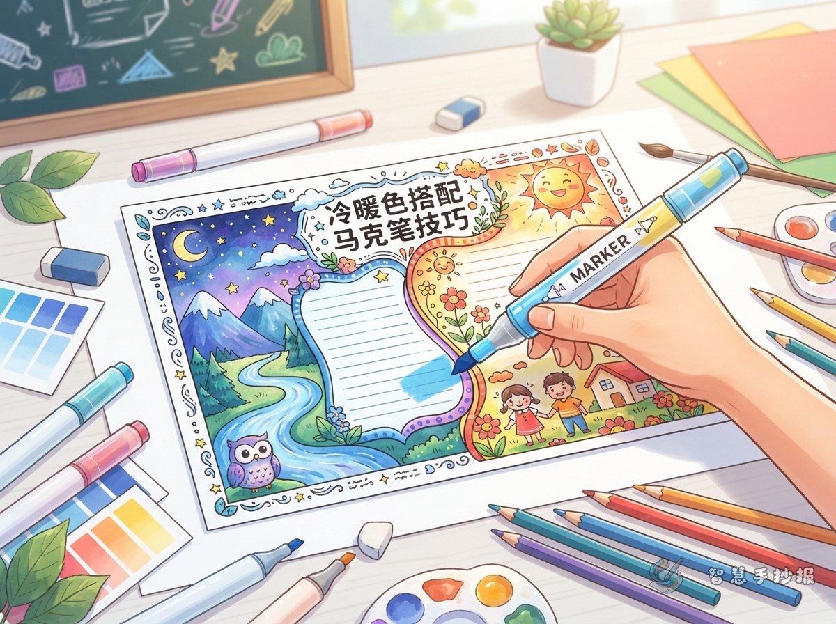
A cool-and-warm palette works well for school posters about science, reading, the environment, festivals, and campus activities. Let blue, teal, or blue-violet lead the page, then use orange, coral, or yellow for the title, numbers, and essential words.
A practical balance is about 60 percent main color, 30 percent supporting color, and 10 percent accent color. Keep the warm accent in places readers should notice first instead of adding it to every border and illustration.
Give Each Content Type a Clear Visual Role
Useful Sections for the Poster
- Key Facts: Explain the topic in three to five short sentences.
- Action List: Suggest realistic steps students can take.
- Interesting Discovery: Add an observation, everyday example, or short question and answer.
- My Message: Finish with a reflection, call to action, or brief slogan.
Use warm colors for headings and action words, black or dark gray for body text, and very pale cool colors behind content sections. This makes a text-rich poster easier to scan.
Place Color Blocks Along the Reading Path
Try a large title in the upper left, a central illustration, and short sections around it. Another option is an asymmetrical two-column layout with one wide column and one narrow column. Sketch the title, text, and illustration areas in pencil before placing any warm-color accents.
- Write the title in a deep cool color and add a short warm underline beneath the key phrase.
- Place the main section near the center with a pale cool background or thin border.
- Arrange supporting sections along the sides and connect them with small warm dots or numbers.
- Leave open space near the edges so the page does not feel packed.
Use Markers from Light to Dark
Test every marker on scrap paper and check how it looks after drying. Fill large areas with a light marker and use strokes in one consistent direction. Outline the boundary first when necessary, then fill the shape in smaller zones to protect the paper surface.
Where warm and cool colors meet, finish the pale cool area first and let it dry. Add warm details afterward, then complete dark lettering and outlines last. This keeps boundaries crisp and prevents dark ink from smearing into light areas.
Run a Final Focus Check
- When you squint, do the title and one or two key points appear first?
- Are warm colors acting as accents rather than appearing everywhere?
- Is there enough contrast between the body text and its background?
- Is there breathing room between illustrations, borders, and text sections?
If the page feels too warm, remove a few decorations or separate areas with white space. If it feels too cool, add one warm detail to a title label, character, or small icon. After choosing a topic, students and parents can continue arranging sections and creating the poster in the Smart Handwritten Poster WeChat Mini Program.