Make a Color Map Before You Start Coloring
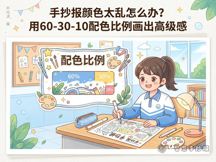
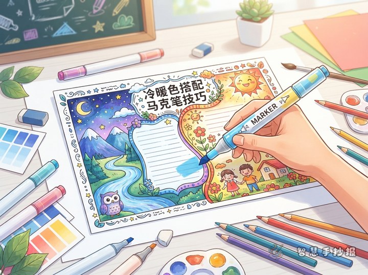
A polished handwritten poster begins with a clear color direction, not with random marker strokes. Choose one main color, one or two supporting colors, and a small accent color. A nature theme may use leafy green with warm white and a little yellow, while a reading theme may use brick red with cream and dark brown. Test the markers on scrap paper first because some colors become darker after drying.
Use the brightest color for the title or central illustration. Keep text boxes light and use a darker outline for readability. Repeat the same colors in the title, border, and illustrations so the whole poster feels connected.
Color from Large Shapes to Fine Details
- Lay down the background: Fill large title panels, section backgrounds, and simple decorations with light colors using steady strokes.
- Color the main subjects: Add medium tones to books, leaves, stars, clothing, or other illustrations without repeatedly rubbing the same edge.
- Finish with details: Use dark markers for selected outlines, textures, and accents instead of making every line equally heavy.
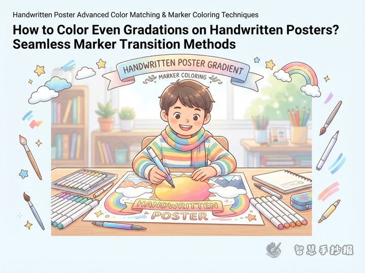
When layering, start with a light color, add a related middle tone to a small area, and use the darkest shade only for limited details. Let the paper settle between layers so wet ink does not turn muddy when dragged repeatedly.
Use One Color Family with Different Textures
A sophisticated look does not require many colors. A blue poster can use pale blue for the title panel, lake blue for illustrations, and dark blue for borders. Keep the title panel flat, add short directional strokes to leaves or objects, and use only small dark sections on the border. Similar colors with different textures create variety without visual noise.
Markers work best with clean, confident shapes. Leave most of a cloud white and add a little gray-blue near the bottom. Draw leaves with a few directional strokes, and use pale cream for pages or paper so black text remains easy to read.
Keep Each Poster Section Easy to Read
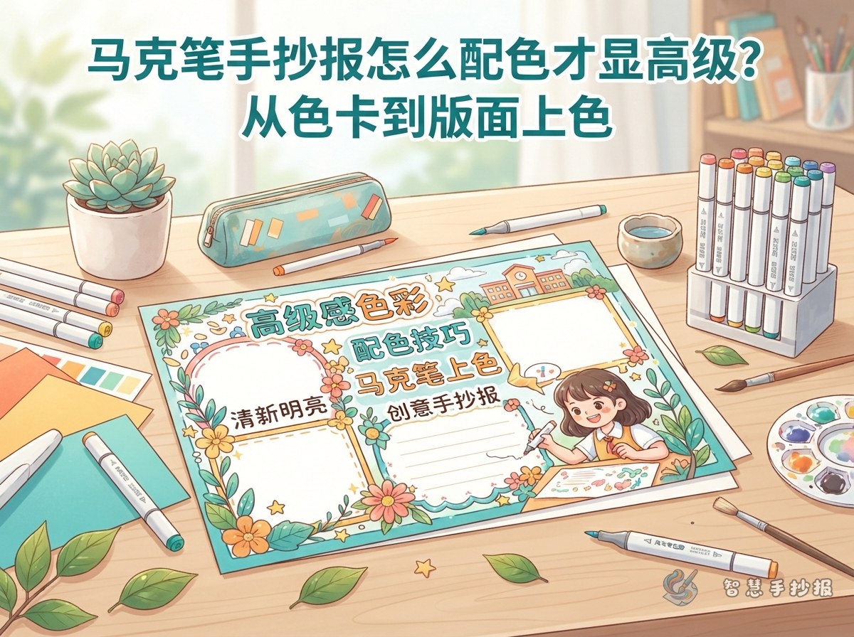
- Title area: Use the main or accent color and leave clean space around the lettering.
- Information area: Choose a light background with dark text for comfortable reading.
- Illustration area: Use more color, but repeat at least one color from the title or border.
- Decoration area: Repeat a few small blocks, dots, or lines instead of adding a new color to every corner.
When a poster contains lots of writing, keep the background especially light. Children can sketch the sections in pencil first, then ask a parent or teacher to check whether the writing areas have enough open space.
A Simple Workflow for a Clean Marker Poster
Choose the topic and about four sections, then plan the title, text boxes, and central illustration. Make a small color key in a corner and label which marker belongs to each area. After filling the large shapes, check for missed spots, overly dark edges, or color gathered on one side. Add the title and key lines only at the end.
You can also browse layout and section ideas in the Zhihui Handwritten Poster WeChat mini program before replacing the sample text and illustrations with your own. Planning the structure first makes it easier to use marker color only where emphasis is needed.