Choose the mood before choosing the markers
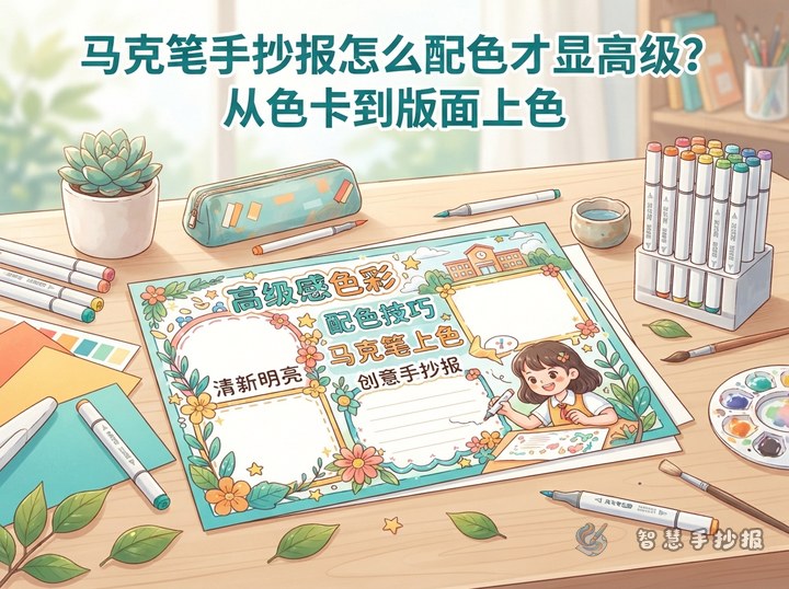
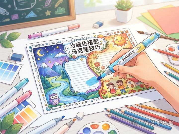
A polished hand-copied poster does not need many colors. The palette should support the topic. Dusty green, muted rose, or soft blue works well for nature, reading, and personal growth themes. Blue-gray suits science or ocean topics, while dark red with warm cream can support traditional culture themes. Once the main color is chosen, keep the supporting shades lighter, darker, or close in brightness.
Test every marker on scrap paper before coloring the poster. Place the swatches side by side. If one color looks much brighter than the rest, reserve it for tiny icons or important words instead of using it across a large area.
Create contrast with value, not extra hues
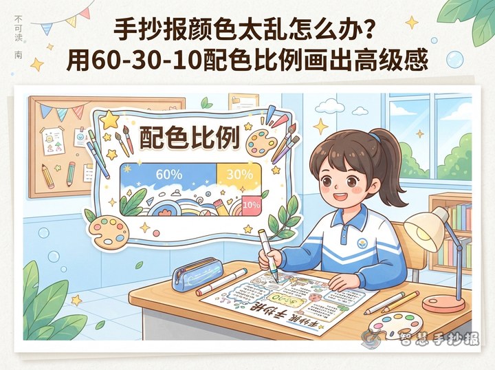
Prepare light, medium, and dark versions of one color family. Use the light shade behind headings and in broad decorative shapes, the medium shade for borders and illustrations, and the dark shade for titles and key details. Dark gray or a deep version of the main color can replace harsh black outlines.
- Light shade: heading panels, clouds, leaves, and subtle backgrounds.
- Medium shade: borders, dividers, and main illustrations.
- Dark shade: titles, numbers, small icons, and highlighted words.
Plan empty space as part of the design
Blank areas do not mean the poster is unfinished. Mark a safe margin around the paper first, then arrange one title area, two or three text sections, and one main illustration. Keep the gaps between sections consistent and leave room inside every text box. Partial color panels and thin borders usually look cleaner than coloring the entire page.
A flexible set of sections
- Place a short “Key Facts” section near the upper left.
- Add an “Action List” with three to five practical suggestions.
- Finish with “My Thoughts” or a brief reminder near the bottom.
Adaptable text for the poster
Opening: Every topic offers useful knowledge, and we can begin putting it into practice through small actions in daily life.
Facts section: We can understand this topic through its meaning, main features, and connection to everyday life. Short sentences make important ideas easier to read and remember.
Action section: Begin with one manageable task, observe carefully, learn actively, and continue building good habits.
Closing: Let knowledge move beyond the page and become part of how we grow.
A clean marker-coloring sequence
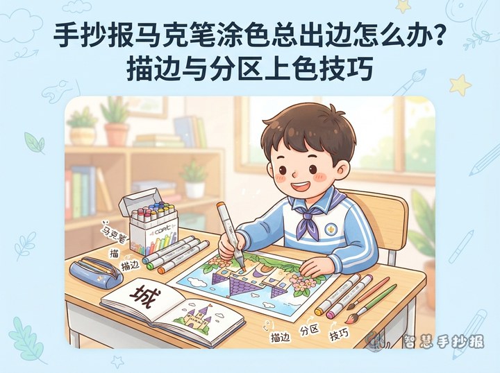
Write and proofread the main text first. Add pale heading panels and decorative shapes, let the paper dry, and then draw medium-tone borders. Finish with dark outlines and a few emphasized keywords. Fill broad areas with strokes moving in one direction, and rotate the paper when approaching an edge rather than rubbing back and forth. Put scrap paper underneath thin sheets to catch bleed-through.
Finally, view the poster from a distance. If too many colorful areas compete for attention, remove some decoration. If the title feels weak, darken only the title or increase the space around it. To explore more topic-based palettes and layouts, scan the code to continue creating in the Smart Hand-Copied Poster WeChat Mini Program.