Choose the Gradient Area Before Coloring
A polished handwritten poster does not need gradients everywhere. Readability comes first, so reserve gradients for the main title, focal illustration, section labels, or page corners. Keep the writing panels white or very pale.
Match the palette to the subject. Try light green to teal for an environmental theme, pale blue to navy for space, soft yellow to coral for spring, or aqua to blue-violet for an ocean poster. A theme-based palette looks more intentional than a collection of unrelated bright colors.
Build a Quick Color Test Strip
Test every marker on scrap paper similar to the final sheet. Draw small swatches and arrange them from light to dark. If two shades look too far apart, add a middle shade to create a softer bridge.
- Single-hue blend: light blue, medium blue, and dark blue are dependable and easy to manage.
- Neighboring-color blend: yellow, orange, and orange-red suit cheerful themes.
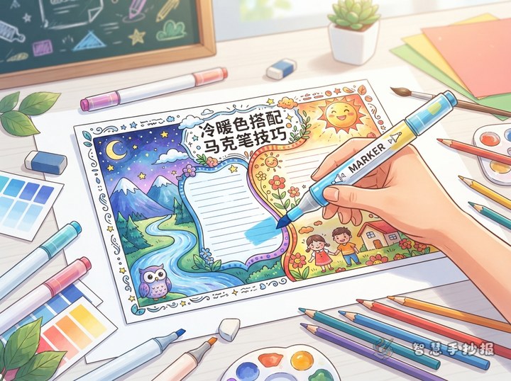
- Cool-to-warm blend: blue-violet to pink works best on a small title rather than a full background.
Check whether the ink bleeds through the sheet. On thin paper, reduce repeated layers and place scrap paper underneath the poster.
Use a Four-Step Blending Motion
- Map the area with the lightest marker, using fast strokes in one consistent direction.
- Add the darkest color from the opposite end while leaving room for a middle transition.
- Pass the middle shade across both edges with slightly overlapping strokes.
- Let the ink dry naturally, then touch up only obvious white gaps.
When coloring letters, finish one letter at a time so the edges stay workable. For a larger shape, move across it in narrow sections and blend each fresh edge before continuing.
Connect the Palette to the Poster Columns
A practical layout places the main title at the top, a central illustration in the middle, writing columns on both sides, and a short tip panel along the bottom. Give the title the fullest gradient, then reuse only two of its shades on the column borders.
Useful Section Ideas
- Color Discovery: explain how the selected colors reflect the topic or mood.
- My Making Process: list the order for framing, writing, outlining, and coloring.
- Readability Reminder: explain why text needs a light background.
- Design Highlights: describe the title, illustration, and gradient in a few sentences.
A Short Text Sample
“Colors change gently from light to dark, much like the sky under different light. On my handwritten poster, I saved the brightest colors for the title and used softer shades around the writing panels. This keeps the words clear and makes the main idea stand out.”
Repair Small Mistakes Without Recoloring Everything
Cover a minor seam with dots, stars, leaves, sparkles, or short decorative lines. If color crosses an outline, slightly thicken the edge or turn it into a shadow effect. Stop immediately if the paper begins to pill, and wait until it is fully dry before making repairs.
Finally, view the poster from a distance. The title should attract attention, the body text should remain easy to read, and the gradient should support rather than overwhelm the page. If you still need a suitable theme or column arrangement, continue planning in the Smart Handwritten Poster WeChat Mini Program and adjust the design to your paper size.