Why screen time deserves a page of its own
"I should use my phone less" is the easiest sentence to write on a self-discipline poster and the easiest one to ignore. A handwritten newspaper turns that sentence into something visible: roughly how long, at what time, and what happens afterwards. Teachers see thinking, parents see a plan, and children can read it themselves.
One big screen in the middle, four boxes around it
Keep the layout simple: a central drawing surrounded by small panels.
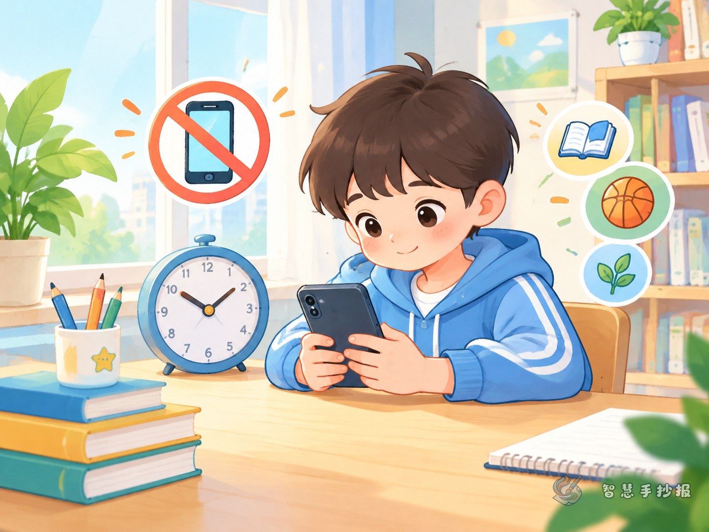
- Centre: draw a phone or tablet outline and write "my screen day" inside the screen, or add small icons for cartoons, games and online lessons.
- Top left: a "now versus goal" comparison using small squares or dots to show length of time.
- Top right: when screen time is allowed, for example after homework, at weekends, or twenty minutes after dinner.
- Bottom left: things to do once the screen is off, such as skipping, jigsaw puzzles, drawing, reading or helping in the kitchen.
- Bottom right: a seven-day check-off chart where each finished day gets a coloured square.
Five panels are plenty. Fewer words and more empty space will make the whole page look tidy.
Short lines you can copy straight onto the page
Short sentences suit a handwritten newspaper far better than long paragraphs, and they are easier to keep straight.
- Finish first, then relax.
- When the time is up, I switch it off myself.
- Look up and look far away every so often.
- The phone stays in the living room, not by the bed.
- Before I ask to play, I ask myself: is my homework done?
Add a small "instead of scrolling" list with three things that are more fun than a video, such as building a model, watering the plants or playing a board game with a parent. Real and specific beats a slogan.
Three small touches that make it convincing
- Draw a power switch and write "I am the one who presses it", handing the control to the child.
- Use one arrow pointing from "want to play" to "what comes first", so the order is obvious.
- Leave a small box for a family signature, so the promise is not a solo effort.
Calm colours, clear spacing
Stick to two or three main colours. Blue-green with pale yellow suits this theme and suggests order and freshness. Make the title bold and the body text small, keep the line spacing generous, and rule your grid lines lightly with a ruler. Do not fill every corner with colour; white space makes the poster easier to read from across the room. If you want ready-made borders or title styles, you can pick a layout in the Smart Handwritten Newspaper mini program and copy your own words into it.
Do not file it away, use it
The most valuable step comes after the poster is finished: hang it by the desk or on the fridge and colour in the check-off squares together each weekend. Next time, make a poster about the adjusted agreement. That way self-discipline becomes something that continues, not a one-off homework task.