Choose a clear visual focus first
The best way to start this type of handwritten newspaper is to decide what the page should highlight. Since the theme is about Spring Festival couplets and lanterns, let those two elements become the main visual focus. A large title at the top or center works well, with lanterns, couplet strips, blessing symbols, or paper-cut decorations around it.
If the page is horizontal, place the title in the middle with lanterns on both sides. If it is vertical, put the title on top and use couplet-shaped side sections below. This keeps the page organized and festive.
Pick simple sections that fit the theme
It is better to choose a few useful sections than to squeeze in too much information. These section ideas are practical for students:
- What Spring Festival couplets mean: They express hopes for good fortune and a happy new year.
- Why people hang lanterns: Lanterns stand for reunion, happiness, and celebration.
- Spring Festival customs: Pasting couplets, hanging lanterns, family dinner, staying up late, and visiting relatives.
- New Year blessing phrases: Short wishes that bring festive spirit to the page.
- My Spring Festival plan: A personal section with a few sentences about your holiday wishes.
Three to five sections are usually enough for a neat and balanced page.
Short text materials you can place directly on the page
A brief note about couplets
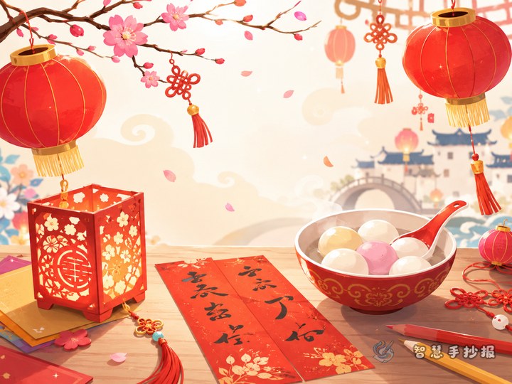
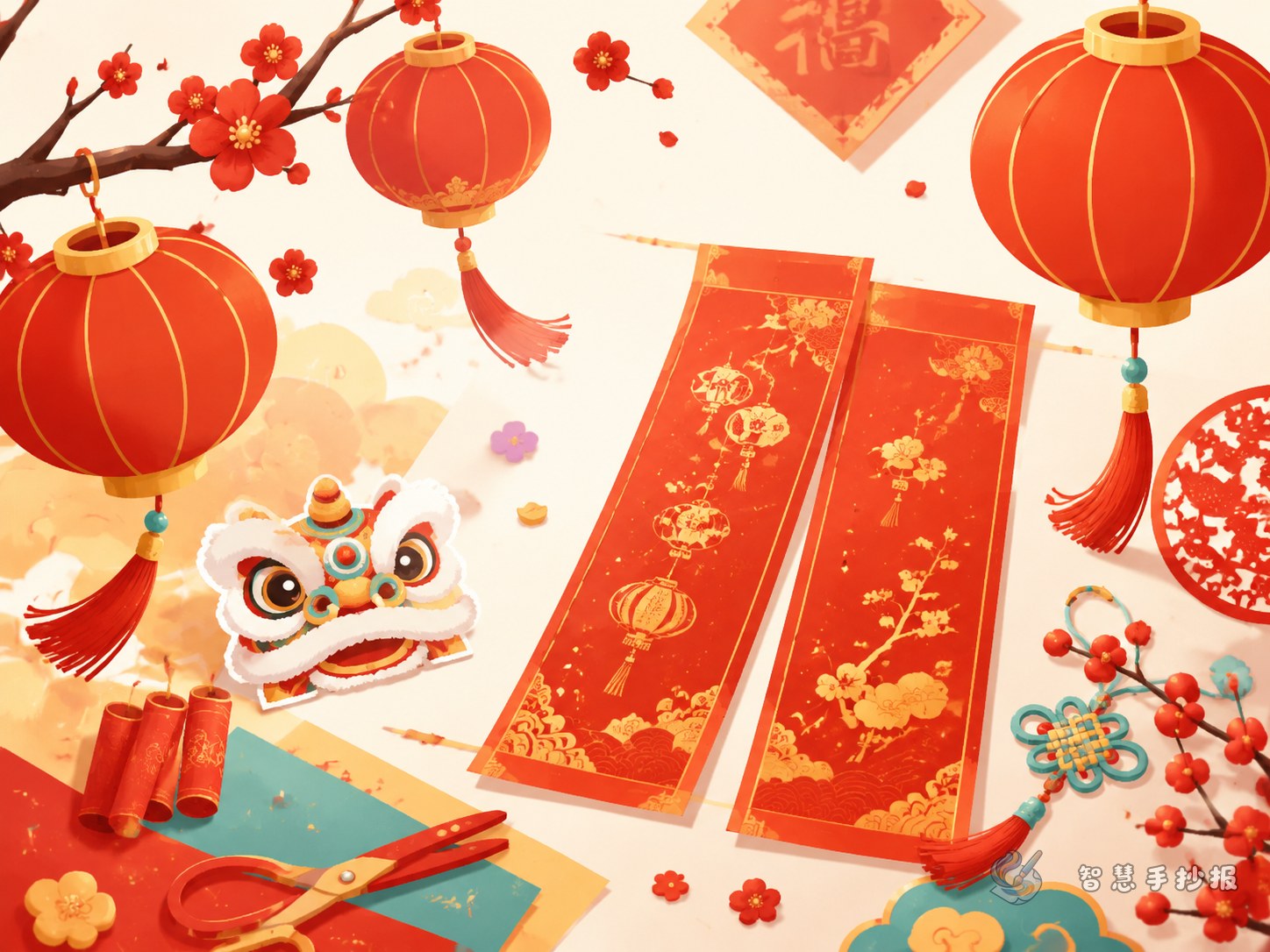
Spring Festival couplets are paired lines written on red paper and placed beside doors during the New Year. They show people’s hopes for peace, happiness, and prosperity in the coming year.
A brief note about lanterns
Lanterns are a bright symbol of reunion and joy. Hanging red lanterns during the Spring Festival adds warmth and a strong holiday feeling to homes and streets.
Short blessing lines
- May the new year bring peace and happiness.
- May every family welcome warmth and reunion.
- May lantern light and blessings fill the new spring.
These short lines are suitable for side boxes, decorative labels, or small corners of the page.
Think about reading order, not only symmetry
Many students try to make the page symmetrical, but a good layout should also guide the reader. A practical method is to divide the page into three parts: title area, main content area, and decoration area.
- Put the title where it is easiest to notice.
- Split the main content into several blocks in a clear reading order.
- Keep decorative drawings on the edges so they do not cover the text.
You can create a center reading area for text and use vertical couplet-style borders on both sides. This matches the theme and keeps the page easy to follow.
Small details that add a stronger traditional feel
- Use a title style that feels festive and slightly calligraphic, but still easy to read.
- Add traditional patterns such as clouds, plum blossoms, paper-cuts, or blessing motifs.
- Keep the main colors red, gold, and orange, with only a little extra color.
- Choose a few matching decorations like lanterns, red envelopes, firecrackers, or lucky knots.
- Add a small corner about safe and polite Spring Festival habits for a more complete page.
If you want to organize your sections more quickly and continue refining the design, you can prepare the text first and then continue making the handwritten newspaper in the Zhihui Shouchaobao WeChat mini program.