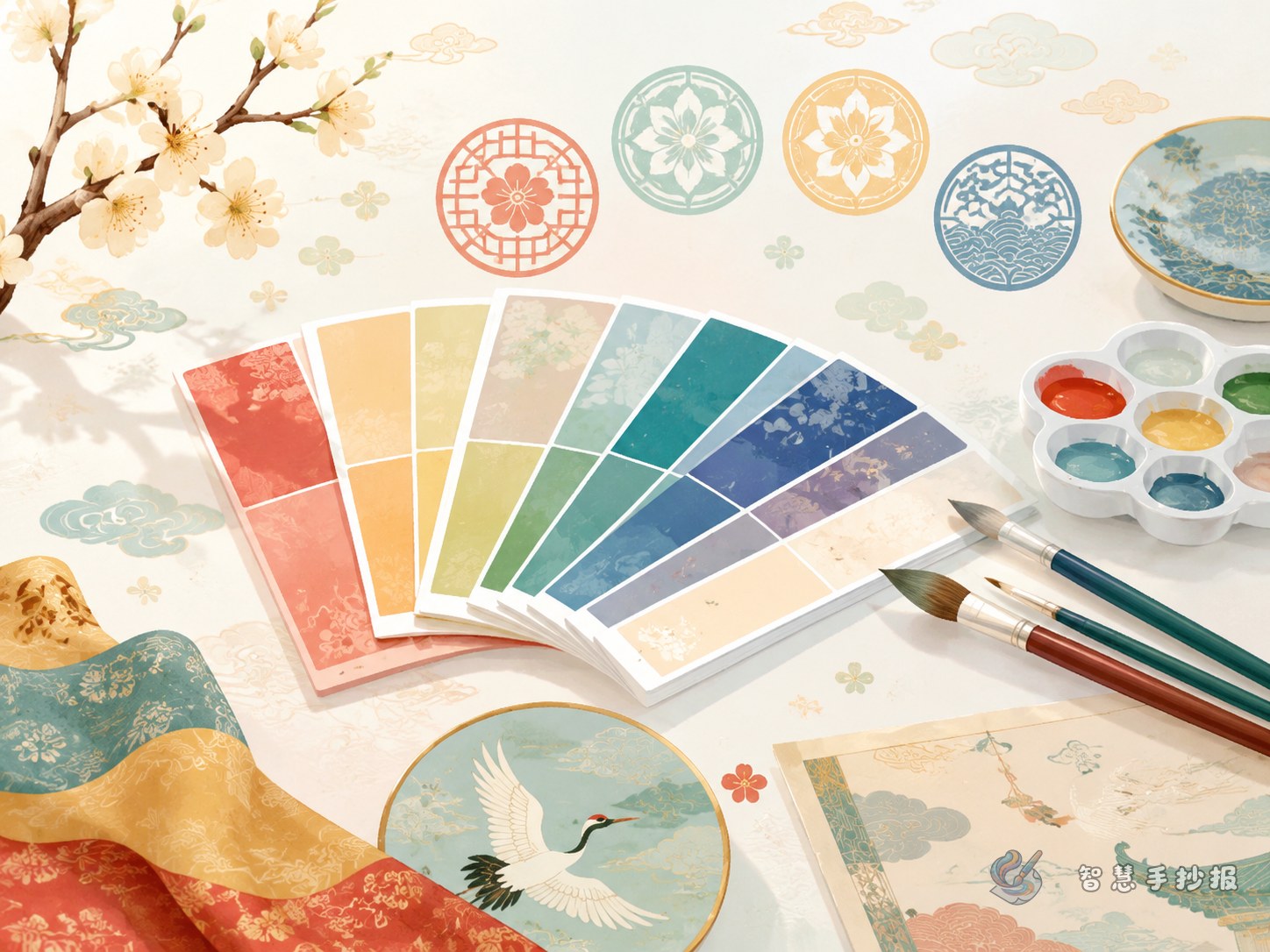
Start with one traditional Chinese color to set the mood
The easiest way to make this kind of handmade newspaper look beautiful is not to use many colors at once, but to choose one representative traditional Chinese color as the main theme. Vermilion feels festive and formal, moon white feels soft and elegant, dark cyan feels calm and steady, and autumn yellow-green feels gentle and classic. After choosing the main color, add one or two similar tones for the title, borders, and small decorations so the whole page looks unified.
For elementary students, it is best to choose combinations that are easy to recognize and color. For example, “vermilion + moon white + golden yellow” creates a festive style, “dark cyan + moon white + light gray” looks quiet and elegant, and “autumn yellow-green + bean green + cream” feels fresh and natural.
Keep the content simple with four useful sections
Section 1: Traditional Chinese colors I know
- Vermilion: bright and lively, often connected with celebration and good fortune.
- Moon white: soft and light, giving a peaceful and fresh feeling.
- Dark cyan: calm and graceful, often linked with landscapes and traditional garments.
- Autumn yellow-green: warm and gentle, with a classic charm.
Section 2: Meanings behind the colors
You can use short sentences to explain the cultural feeling of each color, such as “red suggests joy and vitality,” “green-blue tones remind us of nature and life,” or “white shows purity and simplicity.” One or two lines for each color are enough.
Section 3: My favorite traditional patterns
- Cloud pattern: flowing lines that suggest harmony and beauty.
- Key pattern: neat and continuous, great for borders.
- Ruyi motif: graceful shape that symbolizes good wishes.
- Lotus motif: elegant and balanced, often seen in traditional decoration.
Section 4: Traditional colors and patterns in daily life
You can mention where these colors and motifs appear, such as in clothing, paper-cutting, porcelain, painted architecture, or holiday decorations. This makes the poster feel closer to real life and more personal.
How to match patterns with colors without making the page messy
You do not need to fill the whole poster with patterns. A practical idea is to place one eye-catching motif near the title, add simple corner ornaments, and keep only thin borders around the text area. For example, use a dark cyan key pattern border, add small vermilion ruyi motifs, and leave the writing space in moon white. This keeps the page clear and layered.
If the patterns feel too difficult, just draw repeated shapes. Continuous cloud patterns, wave motifs, and key designs are all suitable for students and easy to finish neatly.
Ready-to-use title ideas and short lines
- Title ideas: Discover Traditional Chinese Colors, My Favorite Chinese Colors, The Beauty of Eastern Colors, Traditional Patterns Are Interesting
- Short lines: A traditional Chinese color carries classical beauty; a single motif tells a story of good wishes; colors are not only beautiful, but also part of cultural memory.
- Ending idea: Through this poster, I learned about traditional Chinese colors and patterns and felt the quiet elegance and symbolic beauty of Chinese culture.
A simple layout that works well
You can divide the page into three parts: top for the title, middle for the main content, and bottom for a short conclusion. Use large lettering and small motifs in the title area, place color introductions on one side and pattern introductions on the other, and leave a small section for “What I learned” or “My thoughts” at the bottom. Do not crowd the page with too much text. Leave enough space for colors and decorations to stand out.
If you want to keep improving the layout, try new color schemes, or add cleaner borders, you can continue your work in the Zhihui Shouchaobao WeChat mini program and make the whole poster more polished.
