Begin with a Simple Question: Why Do the Characters Change Size?
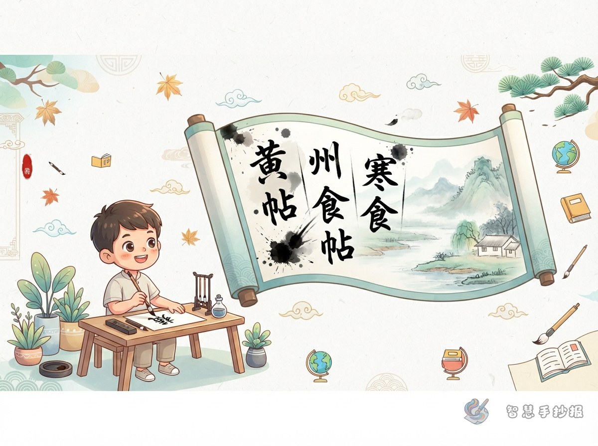
A handwritten newspaper about Su Shi's Cold Food Observance in Huangzhou can focus on the connection between brushwork and emotion. The characters are not uniform. As the writing develops, their size, ink tone, spacing, and movement begin to change. Students can follow a three-part path: a restrained opening, a rising middle, and a more expressive ending.
Build the Page Around Four Content Areas
- Artwork Profile: Introduce Su Shi, the title of the work, and its classification as running script.
- Brushwork Notes: Describe changes in character size, line weight, ink density, and spacing.
- Emotional Movement: Explain how the writing shifts from controlled to increasingly forceful and expressive.
- My Favorite Detail: Choose one character, line, or ink change and explain why it stands out.
Short Text Students Can Adapt
Artwork introduction: Cold Food Observance in Huangzhou is a representative running-script work by Su Shi. Its rhythm comes from the interaction of characters, changing ink tones, varied line weight, and alternating areas of density and openness.
Appreciation note: Some characters are compact, while others stretch outward. Certain strokes appear steady and weighty, while others move quickly and continuously. Together, these contrasts make the work feel like an expression with pauses, turns, and rising emotion.
Learning reflection: Studying a calligraphy model involves more than copying its shapes. Students should observe how each stroke begins, moves, and ends. For a school project, it is better to examine and practice a few clear characters than to reproduce the entire work.
Give the Layout the Rhythm of Running Script
- Place the headline slightly to the right at the top and give it an open, brush-written appearance.
- Use a black ink-like line that gradually becomes heavier to connect the content areas.
- Keep the artwork profile in a neat box, then arrange the observation sections at slightly different heights.
- Choose black, gray, and muted red, using red only for seal-inspired accents and key labels.
- Leave open space around the text so the page has contrast, rhythm, and room to breathe.
Review the Page Through Brushwork and Meaning
Before finishing, check that the title is easy to see, every section relates to the artwork, and the decorations do not cover the writing. Students and parents can continue in the Smart Handwritten Newspaper WeChat Mini Program to choose a layout, adjust the sections, and complete a balanced handwritten newspaper.