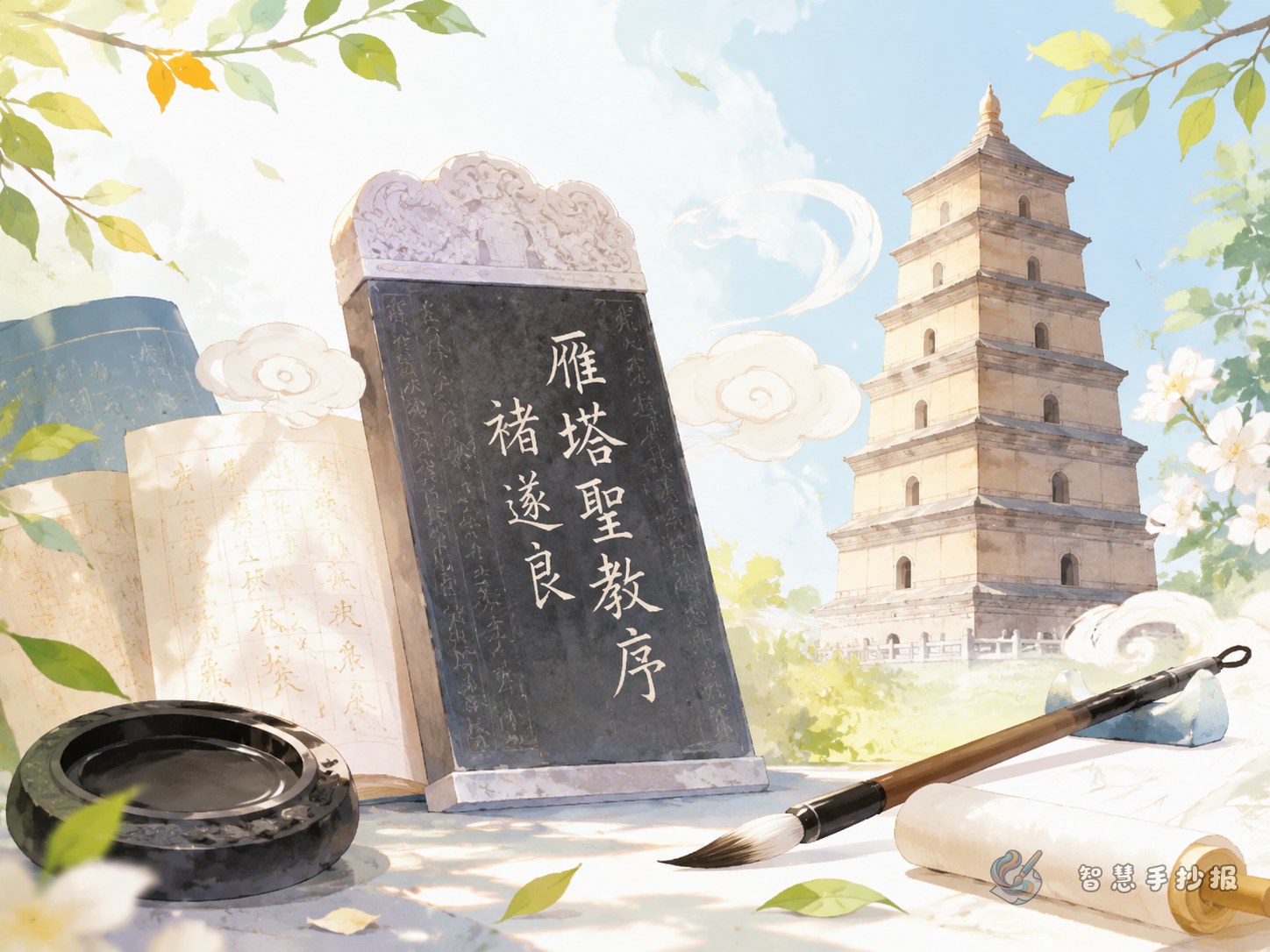
Turn the Topic into an Elegant Calligraphy Display
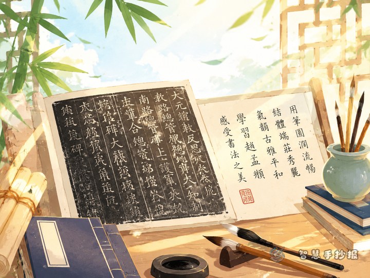
Chu Suiliang’s Preface to the Sacred Teaching at the Wild Goose Pagoda is a good subject for a clean and graceful handwritten newspaper. Instead of writing only a biography, focus on how to appreciate a famous calligraphy work.
Possible titles include The Grace of Tang Regular Script, Discovering Chu Suiliang’s Calligraphy, or A Closer Look at a Famous Stele. You can decorate the title area with a brush, ink stone, seal mark, or a simple outline of the Wild Goose Pagoda.
Build the Page with Five Small Information Cards
Calligrapher Profile
Chu Suiliang was a famous calligrapher of the Tang dynasty. His regular script is known for being elegant, upright, and full of subtle movement. For a student project, a short and clear introduction is enough.
About the Stele
This stele is one of Chu Suiliang’s representative works. Its characters look slim, open, and energetic. On the handwritten newspaper, describe it as a work that shows both discipline and grace.
What to Observe
- Strokes: They show changes in weight and direction.
- Structure: The characters are upright and spacious.
- Mood: The writing feels refined, bright, and lively.
- Learning point: Good handwriting needs balance, patience, and careful spacing.
My Favorite Detail
Add a small personal note such as “I like how the long strokes stretch outward” or “The characters look neat but not stiff.” This makes the project feel more thoughtful and original.
Ready-to-Use Writing Materials
Text 1: The first impression of this stele is elegance and order. The strokes are not flat or dull; they have changes in thickness, direction, and rhythm.
Text 2: When we appreciate calligraphy, we should not only see whether the characters are neat. We can also observe the length of strokes, the space inside each character, and the balance of the whole line.
Text 3: Learning from Chu Suiliang’s writing reminds us to slow down. Before writing a character, we should look at its structure carefully and then write each stroke with attention.
Design the Layout Like a Mini Stele Exhibition
A good layout can look like a small exhibition wall. Place the main title in the center or at the top. Put the calligrapher profile and stele introduction on one side, and the style features and copying tips on the other side. A rice-grid practice strip at the bottom can make the page more connected to calligraphy.
- Recommended colors: warm white, light brown, ink black, and seal red.
- Border ideas: scroll shapes, stone tablet outlines, or paper-texture frames.
- Decoration ideas: brushes, ink drops, seal marks, bamboo slips, and pagoda outlines.
- Spacing tip: Leave some blank space so the page feels calm and refined.
Make the Appreciation Clear and Interesting
A calligraphy appreciation handwritten newspaper should help readers understand where the beauty is. Use arrows, small enlarged boxes, or grid diagrams to point out stretched strokes, upright vertical lines, and spacious structures.
If you want to continue planning columns, colors, and page sections, you can use the Zhihui Handwritten Newspaper WeChat mini program to create a personalized calligraphy-themed handwritten newspaper.