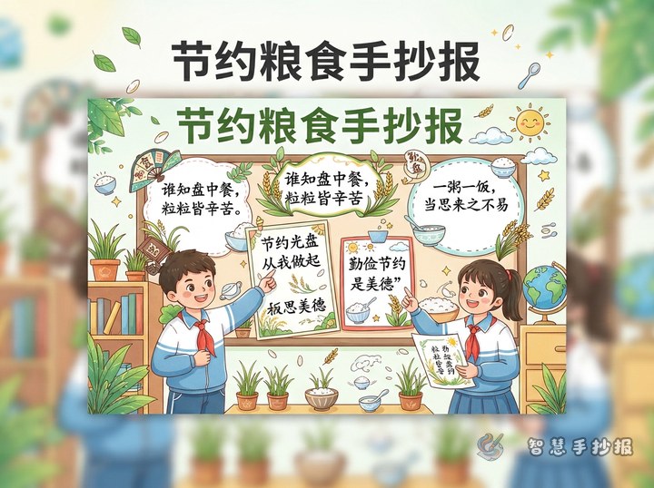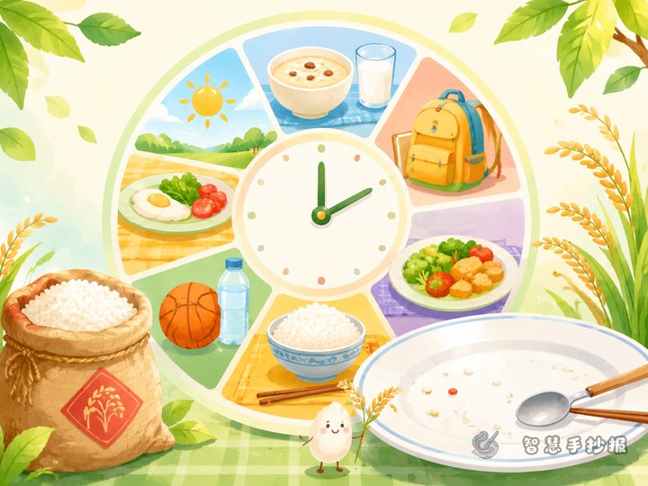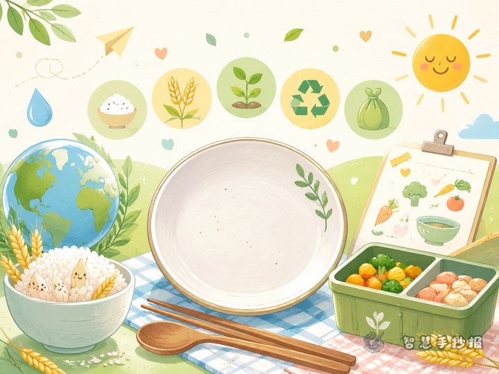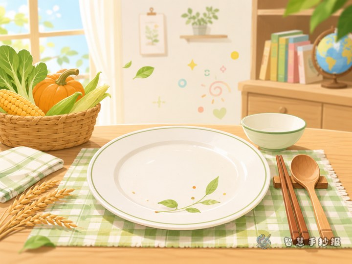
Begin with the header, not the drawings
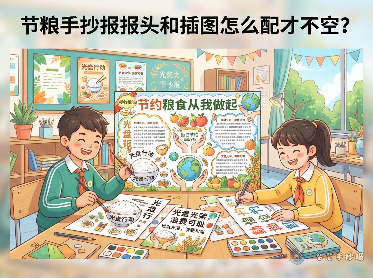
The header is the first thing anyone notices on a food-saving poster, so settle it before you pick up a pen. A simple formula is a theme word plus a short attitude: name the topic, then add your own line. Examples include "Clean Plate Helper," "Save One Grain, Warm One Table," and "Eating It All Is the Real Skill."
Place the header centered at the top or in the upper-left corner. Keep the main title large, add a smaller subtitle such as "No Waste, Starting With Me," and finish with the class and name. Four to ten characters is a comfortable length for the main title.
Three reliable illustration groups
You do not need many drawings; you need the right kinds. For this theme, three groups cover almost everything:
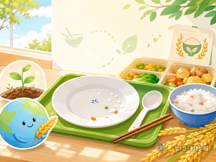
- Tableware: bowls, spoons, chopsticks, plates, and takeaway boxes. Simple outlines that younger students can manage.
- Grain: a bundle of rice stalks, an ear of corn, a steamed bun, a few grains of rice. Good for corners and gaps between sections.
- Scenes: a child carrying a tray, a cafeteria counter, a table set with dishes. These suit the lower half of the page.
Put small drawings on both sides of the header and choose two corners for the rest. The middle belongs to the text. Sketch a light pencil box first so each drawing stays in its place instead of crowding the words.
Fill the gaps with three small sections
Many students finish the drawings and find a large empty area left in the center. Do not force a big picture there; add small sections instead.
- A one-line pledge strip: "Take what you need, finish what you take" or "Packing leftovers home is nothing to be ashamed of." One line plus a tiny icon is enough.
- A short reminder list: three habits, such as serving a little first, not being picky at meals, and reminding family to cook less. Keep each item under fifteen characters.
- A small step box: split the clean plate habit into check the portion, finish it, and tidy up. Three boxes in a row look much better than a paragraph.
Stagger the three sections rather than lining them up in one row, and the page immediately gains depth.
How much room should text and pictures take?
There is no fixed rule, but grade level helps. Younger students can lean toward drawings, roughly six parts picture to four parts text. Older students have more to say, so five to five or even six parts text to four parts picture works better. What matters most is separating three sizes: the main title largest, section headings next, body text smallest.
Before writing, divide the page with pencil: mark the header, then outline two or three section areas, and only then decide where drawings go. Once the zones are set, you will not run out of space halfway through.
Coloring and white space habits
- Keep the whole page to three colors at most, with one bright accent on the header.
- Rice yellow, pale green, and off-white suit a food-saving theme and stay easy on the eye.
- Do not color every blank patch; a little breathing room looks more polished.
- Outline each drawing before adding color so the shapes stay readable from a distance.
A quick look before you hand it in
- Can a reader tell from the header that this is a food-saving poster?
- Is the writing straight and sitting on the guide lines?
- Is there a gap between each section?
- Does any drawing cover the text?
- Is any obvious blank area still untreated?
If you would like the header, sections, and illustrations arranged before you draw, open the Smart Handwritten Newspaper mini program in WeChat, choose a food-saving layout, type your text in, and copy it onto paper. It saves a lot of erasing and redoing.