A Different Angle for Your Mask Project
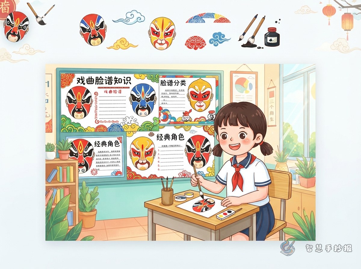
Most students spend all their effort on one large, colorful mask and then run out of things to write. A simpler approach is to organize the whole page around mask types, the traditional way of grouping masks by how they are painted. Once you have a classification, you automatically get a structure: pictures, short labels, side-by-side comparisons, and a page that readers can follow.
Six Mask Types You Can Use Right Away
You do not need all of them. Choose three to five and describe each one in a single sentence.
- Full face: one main color covers the whole face, with black lines for the eyes, brows and texture. It looks steady and serious.
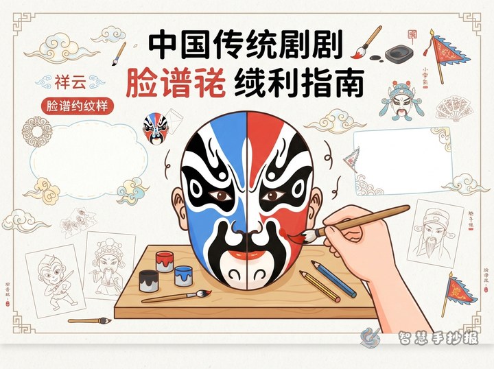
- Three-tile face: the face is divided into forehead and two cheeks, like three roof tiles. Strong color contrast makes it the easiest and most striking type to draw.
- Cross-gate face: a vertical band runs from forehead to nose, crossed by a band over the eyes, forming a cross-shaped frame.
- Broken-flower face: many small, busy patterns and rich colors, lively to look at and useful as a decorative element.
- Pictorial face: the design borrows the shape of an animal or object, such as a monkey or a bird. Children usually like this type best.
- Tilted face: the two sides are deliberately uneven, used for unusual or comic roles.
Turning the List into a Horizontal Strip Layout
A vertical list of six names looks like a glossary. Try this instead:
- Draw a long horizontal strip across the middle of the page and divide it into four equal boxes.
- Put one small mask in each box with its name underneath.
- Above the strip, leave space for your title. Below it, split the area into two columns: “how to recognize it” and “what kind of character it suggests.”
- Frame the whole strip with cloud lines, water lines or stage-curtain curves on the left and right.
The horizontal rhythm pulls the eye across the page, which feels much easier to read than scattered notes.
Short Lines Worth Copying
- “Mask type means the way a mask is painted.”
- “Color shows character; structure shows type.”
- “Change the type and the same face feels completely different.”
- “Draw the center line first, then add patterns, and the mask stays symmetrical.”
Add two or three sentences of your own, such as “I like the pictorial face because it looks like the mask is telling a story.”
Three Common Mistakes to Avoid
- Too many names: six types on one page crowds the text. Fewer types with fuller descriptions read better.
- Drawings too large: keep each small mask under half a palm so the writing still has room.
- Too many colors: stick to three or four main colors, or the small masks will compete with each other.
If laying out the grid takes too long, open the Smart Handwritten Newspaper WeChat mini program, pick an opera mask layout and fill in the mask-type content above.