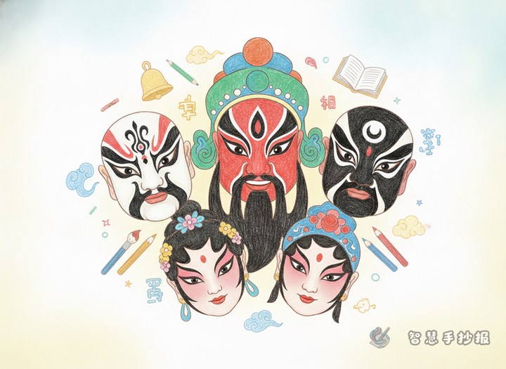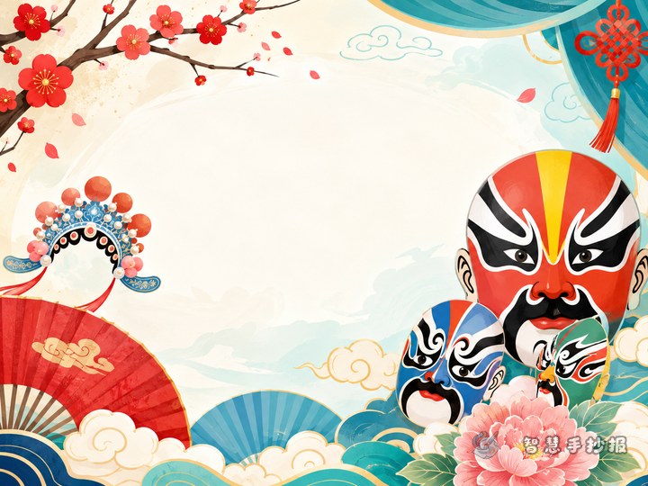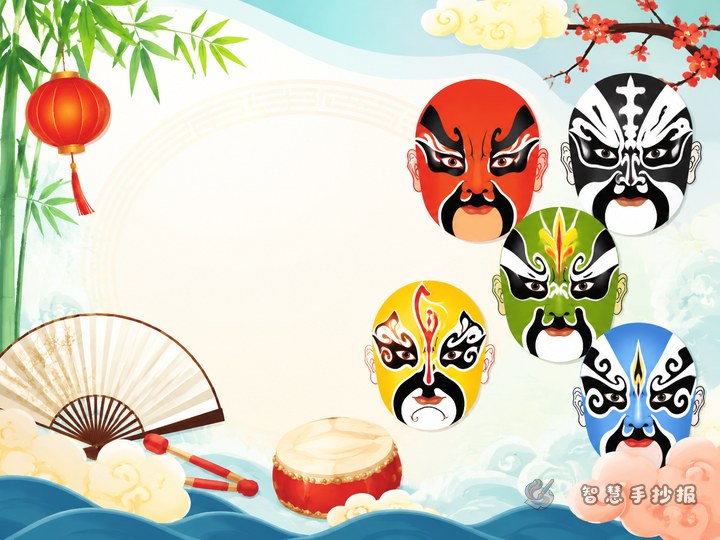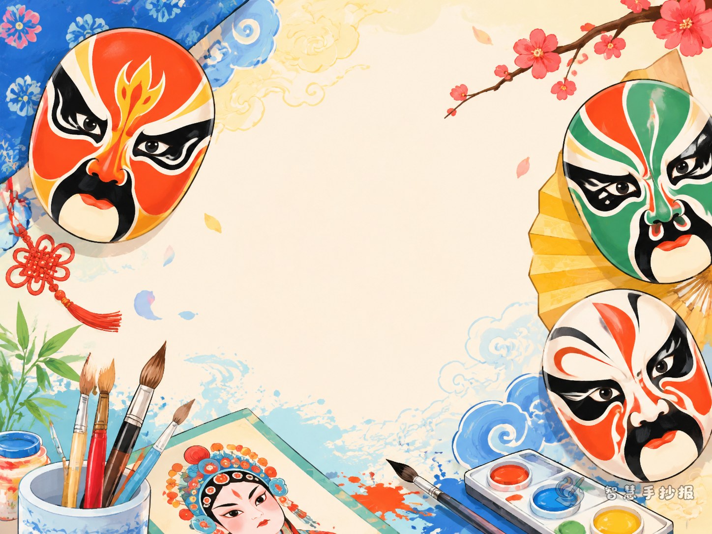
Start with one strong idea: let the mask lead the page
If you are not sure how to begin, choose one main opera mask as the visual center. You can place it in the middle, at the top, or on one side, and arrange the writing blocks around it. This makes the theme clear at first glance.
The main mask does not have to be difficult. As long as it shows symmetry, bold shapes, and clear lines, it can already create a strong traditional feeling.
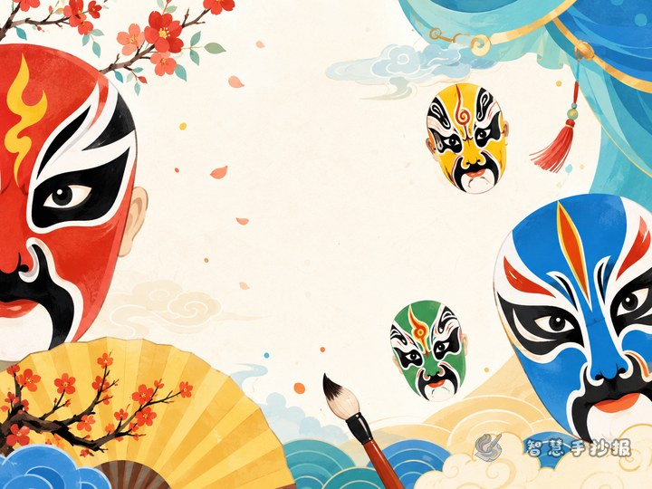
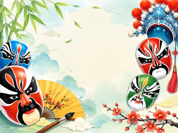
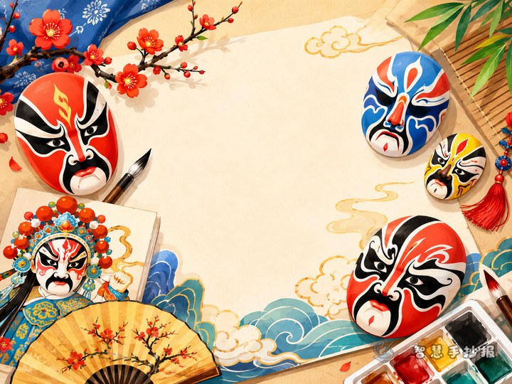
Use stage-inspired borders instead of ordinary lines
For this theme, decorative borders work better than simple straight frames. Try borrowing ideas from opera costumes and stage design to make the page feel more vivid.
- Corner decorations: clouds, classic patterns, fan shapes
- Top and bottom borders: curtain lines, sleeve ribbons, drumbeat motifs
- Side details: small masks, opera instruments, headpiece patterns
- Title frame: scroll style or stage sign style
The key is balance. A border should support the page, not overpower the writing area. Leave open space so the work does not feel crowded.
A simple layout: one picture with three content sections
Many students struggle because their text ends up scattered. A useful structure for this topic is one main illustration plus three writing areas.
- What is an opera mask? A short explanation of its role in traditional opera.
- Color impressions Write about how different colors create different character feelings.
- My favorite mask Add a few lines from a student perspective.
If you have more space, you can include a small extra section such as “The beauty of symmetry” or “Design your own opera mask.”
Short text works better than long paragraphs
This kind of handwritten newspaper looks better with short lines and clear points instead of heavy blocks of text. It is easier to read and easier to match with drawings.
- Opera masks are one of the most recognizable images in traditional Chinese opera.
- Bold lines and bright colors help show different personalities.
- The design often highlights symmetry, rhythm, and decorative beauty.
- A small mask can reveal rich traditional artistic ideas.
You can also add a simple personal reflection, such as how drawing a mask helped you notice the charm of traditional art more closely.
Three small tricks to make the page look better
Keep the main colors focused
Choose combinations like red and black, blue and black, or red, white, and black. A focused palette makes the page look more unified.
Give the title a stage feeling
Make the title thicker and decorate it with curtain shapes, scroll edges, or tiny mask icons.
Leave room to breathe
A handwritten newspaper should not be filled edge to edge. Proper blank space makes the whole design look cleaner and more polished.
An easy order for finishing the work
If you want a quick and practical method, do it in this order: write the title first, draw the central mask second, place three content sections next, and add the border and colors at the end. This saves time and makes the process smoother for schoolwork.
If you want to keep improving your layout, headings, or text ideas, you can also continue your design in the Zhihui Handwritten Newspaper WeChat mini program for a more complete final piece.