Start with a clear and manageable focus
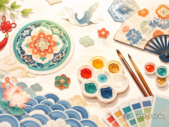
For a hand-copied newspaper about the color aesthetics of traditional Chinese patterns, you do not need to include every pattern you know. It is better to choose two or three key motifs, such as auspicious clouds, ruyi shapes, geometric meanders, lotus patterns, floral medallions, or cloud-collar designs, and pair them with one main color family. Good choices include Chinese red, mineral blue, mineral green, ochre yellow, or dark blue. A focused theme makes the whole page look more unified and easier for students to complete.
You can also frame the topic with a natural title such as “Chinese Colors in Traditional Patterns” or “Why Traditional Motifs Look So Elegant.” These titles feel practical for school projects and help organize the content.
Useful sections students can write directly
Section 1: What are traditional Chinese patterns?
Traditional Chinese patterns are decorative motifs used on clothing, objects, buildings, and festive items. They are not only beautiful, but also carry wishes for luck, harmony, peace, and abundance.
Section 2: Meanings behind common motifs
- Auspicious cloud pattern: often represents good fortune and smooth blessings.
- Lotus pattern: gives a feeling of purity, grace, and calmness.
- Meander pattern: continuous lines suggest order, connection, and extension.
- Floral medallion: rounded compositions feel full, lively, and festive.
- Ruyi pattern: symbolizes good wishes and elegant softness.
Section 3: Why traditional Chinese colors feel balanced
Traditional color matching usually follows a simple logic: a steady main color, gentle supporting colors, and a bright accent. Red with gold feels festive, blue with white feels fresh, and deep blue with earthy tones feels calm and classic. Good color design is not about using many colors, but about harmony and balance.
Let the layout look elegant through order
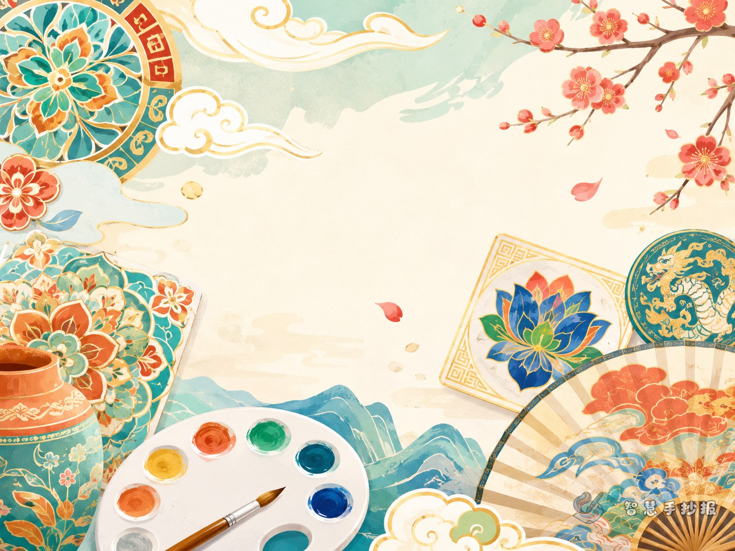
This kind of hand-copied newspaper works well with a “central title plus four surrounding sections” layout. Put a large title such as “Chinese Colors in Traditional Motifs” in the center, then place four panels around it: “Pattern Introduction,” “Color Pairing,” “Symbolic Meanings,” and “My Design Ideas.” A border made with simplified cloud lines or repeating meanders can reinforce the traditional style.
- Use a strong color like red or deep blue for the title area.
- Keep each text block short, about three to five lines.
- Repeat one visual language in the corners, such as curved cloud forms or geometric borders.
- Leave some blank space so the page does not feel crowded.
Easy color plans for students
- Festive style: Chinese red + golden yellow + ivory, good for floral or ruyi motifs.
- Elegant style: mineral blue + soft white + light gray, ideal for lotus or cloud motifs.
- Classic style: ochre + black + beige, suitable for meanders and object-inspired patterns.
- Spring style: mineral green + pale yellow + white, great for floral and leaf motifs.
When coloring, it helps to apply light colors first and then add darker outlines. If you are worried the page may look messy, limit yourself to two main colors and one accent color for a cleaner result.
How to end the hand-copied newspaper well
A good ending can focus on personal understanding, such as: “Traditional patterns are not only decorative, but also reflect the wisdom of Chinese aesthetics. Through this hand-copied newspaper, I learned that colors and motifs together can express cultural beauty.” This kind of ending sounds complete and works well for classroom display.
If you want to keep refining the layout, borders, and title styles, you can continue your design ideas in the Zhihui Shouchaobao WeChat mini program and make your page more polished and organized.