Start with Three Visual Clues
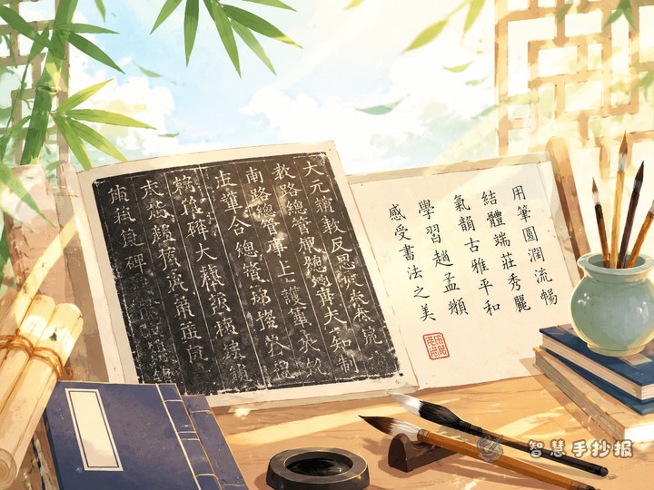
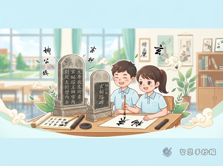
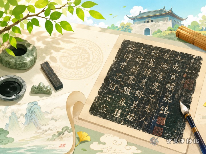
The Cao Quan Stele is a celebrated example of clerical script from the Han dynasty. A school newspaper can focus on three features that children can readily see: broad character shapes, extended horizontal strokes, and an elegant, balanced rhythm. These clues make it easier to compare clerical script with regular script.
- Broad forms: Many characters spread sideways and create a calm, stable appearance.
- Distinctive horizontal strokes: Some strokes begin gently and finish with a lifted, flaring end.
- Graceful spacing: Clear lines and open structures give the inscription both an ancient and refined quality.
Turn Calligraphy Study into Four Features
Stele Profile
Explain that the Cao Quan Stele was carved during the Eastern Han dynasty and is valued as an important work of clerical script. Its orderly inscription helps modern readers explore early Chinese calligraphy and stone-carving culture.
Spot the Clerical Script
Use short notes to identify wide shapes, long horizontal lines, and outward-spreading strokes. Placing a regular-script character beside a clerical-script version can make structural differences easy to understand.
Close-Up Observation
Select a few clear characters and look at their horizontal strokes, diagonals, balance, and empty spaces. Any copied examples should be presented as a learning exercise. The aim is to notice rhythm and structure, not to reproduce the original perfectly.
My Response to the Work
A short reflection might say: “The characters on the Cao Quan Stele open out gracefully. Their strokes vary in weight, bringing movement to an orderly composition. Studying the inscription helps me appreciate the classical beauty of Chinese characters.”
Let the Layout Echo the Script
A horizontal arrangement suits the broad quality of clerical script. Divide the page into a title area, a short stele profile, a character study, and a copying activity. Keep a generous observation panel near the center or lower half so the page feels stable rather than crowded.
- Combine ink black, seal red, and light gray for a traditional but readable palette.
- Use a simple rectangular border inspired by stone rubbings, keeping it thin and restrained.
- Add only a few motifs, such as a seal block, brush, tile pattern, or stele outline.
- Leave visible space between sections so readers can scan the page easily.
Balance the Display Lettering and Body Text
The main heading can use slightly wider character proportions to suggest clerical script. Sketch its size and spacing in pencil before outlining it in a dark color. Keep the body text in neat regular script and highlight only important terms in red. Readability matters more than making every word look ancient.
- Mark the sections and title guideline.
- Add short passages and check facts and spelling.
- Insert a few copied characters with observation notes.
- Finish with borders, seal-colored accents, and spacing adjustments.
Move from Notes to a Finished Newspaper
After planning the sections, open the Smart Handwritten Newspaper WeChat Mini Program to choose a suitable layout and refine the placement of each text block. Preserve one prominent area for viewing the inscription so that background knowledge, visual analysis, and personal response follow a clear sequence.