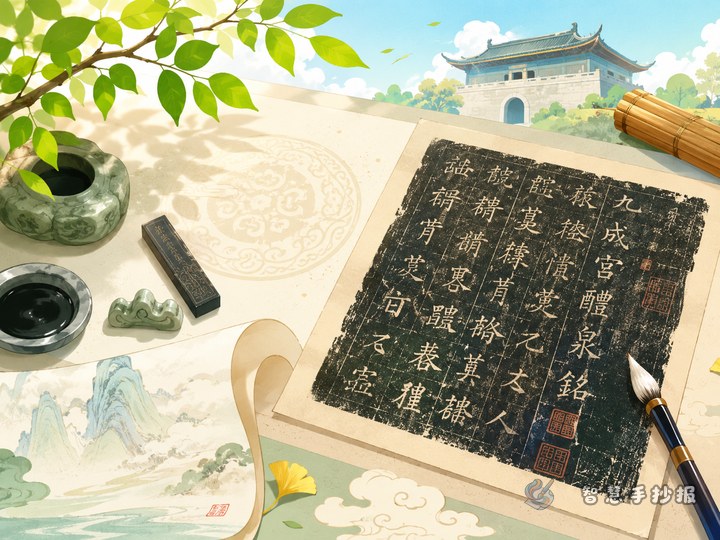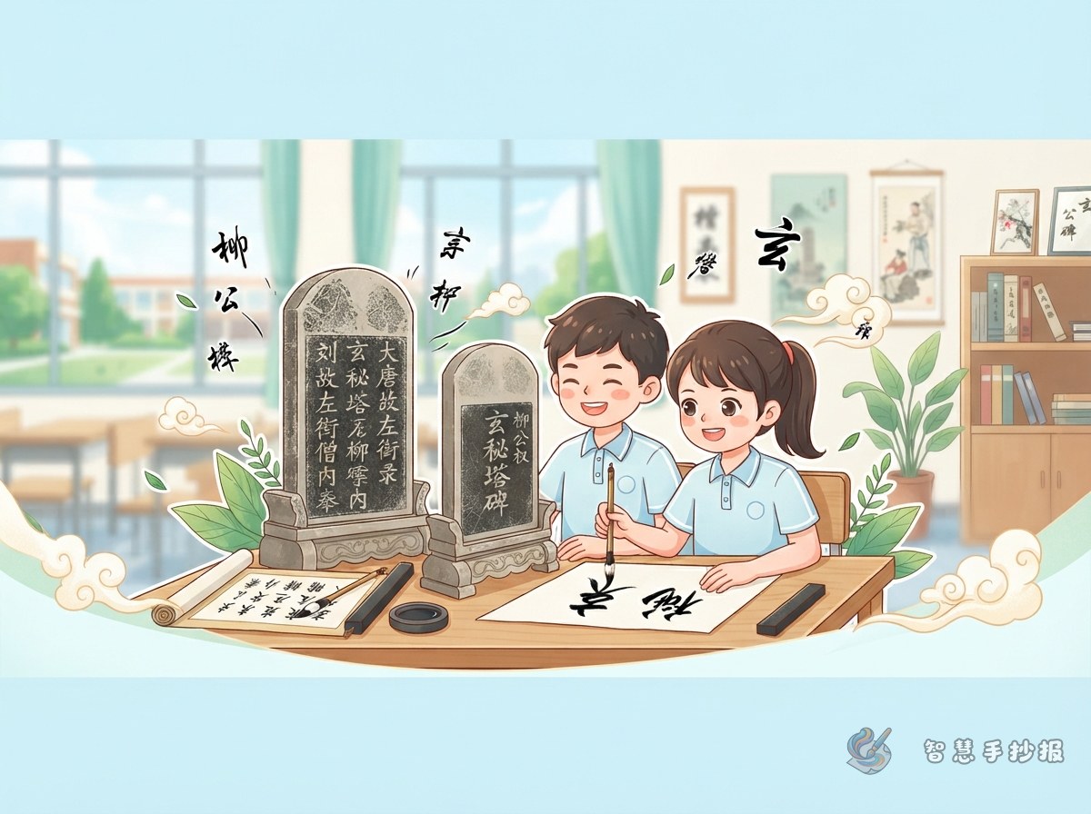
Turn Xuanmi Pagoda Stele into a Theme of Strength and Structure
A handwritten newspaper about Liu Gongquan’s Xuanmi Pagoda Stele can focus on the beauty of strong, upright regular script. Instead of simply listing facts, the page can help students understand why Liu-style calligraphy looks firm, neat, and full of energy.
A good opening sentence could be: Liu Gongquan was a famous calligrapher of the Tang dynasty. His regular script is known for its strict structure and powerful strokes, and Xuanmi Pagoda Stele is an important model for appreciating the Liu style.
Useful Sections to Put on the Page
Meet Liu Gongquan
Liu Gongquan was a well-known calligrapher of the Tang dynasty, especially famous for regular script. His characters look upright and strong, with clear strokes and a steady structure. In a handwritten newspaper, it is better to highlight his calligraphy style rather than write a long biography.
A Small Card for the Stele
- Type: A regular script stele inscription.
- Key features: Slim but powerful strokes, compact structure, and upright character shapes.
- What to learn: Stroke strength, character balance, and the arrangement of parts within a character.
My Observation of the Liu Style
When looking at Xuanmi Pagoda Stele, students may feel that every character stands firmly like a well-balanced person. The horizontal strokes are steady, the vertical strokes are straight, and the turns are clean. This can remind us to sit properly, hold the pen steadily, and write each stroke with care.
Design the Layout Like a Small Stele Gallery
The layout does not need to be crowded or colorful. You can design it like a small calligraphy gallery. Place the title in the center or at the top, then divide the page into sections such as “Calligrapher,” “Stele Appreciation,” and “Writing Tips.” A narrow bottom strip can be used for a short calligraphy quote or a personal note.
- Title: Use bold and square-looking lettering to match the strong style of Liu calligraphy.
- Decorations: Add simple brushes, seals, scrolls, stone textures, or practice grids.
- Colors: Rice white, ink black, seal red, and light gray work well for a traditional calligraphy theme.
- White space: Leave enough blank space so the page looks calm, clean, and elegant.
Short Writing Materials for Students
Appreciation sentence: The characters in Xuanmi Pagoda Stele look slim but strong. Their structures are upright and balanced, giving readers a clear and determined feeling.
Practice tip: When learning from Liu-style regular script, pay attention to the beginning, movement, and ending of each stroke. Writing well is not about speed, but about finishing every stroke carefully.
Theme sentence: Appreciating stele inscriptions helps us understand traditional calligraphy and develop patience and a sense of beauty. Writing a few careful characters every day is a small conversation with traditional culture.
Details That Make the Handwritten Newspaper Better
- Sketch the layout lightly with a pencil before writing.
- Make the title upright and strong to echo the feeling of Liu-style calligraphy.
- Use simple practice grids as decorations instead of copying too many difficult characters.
- Keep paragraphs short so classmates and teachers can read them easily.
- For more layout ideas, you can continue designing this calligraphy theme in the Zhihui Handwritten Newspaper WeChat mini program.