Do Not Shrink the Letters First—Split the Meaning
Placing a long title on one line often makes the letters too small and the spacing uneven. Read the title aloud, identify its natural pause, and divide it into two meaningful lines before drawing any decorative lettering.
- Keep phrases intact: Put “Protect Our Planet” on one line and “Start with Small Actions” on the next.
- Identify the key words: Enlarge phrases such as “Green Future,” “Reading Adventure,” or “Science Dreams,” while keeping connecting words smaller.
- Allow unequal lengths: The two lines do not need to match. Shift the shorter line slightly to create an intentional offset.
Choose an Offset Pattern That Fits the Theme
Centered offset for formal subjects
Arrange both lines around the center of the page, then move the second line half a letter-width to one side. This balanced option works well for school safety, cultural festivals, and civic themes.
Stair-step lettering for energetic subjects
Place the first line higher and to the left, then move the second line lower and to the right. The diagonal rhythm suits sports days, reading celebrations, science exploration, and other lively themes.
A separated key phrase for action slogans
Put the smaller introductory words above and reserve the strongest four to six words for the lower center. The highlighted phrase may be larger, but it should use the same letter shape and outline as the rest of the title.
Draw the Lettering in a Reliable Order
- Mark the space for both lines lightly in pencil, including margins and gaps between letters.
- Write the center strokes of every letter first and check spelling, scale, and balance.
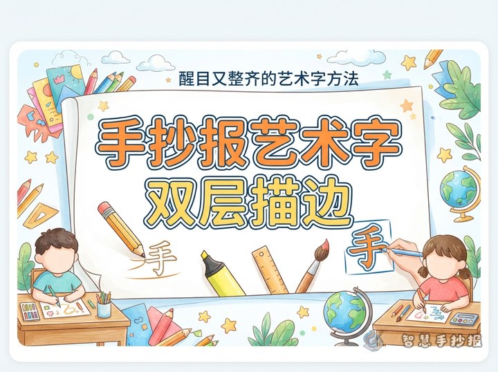
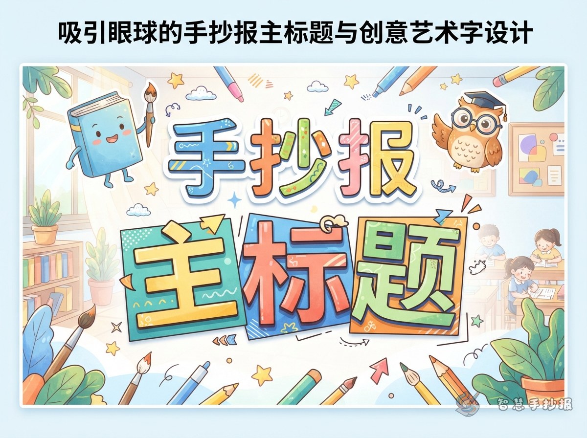
- Thicken the strokes into rounded block letters, outlined letters, or soft bubble letters. Use only one style for the full title.
- Erase extra guides, add a consistent dark outline, and fill the letters with solid colors or simple dot and stripe patterns.
- Add a few theme motifs near line endings or corners rather than decorating every letter.
Useful color pairs include navy with orange, green with pale yellow, or purple with pink. Color should establish emphasis, while the repeated outline visually unifies both lines.
Connect the Title with Useful Content
Plan two to four sections that directly support the title. A water-safety poster might include “Places to Avoid,” “What to Do in an Emergency,” and “Safety Rules to Remember.” A reading poster could feature “My Reading Plan,” “Book Recommendations,” and “Simple Reading Habits.”
Use concise statements instead of copying long paragraphs. Examples include “Never swim in an unsupervised area,” “Check the table of contents before reading,” and “Sort waste before placing it in the correct bin.” Give each section one central idea followed by two to four short points.
Build the Page Around the Title Shape
If the two-line title sits at the top, extend a content box into the open space beside its shorter line. If it occupies the upper-left corner, place one tall section on the right and two smaller horizontal sections below. Content borders should be thinner and less colorful than the main title.
Before adding ink, view the pencil draft from a short distance to check whether the title is readable and whether decorations crowd the text. To test more title positions, color combinations, and section layouts, continue creating the poster in the 智慧手抄报 WeChat Mini Program.