Choose a Stroke That Can Become a Picture
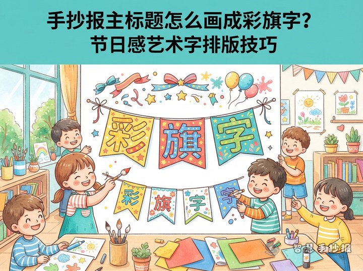
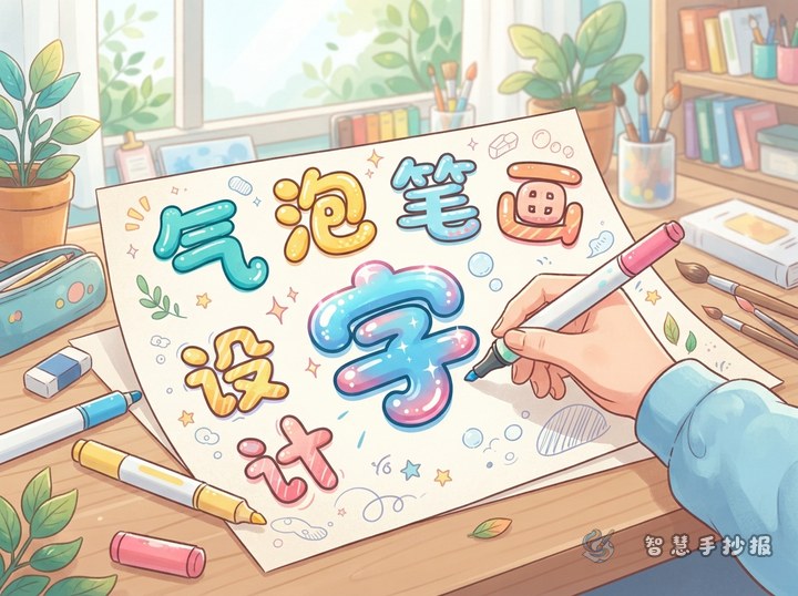
Picture-integrated lettering works best when only one or two strokes are changed. Sketch the full headline in pencil first, then look for a dot, short horizontal stroke, or vertical stroke that can be replaced without making the word difficult to recognize.
- Environmental themes: Turn a dot into a leaf, water drop, or small globe.
- Reading themes: Use a pencil as a vertical stroke or place an open book beneath the headline.
- Festival themes: Replace a dot with a lantern, star, or pennant.
- Science themes: Add a rocket, gear, or planet while preserving the basic letter shape.
Make the Pictures and Letters Feel Connected
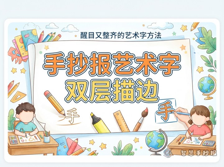
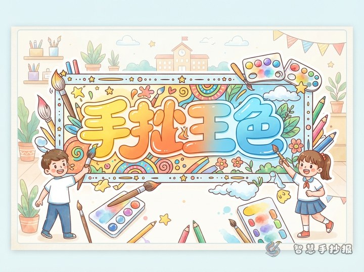
Select one main color and one accent color. Use the main color for ordinary strokes and the accent color for the illustrated stroke. Keep each picture close to the thickness of the lettering and no larger than about one third of a letter's height. A consistent dark outline can bring the whole headline together.
Three Simple Arrangements
- Replace just one dot when the headline is long or the student is new to decorative lettering.
- Decorate only the first word and keep the remaining letters consistent.
- Use one small picture to connect two neighboring letters without covering the space between them.
Match the Headline With Useful Content
The illustrated title should introduce the information below it. An environmental poster could include “Green Facts,” “Actions I Can Take,” and “Ways to Save Resources.” A reading poster might use “Book Recommendation,” “What I Learned,” and “My Reading Plan.” A science poster could feature “An Interesting Observation,” “Experiment Steps,” and “Safety Notes.”
Keep the writing short and easy to copy. Useful lines include “Turn off unused lights to save electricity,” “Read a little every day and let knowledge grow,” and “Observe first, ask a question, and then test your idea.” Each section can contain one short paragraph or three to five bullet points.
Reserve a Clear Area for the Main Title
On a landscape poster, place the headline near the top center and give it about one fifth of the page height. On a portrait page, position it in the upper left and let the content move toward the lower right. Leave open space around the lettering so borders, illustrations, and body text do not compete with it.
Check Readability Before Finishing
Place the poster at a distance and see whether the headline can be read immediately. If a decorated letter looks confusing, restore its key stroke and move the picture beside it. To try more headline styles, content sections, and page layouts, continue creating in the Smart Hand-copied Poster WeChat Mini Program.