Start with the rhythm of the pennant shapes
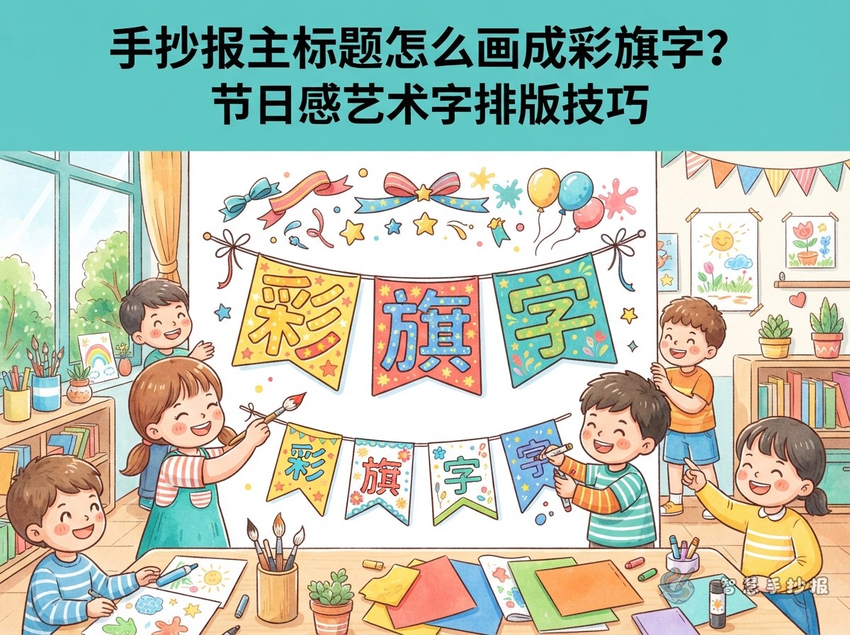
Pennant lettering is more than coloring ordinary words. Each character sits inside a small flag shape, and the flags work together like a cheerful banner. This style is especially suitable for handwritten posters about festivals, reading, sports days, environmental protection, and school activities.
- Keep the title short: A main title of four to eight characters is easiest to arrange. If the wording is longer, highlight the key phrase and place the explanation in smaller text.
- Use a consistent flag style: Choose triangles, trapezoids, or rounded flags. Keep the shapes similar within one poster instead of mixing too many types.
- Leave breathing room: Small gaps between the flags make every character easier to read and prevent the title from looking like one solid strip of color.
Four steps from sketch to colorful banner title
- Draw the hanging line: Lightly sketch a horizontal string first. Decide whether the title will sit at the top, in the center, or above the main illustration.
- Place the flags: Draw similarly sized flags in reading order. An important word may use slightly larger flags, but the height changes should remain modest.
- Write with broad strokes: Add simple, bold lettering inside each flag, then clarify the shape with a dark outline or a narrow dark edge. Keep each character centered.
- Add knots and small decorations: Draw little knots, short sticks, or a thin string above the flags. Stars, confetti, music notes, and ribbons can add an event-like feeling without taking over the title.
An easy practice method for children
Write the title on grid paper first, then fit each character into a flag of the planned size. There is no need to imitate complicated calligraphy. Clear strokes, even thickness, and consistent spacing will make the title look neat and eye-catching.
Make the lettering carry the theme
Pennant lettering works best when the key noun or action in the topic is enlarged and the supporting idea is placed below it. For a reading poster, try “A Bookish School” with “Read a Little Every Day” underneath. An environmental poster could use “Live Green” with “Start by Saving Paper.” For a festival theme, “Happy Childhood” could be followed by “Sharing Games and Good Wishes.”
- Reading motifs: Pages, pencils, glasses, bookmarks, and small bookshelves.
- Environmental motifs: Leaves, the Earth, water drops, recycling symbols, and new shoots.
- Sports motifs: Whistles, medals, balls, track lines, and small cheering flags.
- Festival motifs: Lanterns, gift boxes, stars, paper flowers, and raised hands.
Repeat one or two decorative motifs from the main text area near the title. Leaves can echo an environmental theme, while bookmarks can connect a reading title to its columns. This repetition helps the page feel unified.
Plan the page so the pennant title stays in charge
Place the colorful title in roughly the top quarter of the poster. Keep the string away from the paper edge, allowing its ends to dip gently beside an illustration. Leave a small area of open space beneath the title before arranging the introduction, facts, and smaller sections.
- Use three or four bright colors for the flags. Keep the body text more restrained so the page does not become overly busy.
- Arrange flag colors in an alternating light-and-dark or warm-and-cool pattern. Let nearby illustrations repeat one or two of those colors.
- Divide sections with dots, short dashed lines, or tiny flag knots instead of giving every box a heavy border.
- Before finishing the coloring, step back and check whether the title can still be read from a distance.
To organize the lettering, colors, and columns more quickly, you can browse a related layout in the Smart Handwritten Poster WeChat mini program, then adjust it to your paper size and drawing habits. The final pennant-style title can still be drawn by hand and made uniquely yours.