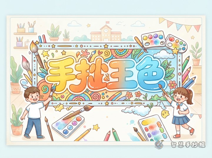
Plan the Letter Shape Before Adding Patterns
The open space inside outlined lettering can help tell the theme of a school poster. Begin by lightly sketching the main title in pencil, leaving about half a stroke of space between letters. Round lettering suits festivals, reading, and personal growth, while block lettering works well for safety, science, and civic topics. Wavy forms are useful for oceans, spring, and travel.
Turn Theme Objects into Tiny Repeating Motifs
Choose one or two simple icons for each word instead of filling every stroke with unrelated details. Repeated motifs keep the title readable and visually consistent.
- Environment: leaves, water drops, globe lines, or recycling arrows.
- Reading: open books, pencils, stars, or bookmarks.
- Traditional festivals: lanterns, moons, clouds, or simplified seasonal foods.
- Safety: traffic lights, shields, crosswalk stripes, or warning triangles.
For a title about protecting Earth, fill part of the lettering with leaf shapes and use blue-green areas with simple globe lines. For a reading title, combine page patterns, colorful bookmarks, and a few small stars.
Draw Clear Outlined Letters in Three Steps
- Write the title lightly in pencil and check that it fits the planned title area.
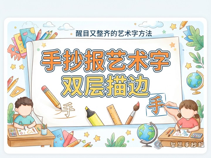
- Expand around each letter to form a thick outline, then erase unnecessary guide lines.
- Trace the outer edge in a dark color, add motifs or alternating color blocks, and finish with a few highlights.
Create contrast between the border and the interior patterns. Dark blue, deep green, or brown works well for the outline, while two or three related colors are enough inside. A different color scheme for every letter usually makes the title feel disconnected.
Connect the Heading to the Rest of the Poster
Place the title at the top center, in a lively upper-left area, or across the space between two content sections. Under it, arrange sections such as “Key Facts,” “What We Can Do,” and “My Thoughts.” Repeat one small motif from the title along the section borders so the whole poster feels intentionally designed.
Check Readability Before Final Coloring
- Make the letters larger if the hollow strokes are too narrow for patterns.
- Leave roughly one-third of the interior open when decorations feel crowded.
- Use one main color and no more than two supporting colors.
Step back about one meter and check whether the heading is readable at a glance before adding final decoration. To explore more title, section, and layout combinations, scan to open the Zhihui Shouchaobao WeChat Mini Program and continue designing your poster.