Why a Double Outline Makes a Title Stand Out
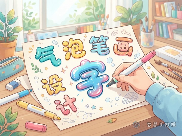
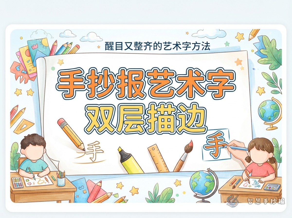
A hand-copied poster can quickly become visually busy once illustrations, borders, and text boxes are added. A double outline separates the main title from that background. Start with thick letters, add a light inner outline, and finish with a dark outer contour. The light band creates breathing room, while the dark edge keeps every letter easy to recognize.
Build the Lettering in Five Controlled Steps
- Mark the title area: Lightly set the total width, baseline, and spacing in pencil.
- Draw the letter skeletons: Check that the letters have balanced heights and widths.
- Thicken the strokes: Expand each skeleton while keeping corners and curves consistent.
- Reserve a light border: Leave an even white, pale yellow, or light blue band around each letter.
- Add the dark contour: Trace the outside with navy, dark green, or deep red, then erase the guides.
Choose Three Colors with Clear Jobs
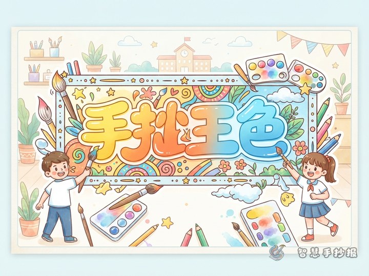
Use a bright color for the letter face, a pale color for separation, and a dark color for definition. Useful combinations include orange with an ivory border and a deep red contour, or sky blue with a white border and a navy contour. Keeping the title to three main colors usually looks more organized than giving every letter a different color.
Connect the Lettering to the Poster Theme
Small details can make the same technique suit different subjects. Festival posters may include tiny stars, flags, or lanterns along the contour. A reading poster can use paper-like cream tones, while an environmental poster works well with green letters, a white border, and a dark green edge. Supporting sections might include “Key Facts,” “What I Can Do,” “A Short Message,” and “Quick Questions.”
Protect the Space Around the Title
Place the title near the top or at the visual center, leaving roughly one stroke-width of open space around its outer contour. Avoid letting illustrations, panel borders, or decorative lines touch the lettering. Arrange the remaining content in two columns or a narrow-top, wide-bottom structure. After sketching the layout, continue choosing a theme, organizing sections, and making the poster in the 智慧手抄报 WeChat Mini Program.