Choose the Curve Before Drawing the Letters
A curved or gently wavy heading works well at the top center of a school poster. It adds movement without making the words difficult to recognize. Begin by marking a light title area in pencil. A heading that uses about one-half to two-thirds of the page width usually leaves enough room for the content sections below.
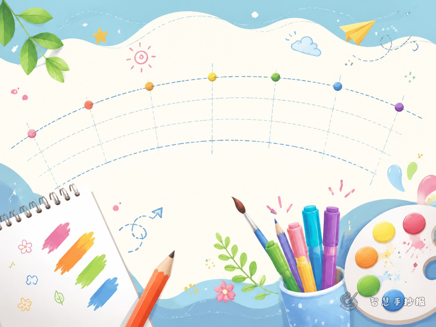
Draw a soft guideline with only one or two rises and dips. A short title can follow a simple upward arch, while a longer title needs a wider, flatter wave. Tight curves make letters tilt too sharply and reduce readability.
Build the Heading in Four Clear Steps
- Mark the center: Find the center of the page and position the middle letter or middle gap there.
- Use letter boxes: Sketch equal-sized boxes along the guideline before writing the actual letters. This helps control spacing.
- Keep one lettering style: Thicken similar strokes and use the same kind of rounded or square corners throughout the title.
- Remove the guideline: Trace the finished letters, wait for the ink to dry, erase the pencil marks, and then add color.
Adapt the Lettering to the Poster Theme
- Reading: Try brown, orange, or blue letters with a small open book, pencil, or bookmark at each end.
- Environmental care: Use rounded letters in green and light blue, accompanied by leaves, water drops, or a tiny globe.
- Celebrations: Choose bright red and yellow accents, then add a few stars, flags, or lanterns without covering the strokes.
- Science: Combine blue and purple with small planets, gears, orbit lines, or a magnifying glass.
Connect the Main Heading with the Content
Place one central section below the curve and add two smaller information boxes on the sides. A reading poster might include “Book Pick,” “Reading Tips,” and “What I Learned.” An environmental poster could use “Green Facts,” “Actions at Home,” and “My Eco Pledge.” Slightly angled borders can echo the title’s movement and make the page feel connected.
Useful short lines include: “Read a little each day and let knowledge grow,” “Save every drop by starting with small daily actions,” and “Stay curious and discover science through observation.” Keep each section brief so that dense paragraphs do not compete with the main heading.
Use Color and Empty Space for Emphasis
One main color and one supporting color are usually enough. On white paper, outline the letters in dark blue, deep green, or warm red, then fill them with a lighter related shade. Decorations should remain visually softer than the words. Leave open space above and below the title instead of surrounding every letter with borders and pictures.
Step back and check whether the title is readable at a glance, whether the spacing feels even, and whether the lowest letters touch the body text. For more layout ideas, open the Smart Hand-Copied Poster WeChat Mini Program to explore suitable themes and arrange content sections before finishing the poster by hand.