Build the Bubble Letters from a Simple Skeleton
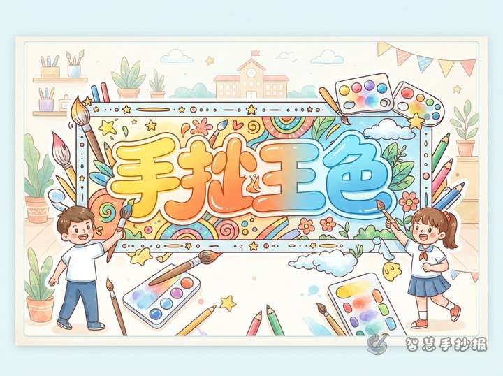
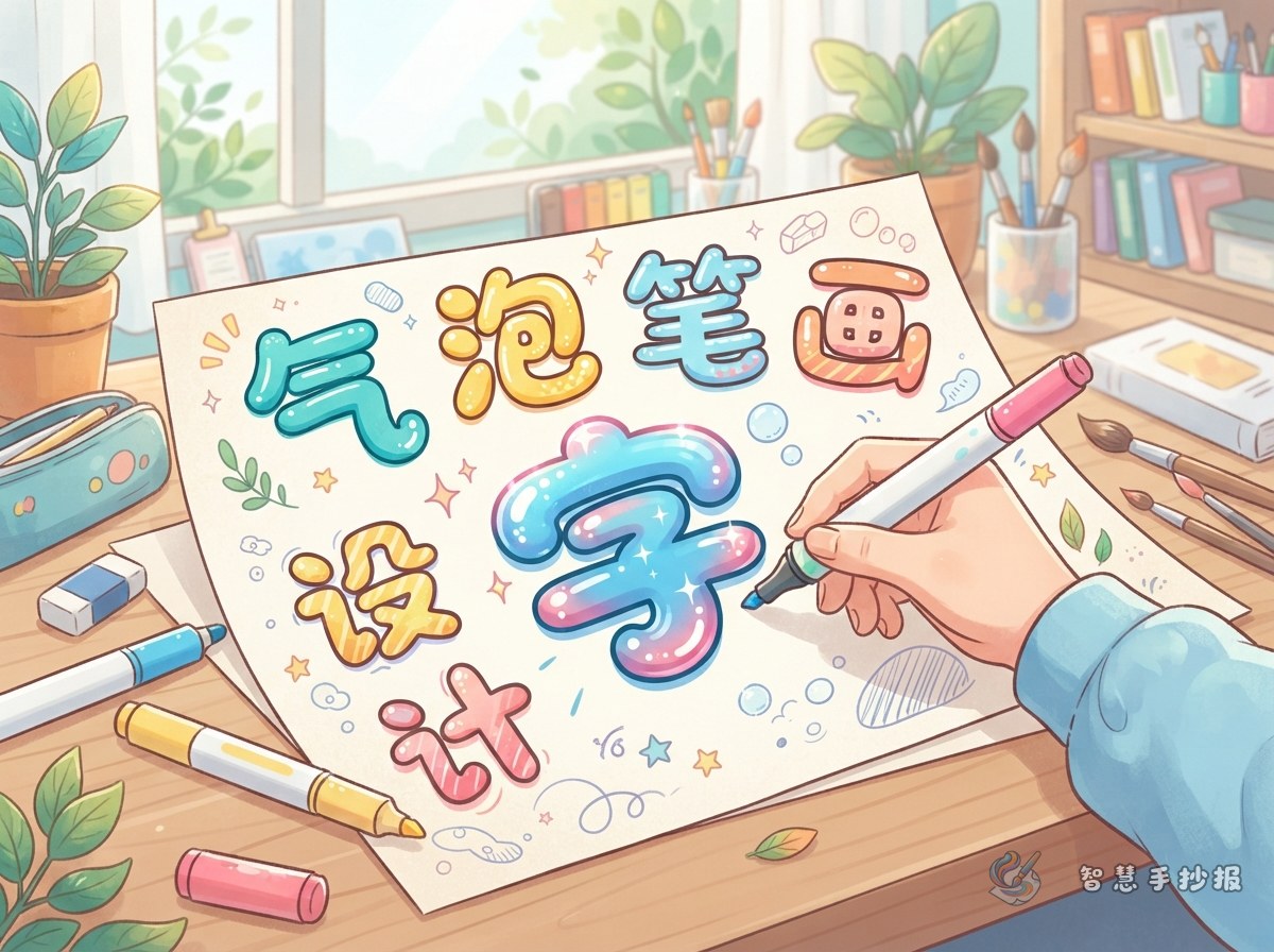
Bubble lettering works especially well for cheerful hand-copied posters about festivals, school life, reading, growth, and the environment. Lightly write the title in pencil first, then draw a rounded outline around each stroke. Soften sharp corners and keep the strokes thick enough to make the letters look inflated rather than cramped.
- Draw a faint baseline to keep the title level.
- Write a single-line skeleton and leave even spaces between letters.
- Expand each stroke into a rounded shape, then erase the inner guides.
- Compare the letter heights and adjust any stroke that looks too heavy.
Place Highlights with One Light Direction
Bubble letters do not need complicated shadows. Imagine that light comes from the upper left, then add a short white curve, a small dot, or a narrow blank area on the upper-left part of each letter. Use highlights only on wider areas and keep their direction consistent across the whole title.
A reliable color formula is dark outline, bright fill, and white highlight. Dark blue with light blue suits ocean or science themes. Orange-red with yellow feels festive and energetic. Dark green with fresh green is suitable for environmental topics.
Add Small Decorations That Support the Topic
Choose decorations that explain the theme without covering the title. An open book, bookmark, and stars fit a reading poster. Sprouts, petals, and birds suit spring. Medals, track lines, and flags work for sports. Keep these drawings near the two ends of the title or in natural gaps, and make them smaller than the lettering.
Ready-to-Use Titles and Sections
- Reading: Use “Growing with Books” with sections such as “Book Picks,” “Reading Tips,” and “What I Learned.”
- Environment: Use “Green Actions” with “Saving Habits,” “Sorting Waste,” and “Protecting Our School.”
- School life: Use “Happy Days at School” with “Good Manners,” “Helping Classmates,” and “A Day on Campus.”
Keep body text short and easy to copy. Useful lines include: “Save paper by starting with one small habit,” “Write down favorite words while reading to understand the story better,” and “Greeting teachers and waiting calmly in line make school more welcoming.”
Let the Title Remain the Visual Center
Place the main title near the top center and let it occupy about one-half to two-thirds of the page width. Arrange two or three content sections beneath it with rounded boxes, cloud shapes, or simple curved dividers. If the title is colorful, use softer borders and dark body text so every area does not compete for attention.
Before drawing the final poster, make a thumbnail sketch for the title, illustrations, and writing areas. Check that the title is easy to notice and that each section has enough room. To explore more themes and adjust the layout, scan the code to open the Smart Hand-Copied Poster WeChat Mini Program and continue creating according to the paper size and assignment requirements.