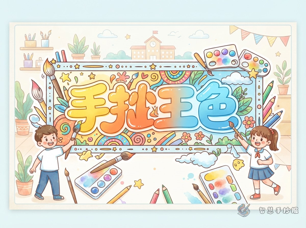
Choose the Gradient Direction Before Drawing
Gradient lettering works best when the colors change in one clear direction rather than being scattered randomly. First decide whether the heading will sit across the top, in the upper-left corner, or near the center of the page. Sketch thick letters lightly in pencil, keeping the spacing and overall height consistent.
A top-to-bottom gradient is the easiest option for beginners. Place the light shade at the top, the middle shade through the center, and the dark shade at the bottom. Apply the same direction to every letter. A left-to-right fade can also suit themes about sunrise, progress, growth, or hope because the color movement follows the reading direction.
Build a Clean Blend in Five Steps
- Test the palette: Try all three colors on scrap paper and check that their overlap does not become muddy.
- Lay down the light color: Cover the full letter with gentle strokes moving in one direction.
- Add the middle shade: Begin around the center and extend it slightly into the light area.
- Deepen one edge: Apply the darkest color at the bottom or on one side, reducing pressure near the transition.
- Soften the boundary: Sweep the light shade gently over the meeting point to connect the colors.
Yellow, orange, and red work well for festivals or labor themes. Light blue, aqua, and dark blue suit oceans, science, or water conservation. A light-to-dark green palette fits environmental and spring topics, while pink-to-purple can support reading, dreams, and personal growth.
Match the Heading to Useful Poster Sections
The title colors should reinforce the topic. A poster called “Green Living” might use green lettering with a few small leaves. A space poster can combine blue and purple with sparse stars. A reading poster can use a warm orange-red heading and repeat one of those colors around a book-shaped text box.
- Environmental topic: “Small Green Actions,” “Sorting Waste,” and “My Promise to Earth.”
- Reading topic: “Book Recommendation,” “Helpful Reading Habits,” and “What I Learned.”
- Science topic: “A Curious Phenomenon,” “Safe Experiment Tips,” and “Life in the Future.”
- School safety topic: “Safe Break Time,” “Stairway Rules,” and “What to Do in Danger.”
Short Text Material to Adapt
For an Environmental Poster
Green living can begin with turning off unused lights, saving water, and sorting waste correctly. When everyone completes one small action, the school and community become cleaner places.
For a Reading Poster
Reading gives us knowledge and introduces us to unfamiliar people, places, and ideas. Set aside a quiet time each day and record one memorable sentence so that progress can build steadily.
For a Science Poster
Scientific discovery often starts with a small question. Observe carefully, make a thoughtful guess, and test it in a safe way to move closer to an answer.
These paragraphs can fit into text boxes of about six to eight handwritten lines. Students may shorten them for the available space or add personal experiences to make the poster more original.
Balance a Bright Heading with Readable Content
Because a gradient heading is already the visual focus, the rest of the page should use simpler colors. Divide the page into two large sections and one smaller section. Put essential information in the large areas, and reserve the small area for a rhyme, reminder, checklist, or personal reflection. Use only one heading color for borders and add a few topic-related drawings in open spaces.
Finally, view the page from a short distance. The heading should attract attention first, every letter should share the same color direction, and the body text should remain easy to read. To compare heading positions and section arrangements before drawing the final version, continue creating in the 智慧手抄报 WeChat Mini Program and adjust the layout to match the paper size.